Wednesday, 14 February 2018

ARTIST RESEARCH- The Printed Peanut

Riso Print:
WHAT DO I LIKE?
- The muted colour palette is a soft and accessible visual, whilst still having a vibrant undertone
- Use of negative space is a good way to let the composition breathe on the page
- Intricacies and details of the mimosa flowers add a good amount of complexity and interest
- Format and background is a fun and professional way
- Print quality is a really fantastic way to add texture to what would otherwise be flat colour.

HOW DOES THIS INFLUENCE ME?
- Think about how to contrast muted colours to make a strong composition
- Include negative space as an additional colour
- How do I want to produce my work? Is riso print an effective way? Limited edition just screen print
- I like the boarder spacing and how this tidily finishes the outcome

Tuesday, 6 February 2018

Renewi brief

I wanted to try something completely different to anything I had done before, so quickly undertook the Renewi Brief from uni

SUCCESSES:
- Using a very different colour palette has broadened my visions about what is appropriate in different settings
- The use of minimal, subtle pattern in the 70's one evokes a strong feeling for the era
- The media was interesting for me to work with, and I think gives a really easy yet professional outcome

IMPROVEMENTS:
- Make do and mend seems forced in it's movement
- Some of the shapes could have been refined further

NEXT STEPS:
- Continue to do short briefs to test myself
- Think of ways to incorporate pattern subtly into my work
- Expand my colour palette usages


Friday, 2 February 2018

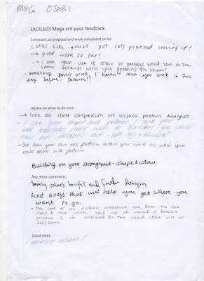
Mega crit

MAIN COMMENTS:
- Shape and colour work well
- Good use of different media- keep this up
- Carefully consider competition briefs

WHAT NEXT?
- Explore new media to work in
- Expand range of colour usage and think of appropriateness
- Keep working with short briefs if possible