Wednesday, 28 October 2015

Photoshop tutorials

Over the past three weeks, during taught photoshop tutorials, I have explored many different approaches to image alteration through photoshop processes. 
To begin with I scanned in an ink drawing from a previous setting, ensuring that the quality was high enough to retain the detail once expanded, therefore we chose 300 dpi, but spoke about the 72dpi needed for on screen images.

Then using the levels and curve features I altered the image to a less tonal, more line based outcome, whilst eradicating the shadow cast by the slightly uneven paper, before using the Magic Wand tool-> Select-> Similar to fully eradicate tone from the image. Once this was done I also used both the eraser and healing spot brush in order to ensure there were no marks or slight imperfections on the image.

After this I created several layers and used the brush and lasso selection tool to add colours, ensuring each colour was on a different layer in order to allow quick editing later on. At this stage I also played around with the different outcomes I could create by playing around with the saturation of both black and colour in order to alter the appearance, and trying out different combinations through changing the visibility on certain layers. 

Then I looked at the blending modes for layers, and selected the multiply in order to add loose colour underneath the black lines, something which I have not done before on Photoshop. I also experimented with different textures and how to add them using vector masks, as well as layering my existing colour on top and lowering the opacity. I really enjoyed playing around with the different outcomes I could achieve here, especially with the opportunity to expose more/less areas of texture through the use of black and white paint.

In addition, I also learnt how to create my own custom brushes through Magic Wand Selection tool -> Edit-> Define Brush Presets, which enabled me to quickly and effectively produce differently sized and orientated versions of my image without the use of copy and paste. This was something I found particularly beneficial to me, as I loved the freedom this gave me to play around with altering my image to create modern, 'print' style pieces, with the use of select colour.

Finally I combined many techniques to create an outcome which I really like. I used Define Brush Presets, multiply blending mode, brush selection, and the brush alteration tools to create the piece, which I then altered using Hue and Saturation to create a few final outcomes which I am quite happy with.


Original scan
Level and curve adjustments


Colour added through lasso and brush tool using layers
Texture added with selection tool
  
Texture added with brush

Brush Preset tool 
Custo brush and multiply blending mode
Altering saturation

Sunday, 25 October 2015

Line as tone

Starting on this process I began by looking at how quality of line and mark making can contribute to the tonal elements of a drawing. I wanted to explore tone without a structured line drawing, as I thought this was an interesting concept. I am overall quite pleased with how these images have turned out as I feel they fit the brief and theme well, whilst still showing interesting techniques of how to add tone using line, which I feel I will be able to incorporate into my future work. 

One thing I need to make sure I consider more is the cohesion between line and tone and how I can create interesting tone through simple, considered line placement


Saturday, 24 October 2015

Line as tone presentation

What dictates line and mark making?

Pressure, stroke, direction and gesture
Ways to explore this is to feel the paper surface through your drawing tool. Instil feeling into your hand, altering pressure within the stroke.
Avoid feathering or going back over existing lines. Commit to drawing, and if it's rubbish, simply draw it again.
Look ahead on the page- try and visualise the shape and direction of your line.


What dictates line drawing?

Synchronise hand and eye
Don't let your hand move faster than your eyes. As you scan your reference information you are processing information all the time within short term memory than recalling it through your hand.
It is crucial to draw multiples of the same subject matter and to maintain a constant and modulating process of reflection.
Tom Gauld

Example of sketching techniques

Wednesday, 21 October 2015

Line Quality

I really wanted to explore different processes and media in this exercise, so I chose quite a simple image to start with in order to be able to invest more time into the production processes.

What I liked:
- Like the varying line quality in the different media, especially the wire drawing where the line thickness is standard but the overlapping and varying forms add interest and ensure it isn't a basic copy of my previous line drawings
- I also like the idea of investigating how different line techniques can be made from how the pen is held, and how much these vary the outcome
- The slightly wobbly nature of the stitch and how it adds a homemade feel to it

What I didn't like:
- Used too much block colour in some of them-supposed to be focused on LINE
- Used tone too much as well- need to focus on simplifying shapes

Pen, carved stamp, cut paper, stitch and wire drawings

Brush marks and different pen holding techniques, such as left hand and mouth

Tuesday, 20 October 2015

Line Quality presentation

'Creative art begins with creative line... Have always the courage to to draw it yourself'- Andrew Loomis

'Skill is a capacity that we develop'- Richard Sennett

From the presentation on line quality, I began to realise how important the process of drawing is, and how much of an impact process has on the final outcome. I also started to think about new ways to approach simple processes, such as appropriate media and how tools can actually dictate the image rather than approaching the problem with a pre formed solution.

We started to focus on the quality of line and the opportunities of how to utilise the versatility of it to create diverse and ranging outcomes, we also began to understand the nature and effect of line within the context of drawing.

We also looked at the skill behind the drawing of a line, and how there is no standard for good drawing, because the creativity and ideas behind the work contains the most weight, and are always totally reliant upon the hand of the artist.

How do gesture, control, speed, tool, pressure and media work to create interesting and engaging pictures?


Ceri Amphlett

Picasso

Ben Shahn

Monday, 19 October 2015

Typology research

Through looking at different depictions of typology alphabets, I saw a strong reliance on the use of type, but many were used as a description for what each image depicted, which I thought was quite limiting, as it doesn't let the artwork talk for itself and let the audience understand the image for themselves. Therefore I decided I wanted to create strong images which could stand without type, but then use the inclusion of type to add a bit of character and humour to the piece, through the depiction of unusual languages. Furthermore, I looked at a few artists who use more graphic, block shapes, as since this was a monochrome task, I thought it would be quite interesting to look at this sort of style. However, upon reflection I think I could have tried to develop my drawings more to create an even more graphic outcome, like the third image here, but since this task did not involve digital work I feel it might have been too ambitious to create and develop 26 stripped down character designs by hand in just a week, and considering the circumstances and time limit I feel very happy with my final outcome.


s-media-cache-ak0.pinimg.com/originals/56/4a/58/564a5857d6729d90d4d3050c4f830012.jpg
media-cache-ak0.pinimg.com/736x/58/cf/3f/58cf3fbc26784638d1c7f084f5c04142.jpg
www.thirdyearabroad.com/media/k2/items/cache/08ae461f14a3d195f7e52b850155dc3c_XL.jpg


Sunday, 18 October 2015

Nigel Peake

I really like the work of Nigel Peake as I find his line work and use of colour and composition incredibly simple yet effective, as his bold and slightly digital technique uses patterns to create the vision of different textures and depths, whilst creating the illusion of tonal depth through the spacing of the lines. Furthermore, I love how he is very select in what portions of the image to draw, and how he is not afraid of negative space, and in fact utilises it to ground his images onto the page and give them a sense of place. I would really like to look more into his work and try to inject some colour into my work, as well as incorporating built up line instead of tone, which is something I haven't really explored before.


My own work drawing from reference

www.tinyshowcase.com/media/detail/nigel_peake_4.jpg
manmakehome.files.wordpress.com/2009/01/nigel-5.jpg
www.pikaland.com/wp-content/uploads/2008/08/611.jpg
files.list.co.uk/images/2009/08/14/bnigel-peake-LST065811.jpg


Final Outcome

Overall, I feel that my piece is successful, as I think the simple block tones are very strong and command the attention of the audience, and I think they work well with the additions of text to be an informative poster.
However, I feel that my composition could have been better, as I realised after that the spacing is not quite even, with the top being less crowded that the bottom. However, since this project could not involve digital work, I struggled with composing the composition without using digital means, but I think with a little practice I will be able to compose outcomes more confidently. In addition, I really like how I've used type in this project, as I think it really adds a slightly graphic element, which works well with the monotone structure.
One aspect which I really like is the type, as I feel happy that I created a friendly yet inclusive typeface which reflects well the meaning of the poster, which tries to include many different nationalities and their greetings.
If I were to repeat this process, I think the main thing I would want to change would be to thin of different ways to display the characters, perhaps with full figures and a more 'in situ' piece, almost reminiscent of a where's Wally type format. Although, I do still feel that this fits the set brief, and I do really like the striking contrast in colour.

A-Z Poster Production

Whilst I was making the final outcome I wanted to roughly sketch out my composition in order to make sure all my proportions and compositions were correct, as I needed to ensure I didn't make a mistake on the drawings as I only had one go to get it right with the pen, so I had to ensure I accurately sketched it out with a light pencil first. I also struggled to find the correct colour stock, as most of the papers in the college shop were either too dark or too bright, since I wanted quite a cool, inclusive colour since the characters are diverse and ranging, so I wanted a simple and not 'in your face' tone.

A-Z Poster development

After our group crit on Monday I decided to expand on the Global Greetings theme, as I feel this was the one that I got the best responses to, and had the most scope for an interesting exploration of character as well as the opportunity the see how diversely different cultures can contrast to each other whilst still maintaining a connecting thread. I decided that I wanted to have a very simple set element for them all, which I quickly decided would be the eyes as just simple dots in order to tie them all together with a reoccurring theme. I also experimented with the use of block colour through cut paper, ink and brush pen, but I feel the cut paper was a little too segregated to use with line, and it would be far too complex to cut the entire figure out. I also experimented a little with type, as it is a very important factor within my poster, as each figure will include their greeting in type form.


Saturday, 17 October 2015

Sketchbooks

'Ideas & image are at the heart of everything you do. Your sketchbook is the place to develop both your ideas & images' -Ping Zu

Sketchbooks are where we develop and explore all the crazy ideas that come into our heads, there's no filter, no pressure to create 'finished' outcomes, just a rough area for playing with images. It's a totally personal place where experimentation occurs and it's up to the individual to use it how they wish, with no need to hide 'ugly' drawings, but instead embrace them and learn from them in order to develop our practice through the repetitive study of one item until we draw it just how we want it.


James Jean
James Jean
Jonathan Edwards


A-Z typology

Initial ideas:


Sign Language

I really liked this theme, as I thought it would be an interesting and very suitable subject, since Lizzie in my class is deaf, and I thought it might be a nice project to learn a little sign language throughout. However, after the crit on Monday I decided that this subject was fairly limiting, as the only drawing matter would be hands, and in a particular position too, so I decided I would like to explore a subject which I was able to put more of my own stamps on.


Country Shapes

Although I really liked the scope of this idea, and the different potential imagery I could make using it, I felt it lacked a little personality, as there was only really one set image, and it would just be the media I would be swapping. In addition I feel that this would work incredibly well using paper cutting techniques, but I fear this may have made the piece look a bit too flat and uninteresting.
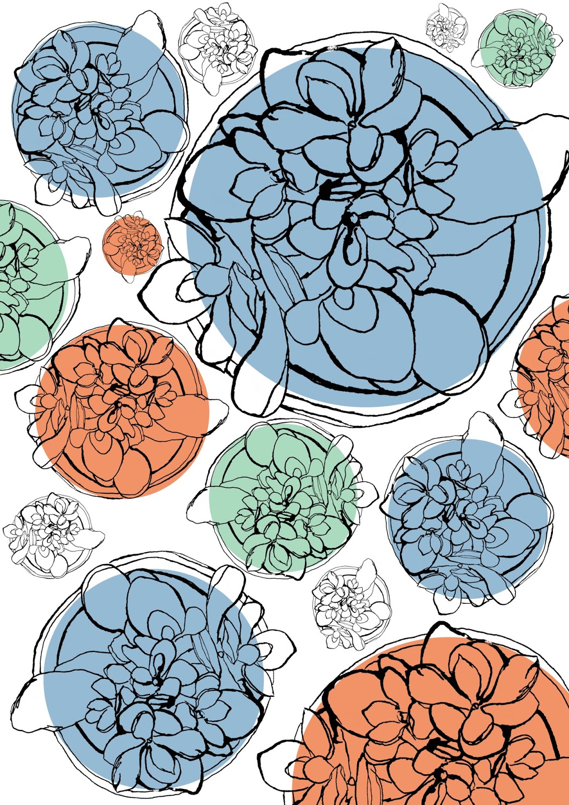

Flowers

Since I used to work as a florist, the idea of flowers appealed greatly to me, as I was able to put my own stamp onto it by choosing my favourites for each letter. I think most flowers translate well into line form, but I feel a major issue with this idea would be the limited colour palette, as I feel the best way to work these images would be with a full and rich colour palette.


Global Greetings

This was one of my favourite concepts, as I really loved the individual and fun nature, as well as the opportunity to explore character development, which is something I haven't done much of previously. I did struggle a little with the research on this one, as there were a few letters which I had to search extensively to find a greeting for, but now I have a very distinct list I feel that this subject would be fairly straightforward, with still much scope to experiment with techniques and media.


Insects

Here I looked at different tones to experiment with interesting approaches to image making, through pen and ink and brush with watered down ink to create looser shapes before adding detail. I really like this set of images, as I think it has a very interesting tonal quality to it, but I feel that the subject matter is again being limited by the colour palette available, as I think these drawings would look really good with bold colour choices to reflect how diverse the colouring of insects really is.

Recipe

I thought this idea was quite interesting, as there are lots of ways I could play around with the compositions in order to create attention grabbing scenes where the drawings relate to one another and give a strong purpose to the poster. However, I feel it may be a little dull in some places, as a few of the images are fairly similar and may get lost in the translation of what the poster is trying to show.


Healthy foods

I really like the images in this collection, as I feel I worked well with varying tones to create drawings which I feel, despite not being accurate to reality, still held a strong sense of what they were trying to portray. During critical class feedback the quality of these was remarked upon, but it was agreed that the subject was a little bit uninteresting, therefore I may try to use this technique on another theme to advance it further.


Anatomy

This set of drawings was done very quickly, which I think may be the reason they are not quite accurate in scale, but I still quite like the joyful feel they hold, as I think the uneven line quality adds to the jovial attitude. In addition, I had a few suggestions concerning the composition of this piece, my favourite of which was lying then out in the positions they are in the body, and perhaps using cut paper, with the rest of the body parts being omitted, which is an idea I would love to explore more.


Sheffield

This was again another set of quick drawings, but I feel that this collection was a lot more personal to me as it is concerning my home town, which is obviously something I would love to explore more. However I feel like I would need more time to make this collection work, as well as the opportunity to draw on location, so I think I will have to discount this idea for now, and maybe revisit it later on in the course.


Sports

This was the most fun set of drawings to create, as I had to think logically abut how to construct the forms, which involved a lot of thinking about how much to strip away whilst still leaving enough information. Although I feel the subject itself isn't too interesting, I really like the effect the cut paper gives, and I would love to explore this further within my work.

Thursday, 8 October 2015

Drawing from reference and observation

Throughout the day on Tuesday we worked from two different sources, one drawing technique was from reference by using a book from the library in order to study more unusual forms, and the other observational drawing through studying a plant we brought in. 

This was the first time I had spent a while drawing from reference, so it was an interesting experience to spend two hours solely working from one photograph, however I really enjoyed spending a little more time working on one image, but producing multiple outcomes. I really liked how this enabled me to experiment with the techniques and composition, especially since I was using ink and pen/brush, as these processes can at times be quite untidy, so the ability to quickly produce several drawings on the same image meant it didn't matter if one didn't quite work out, as I could learn from the pieces which didn't work, and use that to influence my next pieces. 

These two images were my favourite drawings from reference, as I felt I could easily put an interesting twist onto the style of my drawings to help convey tone. 
I really like this observational drawing because of both the technique and composition, as I feel the loose variation in tone as almost a background adds an interesting, free feel to the piece, whilst the unusual composition helps to contrast with the soft tone work. 


Monday, 5 October 2015

Field trip

On Tuesday and Friday, we went on field trips around Leeds in order to gather broader stimuli and inspiration, these a few of the drawings I made over the two days.

Out of all of my drawings over the two days, I think this one is my favourite, as I feel that at every stage I was happy with how it was going. Overall, I probably spent around 2 hours on this piece, which is an extremely long time compared to how I normally work, but I think that this longer chunk of time allowed me to really precisely convey the tones I saw, which to me, is a nice break from the fairly quick line drawings I usually create. Throughout this course I would like to continue to create slower paced, detailed, larger scale work occasionally, as I feel it's a great way to compile a varied collection of self sourced inspiration.

Even though it's a fairly simple drawing, I feel that these loose, quick sketches have a very lively feel to them, especially the variating thickness of line on the black pen. However, I think that the composition would benefit greatly from another overlapped drawing, as I feel there is far too much white space. I also feel that using a different textured media, such as brush and ink or graphite, would have added a different feel to the piece overall, and perhaps made the drawing more three dimensional.

Here I tried to recreate the same item in several different ways, and I feel that this collection is fairly successful, as the variants in tone and line quality ensure that each piece is different enough to one another, yet still retain a similar technique. Overall, I feel that looking at the same item over and over again in both different media and angles is extremely beneficial, as it helped me to gain a thorough understanding of the item in a three dimensional manner, which in turn, ensured what I was drawing was accurate and precise.

Again, I feel that this is a very simple piece, but I still like the composition and shapes it holds. Even though there are many imperfection in this piece, such as the uniformity of the ends, and the steadiness of line, I like the overall impression that a strong line of blue gives to the piece, and how it lifts the drawing into a more developed outcome. However, I would be keen to try and experiment with different ways of adding colour, such as print making or digitally, in order to looses up the shapes of colour, and not limit it to just a single pen line.