Test one:
Lin Yutang test 1 from Megan Ojari on Vimeo.
What did I learn?
- Too much movement, makes it very jumpy- smoother movement would improve it
- Background lines are too thick and hectic and distract from the actual movement- flat colour?
- Needs improved pace to make the images float more and appear less rigid
Test two:
Lin Yutang test from Megan Ojari on Vimeo.
What did I learn?
- Pace has a lot to do with feel- slower is more mystical
- Glitch when hitting moon, I need to invest time in the mechanics of movement to ensure I understand them and can manipulate them well
- About format and scale- I need to ensure I plan my stings format thoroughly before I start making
Test three:
Lin Yutang test 2 from Megan Ojari on Vimeo.
What did I learn?
- How to layer photoshop files and import them correctly so that I can alter individual elements in after effects
- The mixing of different effects to make certain outcomes, such as opacity and toggle hold
- I need to make sure I spend a long time creating a specific psd file before starting to work in After Effects
Friday, 30 December 2016
Saturday, 10 December 2016
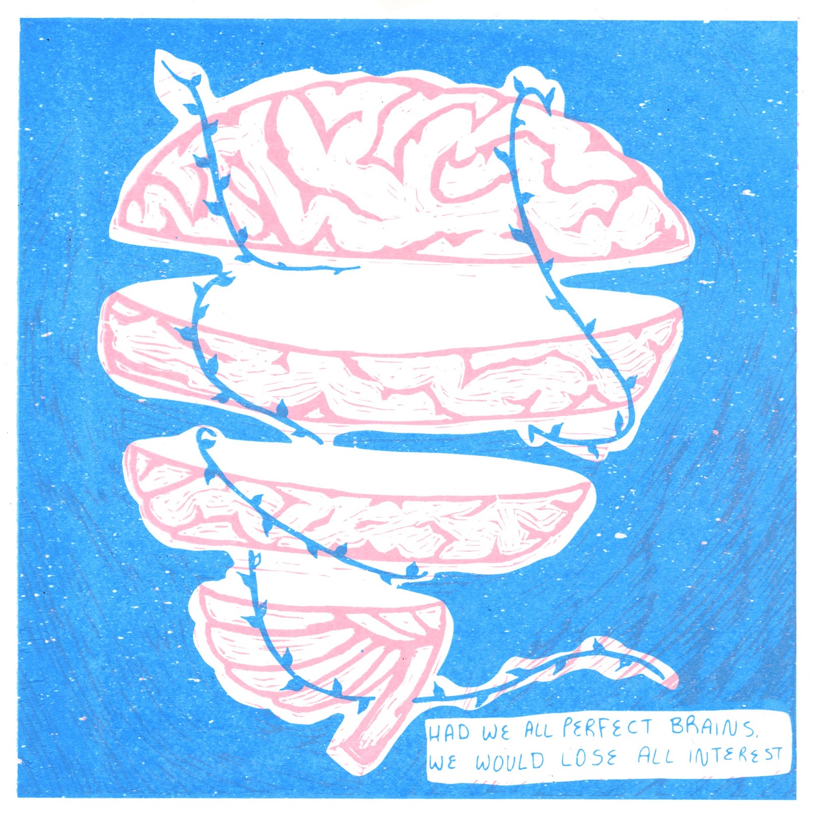
About the Author- Printing stock and interim crit
I printed on three different stocks to decide which background would work best with my colour choice:
- Grey not very clear- not enough contrast
- White builds a strong contrast with inks and negative space, which creates a dynamic composition
- Cream offers a softer, more ethereal tone, which may be more suitable of Yutang's work
White backgrounds:
Cream backgrounds:
Feedback:
- Composition was praised, along with the quality of the lino transferred to screen print
- The cream was slightly more popular than the white stock
- I was concerned about how all five prints were made using the same two colours, but the feedback suggested the same colours throughout worked
- One suggestion was to use a softer grey stock, which is something I need to consider more next time I use traditional print, as I should ensure I collect all the stock I could possibly want use before I start printing

I now need to focus on how to construct my stings, as well as spend more time on my other projects over the Christmas break!
Monday, 5 December 2016
About the Author- Making prints
Today I was able to spend most of the day in the print room, and got my final prints done. Over the weekend, I decided my main concern with them was the colour and quality of the blue, so I decided to change it and use the same screens. I still had some issues with colour and process, but I managed to get some good quality prints that I am fairly happy to use for submission.
Process:
- Made the blue paler and with purple tones through mixing cadmium and cyan, more like my photoshop experiments
- Made more of the pink
- PRINTED
- Realised the pink was far paler than before
- Started again. Again.
- Mixed a more peach toned pink and added more medium to the blue to make it more transparent
- Printed again
What problems did I encounter?
- COLOURS! I kept rushing to get them done and thinking 'it will be fine' rather than spending time really looking at how the colours work together
- Printing close to the edge of the screen meant I got an uneven, watery edge until I rotated the screen
- Remembering to move the codatrace!!
What went well?
- The overprint of the final colours made a strong third colour
- The amount of prints I managed to make was quite substantial
- The ordering of prints- ensuring I used my somerset paper whilst I was making good prints, rather than leave it to last, when the screen might be leaking or excess ink on the table
- I also like the outcome on the cream paper- need to decide which will be my 'final' set
What did I learn?
- To take my time mixing colours to ensure I get the outcome I want- there's no point rushing it and wasting time re printing
- MOVE THE CODATRACE
- Allow enough room around the exposed section of the screen- tape up suction handles if needs be
- Not let one failure stop me from my work flow
Prints from Friday:
Process:
- Made the blue paler and with purple tones through mixing cadmium and cyan, more like my photoshop experiments
- Made more of the pink
- PRINTED
- Realised the pink was far paler than before
- Started again. Again.
- Mixed a more peach toned pink and added more medium to the blue to make it more transparent
- Printed again
What problems did I encounter?
- COLOURS! I kept rushing to get them done and thinking 'it will be fine' rather than spending time really looking at how the colours work together
- Printing close to the edge of the screen meant I got an uneven, watery edge until I rotated the screen
- Remembering to move the codatrace!!
What went well?
- The overprint of the final colours made a strong third colour
- The amount of prints I managed to make was quite substantial
- The ordering of prints- ensuring I used my somerset paper whilst I was making good prints, rather than leave it to last, when the screen might be leaking or excess ink on the table
- I also like the outcome on the cream paper- need to decide which will be my 'final' set
What did I learn?
- To take my time mixing colours to ensure I get the outcome I want- there's no point rushing it and wasting time re printing
- MOVE THE CODATRACE
- Allow enough room around the exposed section of the screen- tape up suction handles if needs be
- Not let one failure stop me from my work flow
 |
| First pink and first blue |
-blue far too cyan and bright, quite like harshness of pink
First Print from today:
 |
| First pink and second blue |
- Pink left over from Friday stands out well against a softer blue
Third print from today:
- Made a more peach toned pink
- Made blue more transparent to ensure a third colour comes through
 |
| Second pink and second blue |
Second prints from today:
- Made more of the pink and printed before realised it's too pale, doesn't stand out against blue
 |
| Third pink and blue |
- Made a more peach toned pink
- Made blue more transparent to ensure a third colour comes through
Sunday, 4 December 2016
About the Author- Study Task 6
PART 1:
It's Nice That sting by Animade
It's Nice That—Animated sting from Animade on Vimeo.
- Sounds add an extra layer of depth and narrative
- The odd, juxtaposed noises in this sting create a very visceral feel of how the letters are being formed, and what they are made of
- Sounds add a presence to the letters, as they have to be separated to add emphasis on the form and meaning
Picnic Sting by Picnic
Picnic Sting from PICNIC* on Vimeo.
- The thing that strikes me most about this is the timing of the sound, as it fits seamlessly with the moving image to create a feel of cause and effect
- The varying pitch and volume also create an interesting and tentative pace, which keeps your attention and ensures the viewer wants to continue watching to see how the animation develops
BAA Sting by Animade
BAA Sting—Baa-corn from Animade on Vimeo.
- Another one by Animade, I love how it uses generic, fairly banal sounds to create an element of relatability in such a fantasised situation
- I would love to use simple, identifiable sounds in my stings to ensure they don't get over complicated but still offer a taste of the real world
PART 2:


Overall I found the creation of these storyboards in response to sound fairly simple to complete, as I focused on quite simple, rhythmic sounds, as that is what I want to focus on for my stings. I did find it a useful exercise on thinking about including sound in the initial planning stages
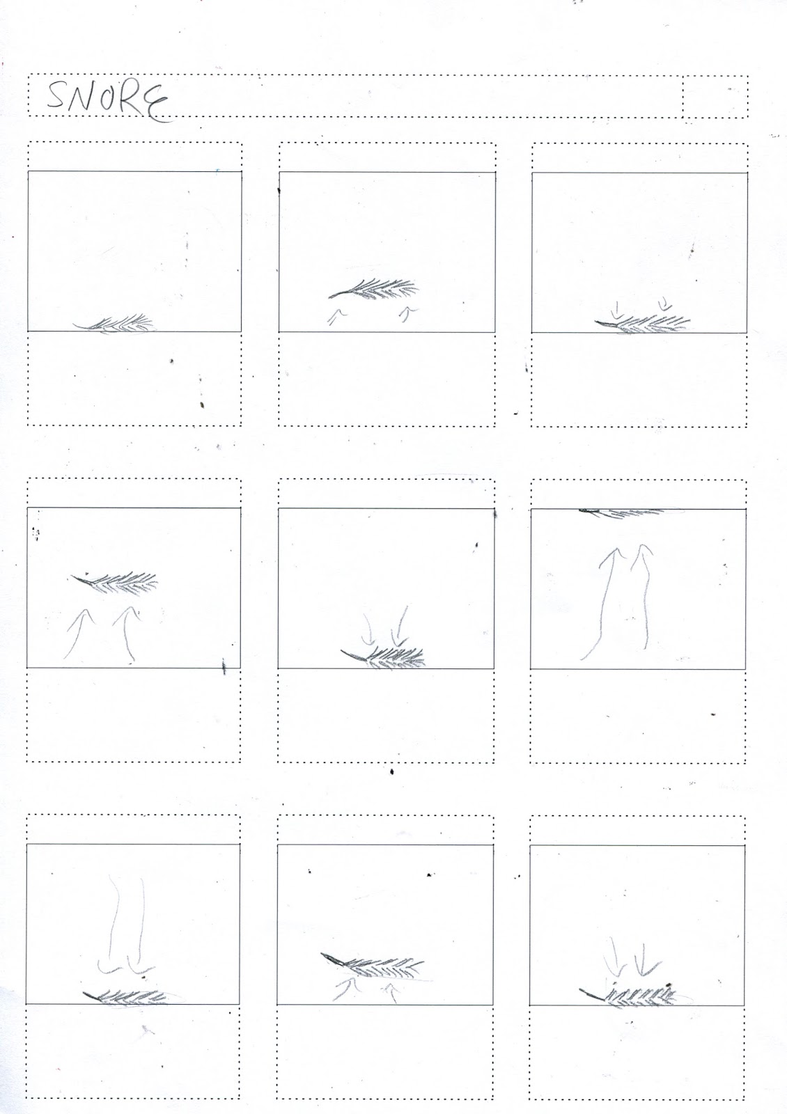
Saturday, 3 December 2016
About the Author- Study Task 5
For this task, I created some quick storyboards in relation to simple words such as 'pop' or 'float', as well as some initial storyboards for my stings, based on my prints

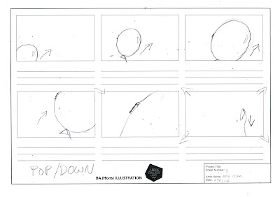


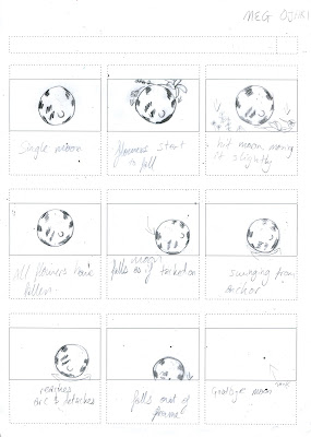

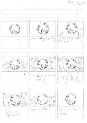
 - Although I've still got a lot of things to finish off before I start making my stings, it was good to get some storyboard practise in when I had support there if I needed it
- I think putting all my ideas down and pushing myself to get varying movements really helped me visualise what my ideas would look like, and therefore which I should develop further


- I found the process of quickly making these simple storyboards really helpful, as it helped me to focus on the important aspect of the movement, rather than trying to cram in a whole story to a short time, where it can often be confusing


- I think putting all my ideas down and pushing myself to get varying movements really helped me visualise what my ideas would look like, and therefore which I should develop further
Friday, 2 December 2016
About the Author- PRINT DISASTERS
I thought I loved traditional print. I was so wrong. Everything that went wrong today could have, and I ended up with a few smudgy, blotchy prints which were the complete wrong colour. Also, the screen I used now has little white bits stuck to it which stop the ink coming through, and I have NO IDEA how that happened. And on top of that, I really don't like the design either!
I talked to Annie, who's also struggling with the print process and I think I just need to forget about it for the weekend, as the more I stress about it, the less motivated I'm going to feel to actually make prints next week.
I talked to Annie, who's also struggling with the print process and I think I just need to forget about it for the weekend, as the more I stress about it, the less motivated I'm going to feel to actually make prints next week.
Thursday, 1 December 2016
About the Author - Development and research
Positives:
- I've had to work really quickly this week in order to get my lino cut and printed before turning them into positives for screen print- this has really been helped by my timetable making
- I also used simple pencil lines and live image trace on illustrator to make the solid colours
- After also investing a lot of time looking at colours, and have come up with a colour scheme I'm really happy with, and reflects the fun yet calm tone of Yutang's work
RESEARCH:
Yutang:
I want to ensure my project is still really reflecting Yutang, so I revisited some of his work. Here are some quotes which helped me to remind what he was about:
- 'The world, I believe, is far too serious'
- 'Where did you find this authority?... in my own heart'
- 'The true motive of travel should be to travel to become lost and unknown... travel to forget'
- 'Paying a compliment well and appropriately is called a beautiful compliment, and on the other hand, paying a compliment with bad taste is called an awkward compliment'
I found this really useful, as although this is a personal response to his work, it still needs to be intrinsically linked to his life and ethos.
Artists:
I really like this linocut print by Andy Johnson, and it really has a quality I want to emulate in my prints.
What does this mean?
- Try to make the most of negative space in my prints
- Really focus on getting cohesive colours
- I would like to try and include some depth in my pictures- and perhaps revisit the rule of three grid to make dynamic images
 |
| Chosen colour scheme |
- I also used simple pencil lines and live image trace on illustrator to make the solid colours
- After also investing a lot of time looking at colours, and have come up with a colour scheme I'm really happy with, and reflects the fun yet calm tone of Yutang's work
RESEARCH:
Yutang:
I want to ensure my project is still really reflecting Yutang, so I revisited some of his work. Here are some quotes which helped me to remind what he was about:
- 'The world, I believe, is far too serious'
- 'Where did you find this authority?... in my own heart'
- 'The true motive of travel should be to travel to become lost and unknown... travel to forget'
- 'Paying a compliment well and appropriately is called a beautiful compliment, and on the other hand, paying a compliment with bad taste is called an awkward compliment'
I found this really useful, as although this is a personal response to his work, it still needs to be intrinsically linked to his life and ethos.
Artists:
 |
| Andy Johnson |
What do I like?
- Use of white as an additional colour- especially with white birds
- Tone of image made using subtle colours
- Perspective and depth of image- huts lead a natural line of sight
What does this mean?
- Try to make the most of negative space in my prints
- Really focus on getting cohesive colours
- I would like to try and include some depth in my pictures- and perhaps revisit the rule of three grid to make dynamic images
Subscribe to:
Comments (Atom)