Process:
- Made the blue paler and with purple tones through mixing cadmium and cyan, more like my photoshop experiments
- Made more of the pink
- PRINTED
- Realised the pink was far paler than before
- Started again. Again.
- Mixed a more peach toned pink and added more medium to the blue to make it more transparent
- Printed again
What problems did I encounter?
- COLOURS! I kept rushing to get them done and thinking 'it will be fine' rather than spending time really looking at how the colours work together
- Printing close to the edge of the screen meant I got an uneven, watery edge until I rotated the screen
- Remembering to move the codatrace!!
What went well?
- The overprint of the final colours made a strong third colour
- The amount of prints I managed to make was quite substantial
- The ordering of prints- ensuring I used my somerset paper whilst I was making good prints, rather than leave it to last, when the screen might be leaking or excess ink on the table
- I also like the outcome on the cream paper- need to decide which will be my 'final' set
What did I learn?
- To take my time mixing colours to ensure I get the outcome I want- there's no point rushing it and wasting time re printing
- MOVE THE CODATRACE
- Allow enough room around the exposed section of the screen- tape up suction handles if needs be
- Not let one failure stop me from my work flow
 |
| First pink and first blue |
-blue far too cyan and bright, quite like harshness of pink
First Print from today:
 |
| First pink and second blue |
- Pink left over from Friday stands out well against a softer blue
Third print from today:
- Made a more peach toned pink
- Made blue more transparent to ensure a third colour comes through
 |
| Second pink and second blue |
Second prints from today:
- Made more of the pink and printed before realised it's too pale, doesn't stand out against blue
 |
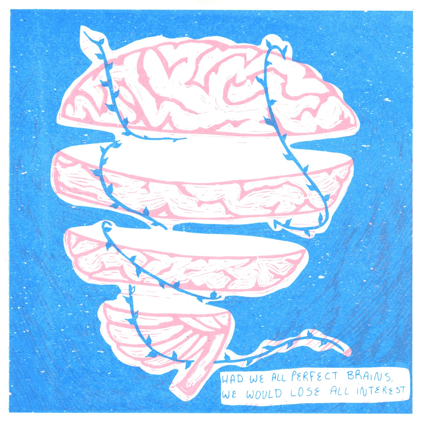
| Third pink and blue |
- Made a more peach toned pink
- Made blue more transparent to ensure a third colour comes through
No comments:
Post a Comment