I have found using pinterest to organise and document inspirational works throughout this project.
It has been really useful to create a digital scrapbook of my inspiration so that I can look back and reassess the direction my work is heading is. I also found it a great way to document colour palettes and print techniques to refer back to.
I've been very conflicted with what I can consider an appropriate audience, as I had always stuck to the fact that men also used cover up creams. However, after doing a lot of social media research, I found that it is in fact only a small percentage of men who do use the camouflage creams, and they didn't tend to mind the current packaging from what I saw. Women on the other hand, are far more inclined to be affected emotionally by having to use the medicinal looking creams. This is most probably due to women typically being more concerned about their facial appearance than men
Also, since this is a proposal for a movement which will highlight the beauty of these skin conditions, I think feminising them through a soft colour palette will be the best way to make them mirror this. Therefore I will focus my range on women primarily, but perhaps make them accessible to men through the use of darker colours in aspects of the packaging.
I have found the packaging from Oliver Bonas really inspirational throughout this project, and as I'm starting to go into the print process, I really want to focus on outcomes in this style, perhaps with this style of colour as well.
I also love the idea of adding in some metallic elements, which Oliver Bonas do in some of their luxury packaged goods.
I am also really looking forward to mocking up my illustrations onto the actual goods, as I think this will be an interesting way to explore the applications of my designs, and how they could work in a real world context.
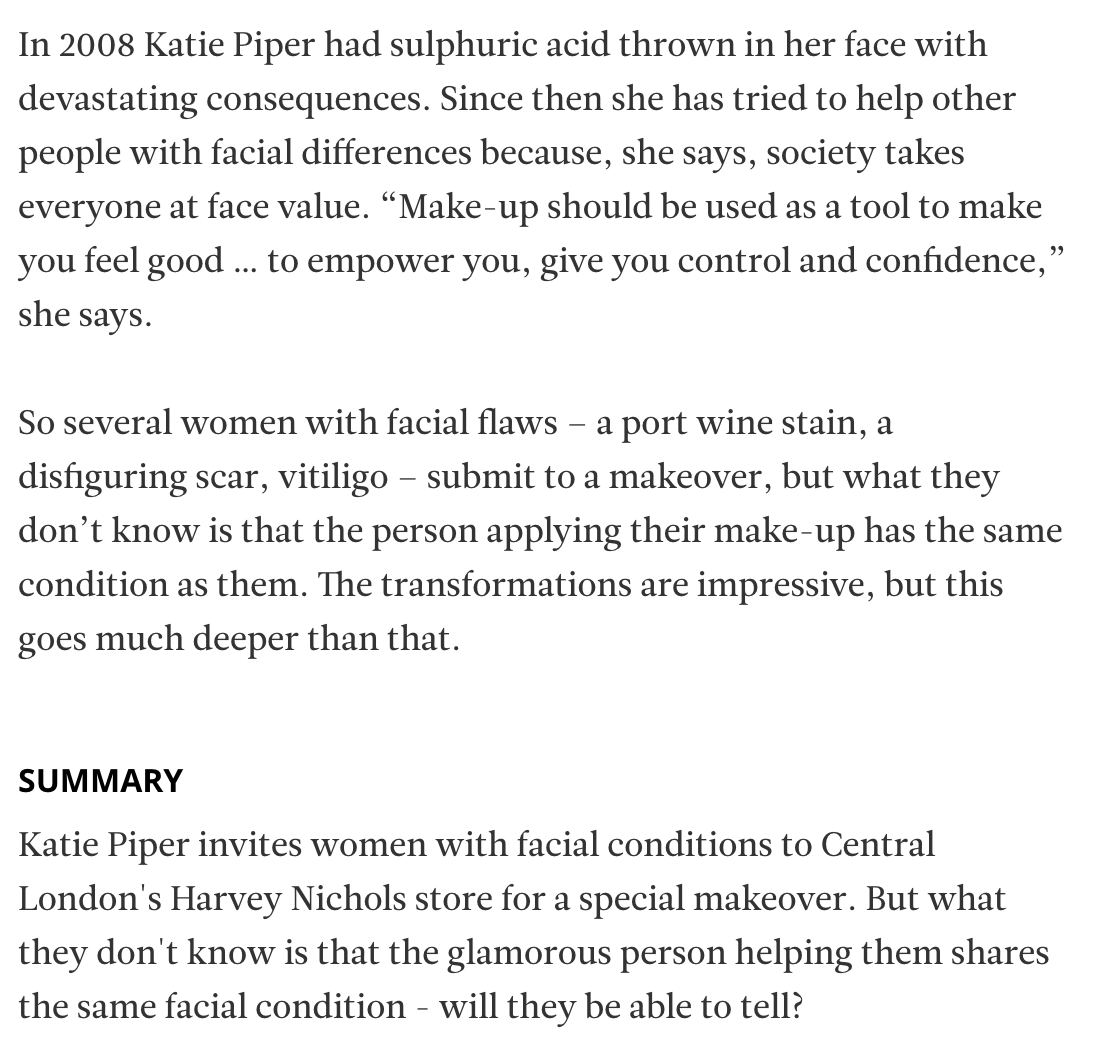
Last night I watched the documentary Katie Piper's Face to Face, where people with visible skin conditions gave make overs to people with the same skin condition.
I thought it was a really interesting, emotional insight into the relationship between skin conditions and make up/cover up creams. BIO:
Notes:
People with melasma, scarring, vitiligo, rosacea and birthmarks take part Vitiligo:
- Make up is friend to call on, but never dependent on
- 'I can put my make up on and embrace myself'
- happy in herself, time to wear makeup?
- 'The biggest part is accepting the reality you have it'
- Discovering new white patches every day
- Used to enhance
- 'I still feel like myself'
- After make-over, talked about how their features are beautiful
- 'Make up is my perfect mask to make me happy'
- Confidence shrinks without make up
- 'you never know what's under someone's clothes or make up
- 'try to love my spots' Port wine stain (birthmark):
- 'I want to look natural'
- 'When I look in the mirror, all I see is my birthmark'
- To avoid people looking and pointing
- 'Do what makes you feel good'
- Versatility of two looks
Rosacea:
- Relapsing condition
- Spots under the skin, pimples, bubbles, purple
- 'Doesn't always have to be about the skin condition'
- All relative
- How it affects your quality of life
- 'It will give me the confidence to succeed'
- Wearing make up will 'give me control'
- 'It's about choice'
Because of this research, I want to ensure I include elements of text concerning emotional wellbeing and confidence within my packaging.
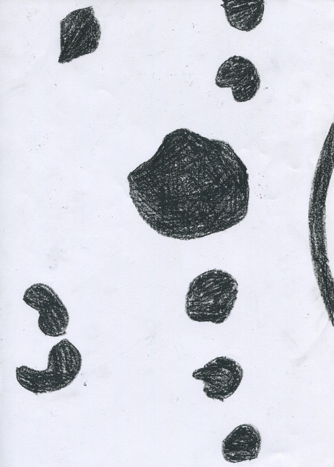
I found the work of Lamai Mccarten by accident online, and I love her use of colour and vague straight lines to show line of sight horizontally across the page.
I also really love her choice of colour palette, which creates a calming, unique effect on the on the audience, I would love to emulate this tone within my work.
I also think the scale of shapes is really important, as the larger, more confident shapes still seem to make room and share space with the small dots higher up.
I stumbled across some relevant secondary research on people with visible skin conditions.
The first was Alba Parejo, a 16 year old girl who was born with a condition meaning she has over 500 birthmarks over her body. The main points I found were:
- She was bullied for a lot of her childhood
- Attempts at removal left her with severe scarring
- Decided to enter a beauty contest and now works as a model
- Is an advocate for body empowerment and positive body images, especially with people with skin conditions
- Believes everyone should embrace their skin and feel proud of their appearance
I also discovered that there is a documentary about skin camouflage presented by Katie Piper on TV next Tuesday, which I will make sure I watch and record the key points to help with development of my work.
Finally, I started looking at individuals who have vitiligo and advocate its beauty, whilst still appreciating the value of skin camouflage to some people.
Khloe Dosh wrote a beautiful poem supporting the use of cover up creams and make up if that's what people wish, as it is their CHOICE and highlights their freedom and beauty
Carlene Aj is a model who has vitiligo, as well as an inspirational positive body message to other people suffering from the skin condition.
- Carlene supports both the natural look of vitiligo as well as the use of cover up creams, as she uses a mix of the two.
- What really struck me about Carlene is that in most of her images, she doesn't make a big deal about wearing or not wearing cover up creams, and simply talks about her life normally, as she should.
- I realised that she regarded her cover up cream just for what is was, a type of make up, and talks about using it just as much as she would for changing her make up.
Finally, I of course had to do some research into Chantelle Brown-Young aka. Winnie Harlow, probably the most prominent vitiligo sufferer in the world, save Michel Jackson.
- Only 22
- Contestant on America's Next Top Model
- Is an activist for body empowerment
- Is open and positive about her vitiligo
- Also supports the use of cover up creams, she wants the person suffering from vitiligo to feel happy
Ted x talk from Winnie covering her life with the condition and how it can affect people
Key points:
- Was bullied and then became the bully to try and fit in to the norm
- Realised beauty is not about what is expected and what is seen as normal
- Found own place to feel beautiful and brave with appearance
- Make your own mold for what beauty is
Young Winnie talking about her condition and the challenges she faces:
Key points:
- People are ignorant of the condition
- People will judge and often be scared of the condition, she wants people to know the truth
- It's ok to ask and learn about skin conditions
- It's not all that makes her, it's just a part of her
Below is a video from Winnie's Instagram, made by Carlene and Khloe to highlight the stigma around using cover up cream instead of embracing the natural beauty of vitiligo
Key points:
- It's ok to use cover up creams if that's your personal choice
- Don't feel like one choice is right and one is wrong
- Do what makes you happy in your appearence
- Cover up creams are just like make up - no big deal!
A post shared by ♔Winnie Harlow♔ (@winnieharlow) on
MY THOUGHTS
- This research actually made me fairly emotional, as it validated the feelings I had of having this condition, and made me realise that there are many beautiful women out there with this condition
- On a personal level, I realised how this condition can be an empowering, beautiful gift
- People need to realise, understand and accept the condition
- Beauty is decided by the individual, and expectations are not to be listened to
WHAT NEXT?
- After thinking about the poem, I really want to make my range feel like a luxury make up range, which is being chosen to be used by the sufferer
- Really celebrate the diversity and uniqueness of the conditions
- Develop an accessible and recognisable range
- I also really want to push the promotional side of the range and include ways to promote the truth behind skin conditions
I have found the use of a physical timetable incredibly useful, as it works for me to see when I have spaces of time, and decide which module I will need to focus on. I have also found it useful to help motivate me to work when I have seen I didn't have much time left!
I think what I need to focus on is allocating specifically which part of the module I will be working on in that time, as just noting I will work on responsive meant I devoted a lot more time to Studio Brief 2 than Studio Brief 1, in which I fell behind. I need to ensure this doesn't happen again.