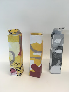
I photocopied a couple of my monoprints and roughly mocked them up into boxes which could hold the camouflage cream.
WHAT DO I LIKE:
- The design flowing over the whole box works well, as it creates a cohesive overall effect
- It was an interesting exercise to see how I need to be considerate of the final outcome, and how this will work in real life context
WHAT DOESN'T WORK:
- I feel like the design is too big to fit onto the box, I need to consider how much will fit onto each side of the box
- The colours are too stark contrast, I need to consider the colour palette carefully
- The line is too thick and takes attention away from the rest of the design
WHAT NEXT:
- Be considerate about the sizing of my illustrations, and how appropriate they will be in context
- Still remember that the illustrations are the most important part, and the applications are secondary


No comments:
Post a Comment