Wednesday, 16 May 2018

End of Module Evaluation

This year, I really needed to focus on my work life balance, as I have struggled a lot with stress and my mental well-being last year. In order to ensure I looked after myself, I strictly timetabled myself to tasks, and set short deadlines so that I was able to take breaks when I needed to, and wasn’t overworked when I had more projects to complete. I really enjoyed my 505 module, and was keen to look into both pattern and packaging again this year, through selecting items to brand and package. However, I overestimated my skills in branding, and this put me off tackling this initially. Also, during the first semester, I devoted a lot of my time to my Context of Practice module, and let my practice take a back seat. However, I did still complete some small briefs during this time, and I think it was beneficial to me to take a break from my extended practice and really focus on my packaging work within Context of Practice. As a result, in January I had a small foundation of work to build from, and I felt refreshed and enthused.

During Context of Practice I learnt a lot about who I want to be as a practitioner, and decided I really wanted to focus on ethical design and helping to reduce waste, which carried forward into my final ‘WonKy’ project. The main things I have learnt this year have come from feedback sessions with tutors and peers, which has been really useful to me. I often put a lot of pressure on myself to finish everything off perfectly, and will push myself further than I should to ensure I do this. However, I have learnt to embrace the imperfections in my work, and regard them as the character behind it, which actually makes the piece more fun. Also, after my Art Fund collaboration project, I finally listened to my tutor’s advice and have made sure I say no to people when I don’t think I can complete the task, or if it won’t further my portfolio. This has alleviated a lot of pressure on me.

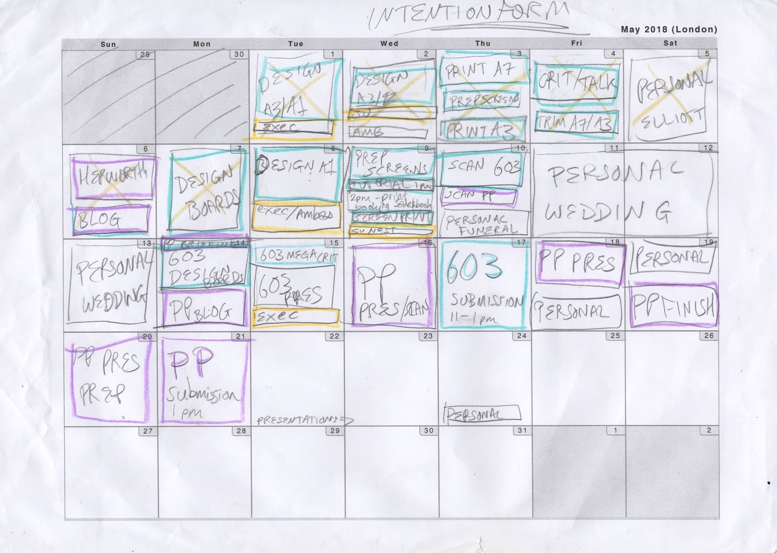
One of the aspects I have enjoyed the most this year was my final ‘WonKy’ project, as I felt the idea perfectly summed up what I want my practice to be about. Also, due to thorough research into primary resources and other practitioners, I was successful in making sustainability more attractive and accessible. I also really enjoyed all the intricacies in my practice from this project, just small things such as preferring the cut paper lines when the blade is slightly blunt, or trusting my intuition in image making. I feel that these are valuable insights I have identified, which will help me with the progression of my work. Another project I loved was my Student President Campaign, as although it felt nerve-wracking to put my work out to my peers, promoting myself, I was really proud of what I produced. I enjoyed transferring imagery across different media quickly. Since I had effectively timetabled my time, I had enough of a cushion to nip into the print room and make more propaganda, without effecting my other studies.

Something I struggled with was communication within my first collaborative project. However, I learnt from it, and in my packaging collaboration, I was able to effectively use what I had learnt to clarify from the outset what I could make, and what my partner wanted. Then I was able to use my transferrable skills from second year to quickly make repeat patterns, and easily feedback between the two of us. I also struggled near the end of the semester with my mental well-being, due to personal reasons. However, after reflection, I really applied my ‘imperfect’ mantra and weighed up the pressure of re-doing prints, and taking a break, and I decided to rest and visit my niece, and I restarted happy with what I had. One of the first things I struggled with was trying to interpret pattern as image. However, I realised I was approaching it the wrong way. Instead of trying to make patterns simply inspired by my stimuli, I depicted my intent, and created elements of pattern making alongside. I still have a way to go with refining this process, but I’m happy with it at the moment.

After I have finished this module, since I will be staying working in the university, I would like to continue my Extended Practice into fun, self directed briefs to fit in alongside my employment. I’m really relieved that I won’t have to stress about getting money from my practice to fund my living costs, and hopefully I will be able to build up a small freelance presence over the next year, which I can expand on after my term finishes, which will continue to build my confidence in my practice. Overall, I feel that I have created a really strong process of paper cutting, Photoshopping and screen printing, which I am happy with right now. I just want to keep working on addressing issues which are close to my heart, and that I think can make a real difference.

DESIGN BOARDS

WONKY:


PACKAGING COLLABORATION:


EESTI PROJECT:


STUDENT PRESIDENT CAMPAIGN:


ART FUND COLLABORATION:


SMALL BRIEFS:


Updated Statement of Intent


Tuesday, 15 May 2018

500 Word evaluations


FINAL mega crit

I'm really pleased with the feedback I got at the final crit, I think my work has payed off in the final results. 

Some people said they liked my work hidden in my sketchbook which was interesting, as I find that something I'm not that proud of, and is just visual thinking.

Pattern making and colour mentioned, which are big passions of mine

Scale was also something that people commented on, and I would really love to continue playing with application to scale and how this can influence tone


Submission folder

Normally I would make folders and boxes for my presentation of my work, but in my COP feedback, it was noted that I want to run a sustainable practice, so making extra boxes and folders was quite wasteful.

I really wanted to do something simple this time, so just stuck to clips and mount board, which I already had and can easily be re-used, and I think it looks really smart.

Monday, 14 May 2018

WonKy- Mockups

I thought I would quickly try some mock-ups to see how my prints could work as a practical outcome.

Here are examples of them applied to the existing wonky produce at Morrisons.

I think it was interesting to see how they work as part of a campaign, but I don't think this is really a necessity for this project, as I'm happy with just having the prints as the final outcomes.


Friday, 11 May 2018

Timetables

I've found using physical timetables the most useful way for me to organise my time, as I like being able to see it all in front of my laid out


Thursday, 10 May 2018

WONKY- Final prints

WOOHOO!

Finished my final prints for my wonky project, and I'm really pleased with them!


A3 prints
A1 Print

A7 Prints

Test layout
POSITIVES:
- Following the observations from Josef Frank, I've been able to use the colour to draw attention to different areas, and make a dynamic composition
- The colour choice was very bold and strong, I'm really in love with the colours I chose, and think they embody me as a practitioner
- The prints really show off my aim of making evident the beauty in wonky produce
- We Are Out Of Office and Match Bloc really influenced me in the composition and colour management- keep an eye out for different practitioners I like

NEGATIVES:
- The background of the A1 print is slightly patchy, from using the big arm in the print room, but I was getting used to it by the end, and the slight imperfections add to the character of the piece
- Could have blown up the small bean print to make the A3 more viceral
- Could have included elements of pattern making- look into this before show?

OVERALL:
- Really pleased that they show the diversity and beauty of the wonky produce
- So much fun playing with processes, and feel like I've found the one which really suits me
- Loved experimenting with scale, and how this effects images

Postcard entry

I decided to put one of my small A7 images as my postcard design:

REFLECTIONS:
- Bold and bright- just what I want to show from my practice
- Scaling up small images shows the intricacies that I want, through the paper cut lines, whilst not being too busy
- The colours are just what I want to show for my practice
- Happy with the flow and placement of image in the page
- Really happy with this submission, as I hope it's something that people will keep as a print from the show

Wednesday, 9 May 2018

WONKY- Reflections

LOOK AT THEM

Matt brought it to my attention how I subconsciously alter compositions when recreating:

A7 on left, vs A3 on right


-The main differences are the bold ness of composition- don't be afraid to follow the space and movement, these beans are massive and wiggly that's fine
- Should have paid closer attention to the real estate the beans took up, don't leave spaces unnecessarily
- All about the character, the visual differences take some of that away and leave spaces of yellow

WONKY- A1 print

After talk with Matt, I wanted to make my squashy beef tomato really true to the initial drawing

AIMS:
- Make the shapes more loose, characterful, viceral
- Stop letting the size dictate my blade usage
- Stop over complicating it
- Only have 40 mins to fix it

OUTCOMES:
- Scanned in A7 and blew it up, them tidied it up with paintbrush
- Happy with the overlap, the messiness and the free shapes
- Nervous about printing this!

REFLECTIONS:
- Don't refine things too much, they loose their 'soul'
- Just go with it- if it successful then don't try and tidy unnecessarily

Initial A1 paper cut 


Initial A1 colour scan for printing


A7 scanned in at high dpi

A7 turned into A1 through photoshop for positives


Tutorial four

NOTES:

- What makes a successful image- composition, be bold
- Remember I can revisit after hand in
- Who am I? - what speaks in my work?
- NOW- spend 40 mins faffing with tomato print- blow up A7?
- Quality of A7 tomato is that it's  a squashy beef tomato- don't loose that through refinement
- It's ok to just 'get it done' in time left, look after my mental wellbeing
- Quality of line and immediacy- about communication not perfection
- Embrace the imperfect, 'wonky' produce is imperfect anyway
- Don't worry about applications- let them stand as they are- write haikus under?
- HAVE FUN
- Be honest about work and realistic- enjoy

Tuesday, 8 May 2018

Collaboration mock ups

My collaborative partner sent over the mock ups she has been working on and I'm really pleased with them!

I really learnt so much from this project, and has rejuvenated my love for collaborative projects, and I'm keen to undertake more soon.


EVALUATION FOUR

Self Portrait

I thought about creating a new self portrait, like from the start of the year. I exposed a screen to screenprint them. But then I realised that wasn't 'me'.

So I started again.

I took this really simple imagery from the prints I did around my Estonian heritage, and it felt like a good 'fit'. It was a bit of a risk to do something so simple, but I think it shows more of my practice and who I am.

I need to keep remembering to be true to my self within every piece I make.

INITIAL:


FINAL:


Monday, 7 May 2018

WONKY- A1 development

REINVENT IT

I asked 6 people, from different backgrounds, artistic and not, which were their favourite of my A7 prints, so that I could pick the most successful

WHAT DO I THINK?
- Carrots in ground- work well compositionally, but a bit basic- be bold and different
- Need to get this done by Wednesday print session- be realistic
- Initially discounted tomato because of amount of colours- this is my final project- LET'S DO IT

WHAT NEXT:
- Even if the large scale print doesn't work- I still want to try it and see what happens- I'll learn a lot either way
- Paper cut tomato
Carrots in ground rough

Tomato rough
ROUGHING:
- I think I've developed my relationship with roughs- They don't have to be tiny pencil sketches- These are A3 and colourful, but still took minimal amounts of time to produce- there's no right or wrong way, just my way!

Saturday, 5 May 2018

Packaging collaboration repeat pattern

INITIAL DESIGNS:


I sent these to my collaborative partner as a test to see if they were what she wanted. I'm glad I did this, as they were rough versions, which meant I didn't spend lots of time before knowing if it was what she wanted. She told me a few things she wanted changing but was overall happy with them.


ISSUES:
- Too linear in the repeat
- Orange needs to be more orange, but still contrast with the carrot
- Too busy on the apple print

RESOLVES:
- Made a bigger repeat block to allow more fluid movement
- Changed hues on just the orange and carrot
- Taken out the green apple slice


FINAL DESIGNS:


POSITIVES:
- Flowing pattern which create a harmonious composition across the design
- The technique I learnt in second year about how to make a repeat pattern was really useful and made the process easy
- I like the aesthetic of the outcome, and think the papercut effect was definitely the right decision

NEGATIVES:
- My partner had a few issues with putting the tiles together, meaning I had to revisit them a few times to tidy up the edges, I think this was due to how it was saved as a png, but I need to make sure I resolve this so that I don't have to keep re editing things, as I imagine this can be frustrating for my partner!
- The colours could have been altered slightly. My partner said she was happy with them so I didn't edit them further, but the mint and lemon could have been brighter


OVERALL COLLABORATION:
- Really enjoyed this collaboration- I think it was due to being honest with each other about what we were expecting, being realistic with time frames, and not being afraid to ask for changes and communicate what the issues were
- I think both our communications were very strong, and we worked well together by reacting quickly to each others emails and messages
- By being prepared from the start to say no, I made sure I didn't get overwhelmed in the work I was creating and resent the project
- Really taught me a lot about communication and time management.
- Need to ensure my files are professionally finished- my partner was very nice about it and accommodating, but I need to ensure in the future everything is sent perfectly the first time I send finals

Friday, 4 May 2018

WONKY- A7 and A3 printing

I managed to get my 20 A7 and 2 A3 prints done in one day, which I'm really pleased with!

'BE BOLD'- advice from my course mate- just be confident, and my work will be confident as a result


REFLECTIONS:
- Good time management meant I wasn't stressing to get them done, as had a day 'cushion' if I didn't get them done, but still had plenty of time on the day
- Mix of colours is really bold, and not what I would normally choose, but I think they reflect the idea of my project- embracing the imperfect and diversity
- I'm so proud of myself for getting all of these prints done so quickly- I think my investment of time in the print room has paid off

NEXT:
- Revisit A1- make this really strong!
- Get feedback on current prints


Positives for one A3


Midway through printing


Layout to test EOYS outcome