WOOHOO!
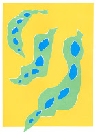
Finished my final prints for my wonky project, and I'm really pleased with them!
A3 prints
 |
| A1 Print |
 |
| A7 Prints |
 |
| Test layout |
- Following the observations from Josef Frank, I've been able to use the colour to draw attention to different areas, and make a dynamic composition
- The colour choice was very bold and strong, I'm really in love with the colours I chose, and think they embody me as a practitioner
- The prints really show off my aim of making evident the beauty in wonky produce
- We Are Out Of Office and Match Bloc really influenced me in the composition and colour management- keep an eye out for different practitioners I like
NEGATIVES:
- The background of the A1 print is slightly patchy, from using the big arm in the print room, but I was getting used to it by the end, and the slight imperfections add to the character of the piece
- Could have blown up the small bean print to make the A3 more viceral
- Could have included elements of pattern making- look into this before show?
OVERALL:
- Really pleased that they show the diversity and beauty of the wonky produce
- So much fun playing with processes, and feel like I've found the one which really suits me
- Loved experimenting with scale, and how this effects images


No comments:
Post a Comment