Saturday, 31 March 2018
Thursday, 29 March 2018
Jades Hen
I got asked to make a poster for a friend's hen party, which included all the guests.
I was quite nervous about undertaking this, as it would be seen by a lot of my friends, and was specifically about drawing people.
However, I had gained a lot of confidence in my YCN collab, and so this only took me a few hours.
WHAT WENT WELL?
- Like how free I was, didn't feel like everything had to be literal
-The colours are quite diverse and eye catching, whilst still having an accessible palette
- Like how I took the hair to be the only recognisable factor, meaning I could quickly make this
WHAT COULD BE IMPROVED?
- Invest more time into the face shapes and features for future
- More funky legs
- Background colour may be a bit washed out
WHAT NEXT?
- Keep drawing people
- Do things for fun and don't stress
 |
| Roughs |

YCN submission
We ended up with a set of four posters that answer the YCN Art Fund Brief, which I think we are both happy with.
STRUGGLES:
- Getting the entire range done, as some of the ideas I intended to illustrate I really struggled with, so I dropped two of the designs. I would have liked to go back to them, but I ran out of time near the end
- I think it would have been useful to get a really clear idea of what we both wanted from the start, as I think there was slight crossed wires which meant we had to do more work near the end to fit them together, rather than just work towards it from the start
- Drawing people was something I struggled with, but I did really enjoy in the end
POSITIVES:
- This project has really improved my confidence in illustrating characters and people
- It has really improved my communication skills and working alongside another designer
- It's been an interesting experience looking at how to promote an idea within a campaign
NEXT STEPS:
- Continue working with characters, especially within my observational drawing sketchbook
- Think about how to work on live competitions and get my work into the professional world
Friday, 23 March 2018
More badges
For Print Stuff I screen printed a lot more badges.
This was the first time I had bought a large piece of wood and printed them all in one go, so it took a lot less time than before, and the registration was far easier.
It was interesting testing this method of printing onto wood, especially using the screen print beds rather than the hand ones.
I then used the bandsaw in woodwork to cut them all down
I'm really proud of how quickly I did these processes, and I'm pleased with the outcomes! I've ended up with a lot of badges and a lot more confidence in working with different media.

Thursday, 22 March 2018
YCN Art Fund collaborative layout
I got sent some rough layouts today from my collaboration partner, which included the content of the type.
After looking at the guidelines, I spent a little time playing around with the size, colour and positioning of the type.
I sent these back to my partner as a potential way to push the ideology that Art Fund want to show.
I'm really happy with the current images now, and I'd really like to see how they all function as a set.
 |
| Initial design recieved |
 |
| Adjusted design |
Tuesday, 20 March 2018
Paper Gang Submission
My housemate sent me a link to the Paper Gang competition to design a gift box for their company.
I was a bit anxious to enter this, as it had to be posted on Instagram to enter, and that was quite a scary thought for me.
CONCEPT:
- Their target audience was young women, and since this would be sent out without them seeing it, I wanted it to be accessible to all, and encompass an upbeat vibe
- I wanted the range to be cohesive, but different through the layout. I also wanted the card to be something which wasn't necessarily for an occasion, and more for an everyday greetings card
PROCESS:
- I papercut some floral shapes, before using china marker to add texture.
- I then scanned them in and used the magic wand tool to make them flat colour shapes.
- I then played around with composition within photoshop until I was happy with it
POSITIVES
- Fun working really quickly to create a professional looking outcome
- I think the mix of abstract and more literal shapes works well to add character to the design
NEGATIVES:
- After submitting it I thought the colours could be brighter, as they are a spring palette, but the box wouldn't be sent out until October
- I could have maybe been more playful with the placement of the shapes, and made them more like an illustration than a pattern


Friday, 16 March 2018
MEGA CRIT
This was a good opportunity for me to gather some feedback on my practice as it currently is:
KEY FEEDBACK:
- Paper-cut images successful, and feel very personal
- Pattern making a strength- build this into figurative images
- Colour schemes are strong
- Playful and fun
- Where could they be pushed? More applicable outcomes?
WHAT NEXT?
- Continue using paper cutting as a process
- Think carefully about colour usage
- HAVE FUN

Eesti Prints
Today we had a talk from Adam Higton, which was really inspirational. The key things I took away from his work are:


- Try different media- it'll be a fun learning experience to try and make it work in different ways, and is the best way to achieve unique work
- Have FUN, there's no point in trying to be an illustrator if you're not enjoying what you're making
- Surround yourself with other creative, inspiring people
- I really like his confidence in creating work, he does it because he wants to, and having others like it is almost a bonus
- I like how he merges things he loves, such as music and illustration- I want to do that in a project I'm really passionate about
Adam then stayed to critique our work:
In order to carry on my work of small scale items from my president campaign but with more integral meaning, I made a set of 12 mini screenprints based on my grandma and her Estonian heritage.
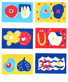

POSITIVES:
- Good tactile size- Adam said it was a strong concept to have them as more 'items' than traditional prints
- The colours work really well to show the Estonian theme, and have loosened up my thoughts about colour usage
- The use of negative space helps to make the composition flow across the print, and ties the single images together
NEGATIVES:
- Is some of the imagery too ambiguous?
- I think the type one didn't work well as it doesn't fit with the rest, and is still obvious what it is
WHAT NEXT:
- Continue to research scale within works, and how this can be applied to real life situations
- Try and push these into a bigger project?
- Think about composition within the prints- could they be in a scene rather than floating?


- Try different media- it'll be a fun learning experience to try and make it work in different ways, and is the best way to achieve unique work
- Have FUN, there's no point in trying to be an illustrator if you're not enjoying what you're making
- Surround yourself with other creative, inspiring people
- I really like his confidence in creating work, he does it because he wants to, and having others like it is almost a bonus
- I like how he merges things he loves, such as music and illustration- I want to do that in a project I'm really passionate about
Adam then stayed to critique our work:
 |
| Campaign work |
In order to carry on my work of small scale items from my president campaign but with more integral meaning, I made a set of 12 mini screenprints based on my grandma and her Estonian heritage.


POSITIVES:
- Good tactile size- Adam said it was a strong concept to have them as more 'items' than traditional prints
- The colours work really well to show the Estonian theme, and have loosened up my thoughts about colour usage
- The use of negative space helps to make the composition flow across the print, and ties the single images together
NEGATIVES:
- Is some of the imagery too ambiguous?
- I think the type one didn't work well as it doesn't fit with the rest, and is still obvious what it is
WHAT NEXT:
- Continue to research scale within works, and how this can be applied to real life situations
- Try and push these into a bigger project?
- Think about composition within the prints- could they be in a scene rather than floating?
Thursday, 15 March 2018
YCN Collaboration
After talking to my collaborative partner, we decided it would be better if the images were more flat colour rather than paper cut scans.
I used the magic wand tool to change the look of the illustrations and sent them on to my partner to incorporate the text.


I used the magic wand tool to change the look of the illustrations and sent them on to my partner to incorporate the text.


Wednesday, 14 March 2018
Eesti project
After my tutorial with Matt, I wanted to work on a project which is more personal and reflects the work I want to be making
I was inspired by the work featured on the Match Bloc instagram page:


MY WORK
I papercut these designs based on my Estonian heritage and my grandma. I thought of the things which had been important to my grandma, and what defined her life.
WHAT'S WORKING?
- The colours have had a lot of positive feedback, and as they're different to what I normally do I'm pleased they are received well
- I like the instinctive cutting of the paper, as Matt encouraged me to follow my intuition, which is really working for me
- I really like the elements of pattern making in some of the designs
- The abstraction of the imagery works to make the designs more inviting and intriguing to the audience
WHAT NEXT?
- Develop these into screen prints
- Continue to look into new ways to explore simple imagery and create successful compositions
- Think about the purpose, how can these be used in a real life context?
I was inspired by the work featured on the Match Bloc instagram page:


WHAT DO I LIKE?
- Use of negative space is an effective way to create form without adding extra colours
- The fun, loose and characterful imagery makes effective and accessible designs
- Full bleed images with a white crop really contain a strong retro Eastern European feel
- Really love the print quality and how it offers a tangible, small outcome
MY WORK
I papercut these designs based on my Estonian heritage and my grandma. I thought of the things which had been important to my grandma, and what defined her life.
WHAT'S WORKING?
- The colours have had a lot of positive feedback, and as they're different to what I normally do I'm pleased they are received well
- I like the instinctive cutting of the paper, as Matt encouraged me to follow my intuition, which is really working for me
- I really like the elements of pattern making in some of the designs
- The abstraction of the imagery works to make the designs more inviting and intriguing to the audience
WHAT NEXT?
- Develop these into screen prints
- Continue to look into new ways to explore simple imagery and create successful compositions
- Think about the purpose, how can these be used in a real life context?
 |
| Initial sketches |
 |
| Like this simplicity |
 |
| Papercut |
 |
| Papercut |
 |
| Photoshop document preparing for screen print |
Saturday, 10 March 2018
ARTIST RESEARCH- Kristin Texeira
Paintings:


WHAT DO I LIKE?
- The flowing compositions create seamless lines of sight across the whole image
- Straight and curved lines juxtapose to create an intriguing movement
- Addition of text is nice character and adds personal touch
- Natural colour palette ensures the pieces are accessible and muted
HOW DOES THIS INFLUENCE ME?
- Contrast of paper colour and striking colours could be a way for me to make the image jump off the page and contain a lot of energy
- Adding text could help me create more meaningful works
- Use of paint would expand my toolkit and ability to create visually different outcomes
- Seamless fit of shapes would help me explore form and pattern
Thursday, 8 March 2018
YCN Collaboration papercut
For my collaborative project I created these papercut illustrations.
I'm relatively happy with them, although I feel that I could somehow tie the shapes together more.
I've sent them over to my partner to see what she thinks, although since it's one of my first attempts and depicting people I'm happy with the outcome.


I'm relatively happy with them, although I feel that I could somehow tie the shapes together more.
I've sent them over to my partner to see what she thinks, although since it's one of my first attempts and depicting people I'm happy with the outcome.


Wednesday, 7 March 2018
Tutorial one
This was a good reference starting point for the 'meat' of my projects, I feel like I'm well prepared and enthused to really focus on this module now
MAIN POINTS:
- What am I trying to solve? Landfill? Waste? Environment?
- Think about purpose and function, tangible and interactive
- Think about content- what am I illustrating?
- Craft is a big part- play on this and invest time into the crafting

I also talked to Matt about Camille Walala:


MAIN POINTS:
- What am I trying to solve? Landfill? Waste? Environment?
- Think about purpose and function, tangible and interactive
- Think about content- what am I illustrating?
- Craft is a big part- play on this and invest time into the crafting

I also talked to Matt about Camille Walala:
OBSERVATIONS:
- Retro yet contemporary vibes through the use of colour and thick lines
- Able to imbue context and ideas through the application of pattern
- Strong and confident compositions give strength to work
- Colours are muted yet bright, and definitely capture the attention of the audience
Crafting cards
I made a few greetings cards for friends and family members, based on my initial self portrait.
It was a really quick process, but it was fun for me to see how I could push imagery to create new outcomes.
These aren't really viable for me to make and sell, but it was still a fun learning experience.

It was a really quick process, but it was fun for me to see how I could push imagery to create new outcomes.
These aren't really viable for me to make and sell, but it was still a fun learning experience.

Tuesday, 6 March 2018
Planning
I've found list making really useful during this module, as with so many briefs going on, it's been a good way to stay on top of my tasks, and ensure I have enough time left for my chosen briefs
I think the act of hand writing out my tasks and crossing them out is a good way of me to metally record what I need to do/have done

Monday, 5 March 2018
Campaign
As part of my campaign for Student President, I created a cohesive brand which I could apply to different promotional goods.
DIFFICULTIES:
- I based my identity on my campaign from last year - "shape your uni" However, just days before, NSS released their campaign also named 'shape your uni', so I had to drop that aspect and just stick with the visuals
- It was difficult to know where to stop, and what would actually make a difference
SUCCESSES:
- I'm really pleased with how the clean shapes ensured a cohesive, recognisable outcome
- It was a good idea to give brooches which didn't overtly say 'vote Meg' and just include info on the back, as this encouraged people to wear them
- I gave away around 100 badges and 100 limited edition prints, and made over 30 posters, I'm really happy with the quantity I managed to produce
- I was really overwhelmed with the response I got, I felt proud that people actually wanted to interact with and own something I made
- I asked for help from one of my friends on Graphic Design to put my poster together. This was a really good decision so that I got a bit of a break
OVERALL:
- Really pleased with the overall outcomes, and it's taught me a lot about how to run a campaign
- I've had a lot of fun, and this whole experience has really boosted my confidence in my work and my public speaking
 |
| Roughs |
 |
| Still from a video, featuring screenprinted t-shirt |
 |
| Collaboration with Graphic Designer |
 |
| Screen printed posters |
 |
| Screen printed wooden brooches |
 |
| Mini screen prints |
Subscribe to:
Comments (Atom)