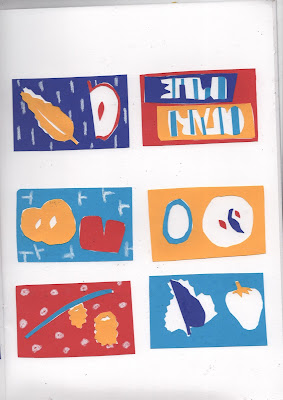
I was inspired by the work featured on the Match Bloc instagram page:
WHAT DO I LIKE?
- Use of negative space is an effective way to create form without adding extra colours
- The fun, loose and characterful imagery makes effective and accessible designs
- Full bleed images with a white crop really contain a strong retro Eastern European feel
- Really love the print quality and how it offers a tangible, small outcome
MY WORK
I papercut these designs based on my Estonian heritage and my grandma. I thought of the things which had been important to my grandma, and what defined her life.
WHAT'S WORKING?
- The colours have had a lot of positive feedback, and as they're different to what I normally do I'm pleased they are received well
- I like the instinctive cutting of the paper, as Matt encouraged me to follow my intuition, which is really working for me
- I really like the elements of pattern making in some of the designs
- The abstraction of the imagery works to make the designs more inviting and intriguing to the audience
WHAT NEXT?
- Develop these into screen prints
- Continue to look into new ways to explore simple imagery and create successful compositions
- Think about the purpose, how can these be used in a real life context?
 |
| Initial sketches |
 |
| Like this simplicity |
 |
| Papercut |
 |
| Papercut |
 |
| Photoshop document preparing for screen print |


No comments:
Post a Comment