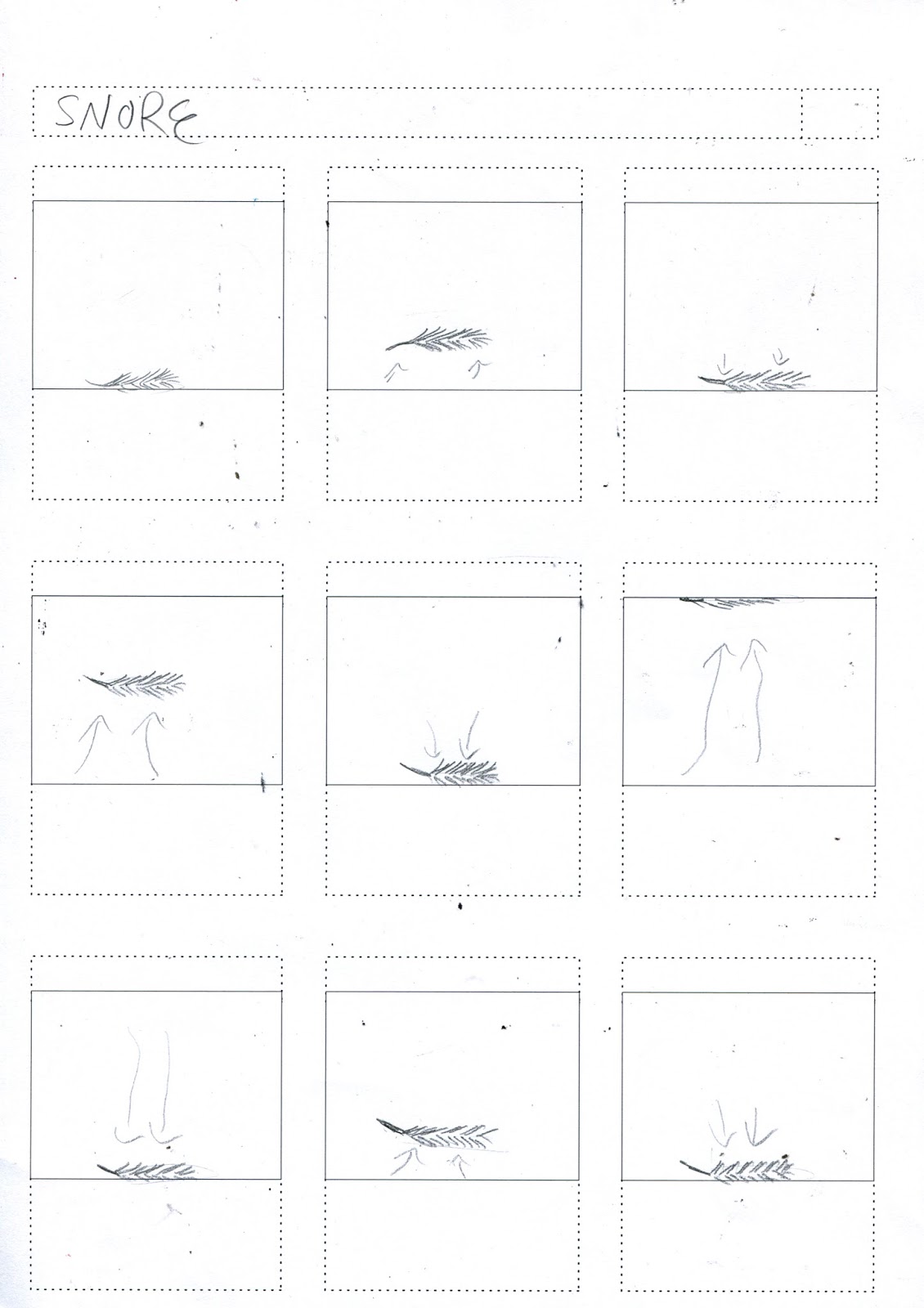
Test one:
Lin Yutang test 1 from Megan Ojari on Vimeo.
What did I learn?
- Too much movement, makes it very jumpy- smoother movement would improve it
- Background lines are too thick and hectic and distract from the actual movement- flat colour?
- Needs improved pace to make the images float more and appear less rigid
Test two:
Lin Yutang test from Megan Ojari on Vimeo.
What did I learn?
- Pace has a lot to do with feel- slower is more mystical
- Glitch when hitting moon, I need to invest time in the mechanics of movement to ensure I understand them and can manipulate them well
- About format and scale- I need to ensure I plan my stings format thoroughly before I start making
Test three:
Lin Yutang test 2 from Megan Ojari on Vimeo.
What did I learn?
- How to layer photoshop files and import them correctly so that I can alter individual elements in after effects
- The mixing of different effects to make certain outcomes, such as opacity and toggle hold
- I need to make sure I spend a long time creating a specific psd file before starting to work in After Effects
Friday, 30 December 2016
Saturday, 10 December 2016
About the Author- Printing stock and interim crit
I printed on three different stocks to decide which background would work best with my colour choice:
- Grey not very clear- not enough contrast
- White builds a strong contrast with inks and negative space, which creates a dynamic composition
- Cream offers a softer, more ethereal tone, which may be more suitable of Yutang's work
White backgrounds:
Cream backgrounds:
Feedback:
- Composition was praised, along with the quality of the lino transferred to screen print
- The cream was slightly more popular than the white stock
- I was concerned about how all five prints were made using the same two colours, but the feedback suggested the same colours throughout worked
- One suggestion was to use a softer grey stock, which is something I need to consider more next time I use traditional print, as I should ensure I collect all the stock I could possibly want use before I start printing

I now need to focus on how to construct my stings, as well as spend more time on my other projects over the Christmas break!
Monday, 5 December 2016
About the Author- Making prints
Today I was able to spend most of the day in the print room, and got my final prints done. Over the weekend, I decided my main concern with them was the colour and quality of the blue, so I decided to change it and use the same screens. I still had some issues with colour and process, but I managed to get some good quality prints that I am fairly happy to use for submission.
Process:
- Made the blue paler and with purple tones through mixing cadmium and cyan, more like my photoshop experiments
- Made more of the pink
- PRINTED
- Realised the pink was far paler than before
- Started again. Again.
- Mixed a more peach toned pink and added more medium to the blue to make it more transparent
- Printed again
What problems did I encounter?
- COLOURS! I kept rushing to get them done and thinking 'it will be fine' rather than spending time really looking at how the colours work together
- Printing close to the edge of the screen meant I got an uneven, watery edge until I rotated the screen
- Remembering to move the codatrace!!
What went well?
- The overprint of the final colours made a strong third colour
- The amount of prints I managed to make was quite substantial
- The ordering of prints- ensuring I used my somerset paper whilst I was making good prints, rather than leave it to last, when the screen might be leaking or excess ink on the table
- I also like the outcome on the cream paper- need to decide which will be my 'final' set
What did I learn?
- To take my time mixing colours to ensure I get the outcome I want- there's no point rushing it and wasting time re printing
- MOVE THE CODATRACE
- Allow enough room around the exposed section of the screen- tape up suction handles if needs be
- Not let one failure stop me from my work flow
Prints from Friday:
Process:
- Made the blue paler and with purple tones through mixing cadmium and cyan, more like my photoshop experiments
- Made more of the pink
- PRINTED
- Realised the pink was far paler than before
- Started again. Again.
- Mixed a more peach toned pink and added more medium to the blue to make it more transparent
- Printed again
What problems did I encounter?
- COLOURS! I kept rushing to get them done and thinking 'it will be fine' rather than spending time really looking at how the colours work together
- Printing close to the edge of the screen meant I got an uneven, watery edge until I rotated the screen
- Remembering to move the codatrace!!
What went well?
- The overprint of the final colours made a strong third colour
- The amount of prints I managed to make was quite substantial
- The ordering of prints- ensuring I used my somerset paper whilst I was making good prints, rather than leave it to last, when the screen might be leaking or excess ink on the table
- I also like the outcome on the cream paper- need to decide which will be my 'final' set
What did I learn?
- To take my time mixing colours to ensure I get the outcome I want- there's no point rushing it and wasting time re printing
- MOVE THE CODATRACE
- Allow enough room around the exposed section of the screen- tape up suction handles if needs be
- Not let one failure stop me from my work flow
 |
| First pink and first blue |
-blue far too cyan and bright, quite like harshness of pink
First Print from today:
 |
| First pink and second blue |
- Pink left over from Friday stands out well against a softer blue
Third print from today:
- Made a more peach toned pink
- Made blue more transparent to ensure a third colour comes through
 |
| Second pink and second blue |
Second prints from today:
- Made more of the pink and printed before realised it's too pale, doesn't stand out against blue
 |
| Third pink and blue |
- Made a more peach toned pink
- Made blue more transparent to ensure a third colour comes through
Sunday, 4 December 2016
About the Author- Study Task 6
PART 1:
It's Nice That sting by Animade
It's Nice That—Animated sting from Animade on Vimeo.
- Sounds add an extra layer of depth and narrative
- The odd, juxtaposed noises in this sting create a very visceral feel of how the letters are being formed, and what they are made of
- Sounds add a presence to the letters, as they have to be separated to add emphasis on the form and meaning
Picnic Sting by Picnic
Picnic Sting from PICNIC* on Vimeo.
- The thing that strikes me most about this is the timing of the sound, as it fits seamlessly with the moving image to create a feel of cause and effect
- The varying pitch and volume also create an interesting and tentative pace, which keeps your attention and ensures the viewer wants to continue watching to see how the animation develops
BAA Sting by Animade
BAA Sting—Baa-corn from Animade on Vimeo.
- Another one by Animade, I love how it uses generic, fairly banal sounds to create an element of relatability in such a fantasised situation
- I would love to use simple, identifiable sounds in my stings to ensure they don't get over complicated but still offer a taste of the real world
PART 2:


Overall I found the creation of these storyboards in response to sound fairly simple to complete, as I focused on quite simple, rhythmic sounds, as that is what I want to focus on for my stings. I did find it a useful exercise on thinking about including sound in the initial planning stages
Saturday, 3 December 2016
About the Author- Study Task 5
For this task, I created some quick storyboards in relation to simple words such as 'pop' or 'float', as well as some initial storyboards for my stings, based on my prints

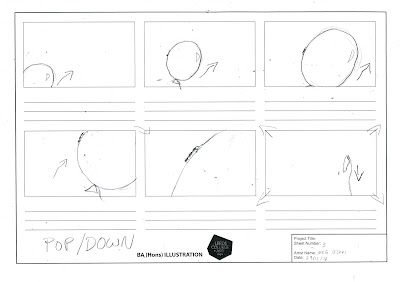


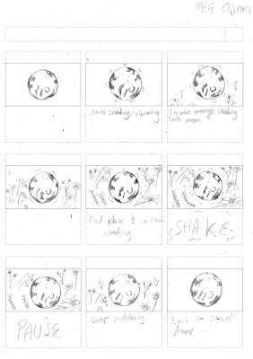
 - Although I've still got a lot of things to finish off before I start making my stings, it was good to get some storyboard practise in when I had support there if I needed it
- I think putting all my ideas down and pushing myself to get varying movements really helped me visualise what my ideas would look like, and therefore which I should develop further


- I found the process of quickly making these simple storyboards really helpful, as it helped me to focus on the important aspect of the movement, rather than trying to cram in a whole story to a short time, where it can often be confusing


- I think putting all my ideas down and pushing myself to get varying movements really helped me visualise what my ideas would look like, and therefore which I should develop further
Friday, 2 December 2016
About the Author- PRINT DISASTERS
I thought I loved traditional print. I was so wrong. Everything that went wrong today could have, and I ended up with a few smudgy, blotchy prints which were the complete wrong colour. Also, the screen I used now has little white bits stuck to it which stop the ink coming through, and I have NO IDEA how that happened. And on top of that, I really don't like the design either!
I talked to Annie, who's also struggling with the print process and I think I just need to forget about it for the weekend, as the more I stress about it, the less motivated I'm going to feel to actually make prints next week.
I talked to Annie, who's also struggling with the print process and I think I just need to forget about it for the weekend, as the more I stress about it, the less motivated I'm going to feel to actually make prints next week.
Thursday, 1 December 2016
About the Author - Development and research
Positives:
- I've had to work really quickly this week in order to get my lino cut and printed before turning them into positives for screen print- this has really been helped by my timetable making
- I also used simple pencil lines and live image trace on illustrator to make the solid colours
- After also investing a lot of time looking at colours, and have come up with a colour scheme I'm really happy with, and reflects the fun yet calm tone of Yutang's work
RESEARCH:
Yutang:
I want to ensure my project is still really reflecting Yutang, so I revisited some of his work. Here are some quotes which helped me to remind what he was about:
- 'The world, I believe, is far too serious'
- 'Where did you find this authority?... in my own heart'
- 'The true motive of travel should be to travel to become lost and unknown... travel to forget'
- 'Paying a compliment well and appropriately is called a beautiful compliment, and on the other hand, paying a compliment with bad taste is called an awkward compliment'
I found this really useful, as although this is a personal response to his work, it still needs to be intrinsically linked to his life and ethos.
Artists:
I really like this linocut print by Andy Johnson, and it really has a quality I want to emulate in my prints.
What does this mean?
- Try to make the most of negative space in my prints
- Really focus on getting cohesive colours
- I would like to try and include some depth in my pictures- and perhaps revisit the rule of three grid to make dynamic images
 |
| Chosen colour scheme |
- I also used simple pencil lines and live image trace on illustrator to make the solid colours
- After also investing a lot of time looking at colours, and have come up with a colour scheme I'm really happy with, and reflects the fun yet calm tone of Yutang's work
RESEARCH:
Yutang:
I want to ensure my project is still really reflecting Yutang, so I revisited some of his work. Here are some quotes which helped me to remind what he was about:
- 'The world, I believe, is far too serious'
- 'Where did you find this authority?... in my own heart'
- 'The true motive of travel should be to travel to become lost and unknown... travel to forget'
- 'Paying a compliment well and appropriately is called a beautiful compliment, and on the other hand, paying a compliment with bad taste is called an awkward compliment'
I found this really useful, as although this is a personal response to his work, it still needs to be intrinsically linked to his life and ethos.
Artists:
 |
| Andy Johnson |
What do I like?
- Use of white as an additional colour- especially with white birds
- Tone of image made using subtle colours
- Perspective and depth of image- huts lead a natural line of sight
What does this mean?
- Try to make the most of negative space in my prints
- Really focus on getting cohesive colours
- I would like to try and include some depth in my pictures- and perhaps revisit the rule of three grid to make dynamic images
Friday, 25 November 2016
After Effects- Workshop 4
These workshops have been incredibly useful, as I have been able to really explore in depth a programme which is new to me. Although at the moment I feel fairly confident about how to use it all, I hope I can remember what to do over the holidays whilst I work on my prints!
Orienting object on a path:
- Select layer -> Layer -> Transform -> Auto-orient -> Orient along path
Constant speed:
- Only for position key frames
- Select all keyframes except first and last -> Right click on one -> Rove across time (Now don't need to hold alt to stretch keyframes)
LAYER SWITCHES:
- Shy layer: Hides layer bars you don't want to work on anymore (E.g. with parents) -> Select which ones to hide -> Use master key on top right to hide/reveal
- Comp layer: Works with Illustrator files - Continuously rasterize -> check box and they will retain vector qualities
- Line quality: Allows to temporarily lower layer quality (Like 'half' drop down menu for preview)
- Fx: (applies to effects menu) - Search effects and presets on right (shortcut) -> Drag and drop onto layer or double click - Switch can now enable/disable effects - Can remove effect by selecting name and pressing backspace - Can choose stopwatch in project box to choose keyframes - In bottom box drop down now includes effects
- Pieces of film: Only works with speed of video
- Motion blur: Will create a motion blur on movement - Turn on layer and master switch - can turn on or off, but use at end for fast moving objects
- Adjustment layers: Select top layer -> Layer -> New solid layer -> Make comp size -> Select adjustment switch - works like in Photoshop, any effect will work on all layers below
IN PHOTOSHOP:
- New document -> Film and video -> HDTV 1080p -> New layer and delete background to make it transparent and save as psd.
IN AFTER EFFECTS:
- Import psd.
- Click 'toggle switches/modes' if options aren't showing
- Trk mat -> will specify what is opaque
- Can drag footage onto third icon (Before 8 bpc) To make composition same size
- Composition settings -> uncheck lock aspect ratio
- Can change anchor to affect scale too
- Can drag composition into bottom box and movement will stay the same - Nesting compositions
-Can drag compositions from project bar into new composition to change scenes
SAVE EVERYTHING TOGETHER:
-File- dependencies -> Collect files - will make folder with all footage files to ensure nothing is lost (Works like In Design)
-File- dependencies -> Collect files - will make folder with all footage files to ensure nothing is lost (Works like In Design)
ON OWN COMPUTER:
- Save as -> Save a copy as CC (13) to ensure it opens in college
- Save as -> Save a copy as CC (13) to ensure it opens in college
Thursday, 24 November 2016
About the Author- PLAYING
Over the past week, I've been more relaxed about the creation of my prints, and allowing myself to just play around with what I could create, without stressing about making final outcomes yet, and I think it's really worked.
What worked?
- Putting all of my ranging ideas down on paper really helped me to clarify all the thoughts I had in my head, and how I could visualise them
- I found it a lot more relaxing not thinking about creating a strict, matching set of prints
- Continually sketching different formats and variations of the same subject helped me to understand the concept I was developing, and ensure I really understood the importance of the motifs to Yutang's work and life
What next?
- Decide on application of main colour and quality of line- perhaps lino cut?
- Cut out precisely card for fish/hands compositions
- Decide on final five formats


Monday, 21 November 2016
After Effects- Workshop 3
When working straight from layered Photoshop file:
- Don't need new composition
- Import as composition Retain layer sizes
- Composition -> Composition settings - set duration and check format
For repeated keyframes:
- Set keyframe for first movement -> copy and paste
- Right click on keyframe -> Toggle hold keyframe (Holds in place until jumping to next keyframe)
- Can use for most transformations, e.g. fade to create flash
If used position and want to change all (e.g. copy layer then change to run alongside):
- Click on position - will highlight all keyframes
- Select next or previous keyframe arrow (Under eye) to line up blue line to ANY keyframe
- Drag across position to change horizontal position of all key frames
To link transformations to individual shapes:
- Use parent drop down menu to link to 'parent' layer
OR
- Spiral next to parent menu- drag and drop to parent layer
- Then all transformations (Except opacity) will change with alterations to the parent layer
AUDIO:
- Usable audio formats: MP3, aiff or aif, wav
- Has to be royalty free
- Could be sourced online or recorded- maybe in audio booths? (Book in computer resource office)
- File -> Import
- Double click on audio layer -> change duration by clicking and dragging ends of audio
- Expand layer back in composition menu -> Audio level - 48.00 = silence
- Expand further to view waveforms as visual representation of how it sounds
- Can use keyframes and audio levels to fade music etc. and give smooth transitions
- (Can use to mix sounds on top of each other)
EXPORTING WITH AUDIO:
- Click output module -> Audio output
- Change format options from animation to H.264
Friday, 18 November 2016
After Effects- Workshop 2
I'm starting to really get the hang of After Effects, and I actually really look forward to the sessions! Although I don't find it as intuitive as the other Adobe suites, I find it really helpful to work in sessions with tutors and peers, as I think it's a really good environment where we can help each other.
TIP:
- In order to change pace -> press U -> Click and drag to select all keyframes -> Drag and drop to change placement -> Hold alt and drag first or last keyframe to stretch out time
IN PHOTOSHOP:
- File -> New -> Document type -> Film and video -> HDTV 1080p (will give composition exactly the same as after effects
- Colour mode RGB
- Keep any significant action within outer rectangle of guides on photoshop- will ensure cropping in different formats doesn't effect video
- Outer rectangle- film safe zone
- Inner rectangle - title safe zone
IN AFTER EFFECTS:
- Image -> canvas size to change size of area to work with
- After Effects works like In Design - keep all files in one folder
To import images:
- Click project box -> File -> Import -> File - Import kind - footage will work like solid squares
- Click and drag into composition
OR
-Drag into timeline (Will automatically be in the middle of composition)
To work with layered photoshop files:
- File -> Import file -> import kind - Composition (Will work as one image with central anchor)
OR
- Composition retain layer sizes (Will each keep individual size and shape- more like layers in photoshop)
- Double click on composition in project window
- Composition -> Composition settings - Can change time
- Use navigation bar to zoom out, then select and drag length of each element
TIP:
- Set end point then work backwards to create 'coming together'
EXPORTING:
- Whilst working save After Effects file with images - like In Design
- Composition -> Add to render queue
-> Best settings - Time span- work area or whole thing?
-> Lossless - Format options... Change animation to H.264
-> Output to- Choose where/name
CLICK RENDER
TIP:
- In order to change pace -> press U -> Click and drag to select all keyframes -> Drag and drop to change placement -> Hold alt and drag first or last keyframe to stretch out time
IN PHOTOSHOP:
- File -> New -> Document type -> Film and video -> HDTV 1080p (will give composition exactly the same as after effects
- Colour mode RGB
- Keep any significant action within outer rectangle of guides on photoshop- will ensure cropping in different formats doesn't effect video
- Outer rectangle- film safe zone
- Inner rectangle - title safe zone
IN AFTER EFFECTS:
- Image -> canvas size to change size of area to work with
- After Effects works like In Design - keep all files in one folder
To import images:
- Click project box -> File -> Import -> File - Import kind - footage will work like solid squares
- Click and drag into composition
OR
-Drag into timeline (Will automatically be in the middle of composition)
To work with layered photoshop files:
- File -> Import file -> import kind - Composition (Will work as one image with central anchor)
OR
- Composition retain layer sizes (Will each keep individual size and shape- more like layers in photoshop)
- Double click on composition in project window
- Composition -> Composition settings - Can change time
- Use navigation bar to zoom out, then select and drag length of each element
TIP:
- Set end point then work backwards to create 'coming together'
EXPORTING:
- Whilst working save After Effects file with images - like In Design
- Composition -> Add to render queue
-> Best settings - Time span- work area or whole thing?
-> Lossless - Format options... Change animation to H.264
-> Output to- Choose where/name
CLICK RENDER
Thursday, 17 November 2016
Responsive- Brief reflection
Today we worked in groups of four to reflect on our chosen briefs and their appropriateness
Briefs selected:
- UK Greetings
- Secret 7
- Batsford Prize
Is the rationale sound?
- UK Greetings- different and fits with new direction of work- may be difficult but should be fun and constructive
- Secret 7- Try to develop a more thought out developed idea, could tell a lot with little info- way of thinking like editorial pieces
- Batsford Prize- More relaxed and can include collection of works brought together. Annie suggested I work similar to the Illustration Friday brief and just make some work each week, and possibly bring it together at the end in a final piece for submission
What technical considerations are there?
- Consider brief outcomes- especially format (UK Greetings, Secret 7)
- Consider judges
- If it doesn't give dimensions, consider appropriateness of scale for yourself
- Ensure outcomes are of a high standard
- May have to consider including logos or barcodes- read the brief carefully to ensure outcome is appropriate and includes all necessary information
- Consider audience appropriateness
What time considerations are there?
- Brief deadlines
- Module deadline
- Balancing all three briefs (ensure I plan time effectively)
- Working alongside other modules- make a clear timetable
- Give time at the end of the project to finish final outcome to a professional standard- especially since this will be what is judged mainly
- Consider which ones I need to hand in and which ones work solely as idea and work generators
Is the balance of briefs appropriate?
- Most projects don't have a set 'size', so I can scale them up or down as required, based upon workload from other briefs and modules
- Final outcomes are set for two briefs, so I need to ensure I don't keep creating after the final outcome
What next?
- Maybe look into Qwerty, Threadless and colour collective as other smaller briefs to dip into
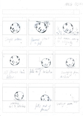
Tuesday, 15 November 2016
About the Author- Peer Review
After discussing my concerns with my peers, I feel a lot more confident with how to pursue my final designs.
What was wrong?
- I was struggling to decide on what kind of 'style' to use across my designs
- I wasn't sure about the content of my images- were they showing what I wanted about Yutang
- Need more contextual research- how does my work have grounding?
- Not stepping back and reflecting on my work as I go
How was this resolved?
- Wilf suggested I mix the use of line and shape work, as he thought the hand shapes were quite successful
- The group agreed that the snow globe idea would work well, as it would offer more information and feel of Yutang's work
- Take some time out to look at what work is similar to mine, and how they work on similar problems
- Stick to a timetable and remember to blog about processes and problems as they happen in order to develop
What now?
- Continue to develop different styles of outcomes, regardless of whether they 'link'- they could work independently, or use the same colours to link
- Remember to have fun! You can tell when I've been enjoying the work during production
- Develop third line drawing
- Re work hands more precisely and experiment with fish shapes
COLOUR CHOICES:
- I really want to ensure I get the colours right in this project, so I looked at a lot of different colours that I could use to create a strong third colour print
- I think the brighter colours work better, such as the yellow and blue or pink and blue, rather than the harsh red or purple, as I want my prints to still have a mystical, fun feel
- As inspiration I looked at some artists who overprint to create a third colour
Kim Boyoun:
- I really love Boyoun's bright command of colour, and how it is an unusual twist on the usual colours of screen print
- In addition, I love how she has combined unusual, slightly jarring hues to create a neutral tone which ties them together

- This is a more traditional colour combination, which has a very clear colour difference
- Also, I like how the blue, which is traditionally a darker colour, is made a lot lighter, and vice versa for the pink, which keeps the traditional combination interesting


What was wrong?
- I was struggling to decide on what kind of 'style' to use across my designs
- I wasn't sure about the content of my images- were they showing what I wanted about Yutang
- Need more contextual research- how does my work have grounding?
- Not stepping back and reflecting on my work as I go
How was this resolved?
- Wilf suggested I mix the use of line and shape work, as he thought the hand shapes were quite successful
- The group agreed that the snow globe idea would work well, as it would offer more information and feel of Yutang's work
- Take some time out to look at what work is similar to mine, and how they work on similar problems
- Stick to a timetable and remember to blog about processes and problems as they happen in order to develop
What now?
- Continue to develop different styles of outcomes, regardless of whether they 'link'- they could work independently, or use the same colours to link
- Remember to have fun! You can tell when I've been enjoying the work during production
- Develop third line drawing
- Re work hands more precisely and experiment with fish shapes
COLOUR CHOICES:
- I really want to ensure I get the colours right in this project, so I looked at a lot of different colours that I could use to create a strong third colour print
- I think the brighter colours work better, such as the yellow and blue or pink and blue, rather than the harsh red or purple, as I want my prints to still have a mystical, fun feel
- As inspiration I looked at some artists who overprint to create a third colour
Kim Boyoun:
- I really love Boyoun's bright command of colour, and how it is an unusual twist on the usual colours of screen print
- In addition, I love how she has combined unusual, slightly jarring hues to create a neutral tone which ties them together

Spoon Graphics:
- This is a more traditional colour combination, which has a very clear colour difference
- Also, I like how the blue, which is traditionally a darker colour, is made a lot lighter, and vice versa for the pink, which keeps the traditional combination interesting

Owen Davey:
- Similar to the previous combination, Davey puts his own twists on pink and blue to make an unusual but recognisable colour palette
- I really like how he has put the two colours right next to each other to draw a stark comparison, but I'm not sure how easy this would be to replicate in screen print without an accidental overlap

Monday, 14 November 2016
After Effects- Workshop 1
I'd never touched After Effects until today, so everything I was doing was really brand new, but there are a lot of similarities to photoshop and illustrator, which I can use fairly efficiently, I think it's just gaining an understanding of how the different elements work together that I need to practice.
My notes from the session:
- Composition -> new composition (Not file-> new)
- For this project use - HDTV 1080 25 (1080 definition, 25 frames per second)
- Duration can change later
- Choose colour background
- To create shapes in AE- Layer -> New -> solid (like illustrator for solid shapes- shortcuts)
- Can drag red bar to shorten/ lengthen time it is shown
- All just values- keyframes in that specific time
- Drop down (under tag) -> Transform -> press stopwatch for desired movement -> drag blue line to desired place -> drag and drop shape -> Can then alter line like on illustrator handles (Pen tool)
- Same with scale and rotation etc. (For rotation drag to right/left, or enter numbers)
Keynotes denote change- where it is in that moment
- Can use spacebar to play
- Under preview- have info tab open -> if in red, mac is struggling, it won't be playing in real time- change 'half' to 'auto' (next to 3 coloured dots)
- In order to make all shapes move together, copy and paste plain shape (No keyframes) -> Shift and change all paths together
- Use workbar (greyed out with blue ends) to focus/loop
Shortcuts:
P - position
A - anchor (Or can press and hold Y)
R- rotation
S- scale
T - opacity
U - reveal all animated properties -> hot twice for ALL changes
Saturday, 12 November 2016
About the Author- Study Task 4
ROB HUNTER:
Narrative
- Creates a feel of mischievousness and gives a clear feel that the boy is hiding through only the simple order of the characters appearing and the movement of the boy
Sequential thinking
- By separating the boy and tiger completely from appearing at the same time, Hunter ensures there is not a hurried, chased feel to the animation, but more an adventure of evasion
Composition
- Hunter includes strong lines of sight from the landscape to the direction of the tiger and the boys gaze, and the way he holds the boys movement within one central space whereas the tiger roams across the whole composition separates them still further
Pace
- The inclusion of solid colour frames and then 'empty' street scenes ensure that the animation is not rushed, and even gives more power to the tiger, as he seems to leisurely stroll through shot, showing that he is not fearful, where as the fast paced movement of the boys hair shows the opposite
Technical questions
- How does he get the tiger to move so slowly? I noticed the feet were hidden, as Fred mentioned that often animators avoid trying to show the whole body movement when walking
- How does he merge the whole colour screen into swaying independent sections? is there a tool to select certain aspects of the same layer?
CHRIS NIXON:
PANDAMONIA trailer from Chris Nixon on Vimeo.
Narrative
- Through the zooming and panning, Nixon creates a real sense of place, and makes the whole story feel a lot larger than the audience can see
Sequential thinking
- By travelling to the right he mimics the narrative of the book, so by slowly changing from very empty scenes to busier ones helps to build tension and a sense of a developing plot, which is perfect for a book advertisement
Composition
- Nixon creates frames of empty space from substantial material in his animation (such as the leaves in the first frame) which creates strong links across the whole image, and in particular with the text
Pace
- The pace is fairly slow, as it needs to be to ensure that all the writing is clearly read, but he keeps it interesting by the slight grain and movement in the background so that it isn't just a static background with moving text
Technical questions
- How does he create that altering background? Maybe by toggle hold keyframe on opacity with varying backgrounds? Or does he simply move the same one?
LUKE BEST:
How We Got To Now | Montage from Trunk Animation on Vimeo.
Narrative
- By including leading text throughout, Best links a lot of the seemingly unrelated scenes through the strong narrative hook he has built with the inclusion of text
Sequential thinking
- The start of Best's animation is very focused on the construction and formation of his lines, which helps really well to build a scene from which he then includes more movement and interaction between his elements
Composition
- The compositions in his animation are varied scene to scene, but he seems to keep them on a similar level of hectic, with the same amount of movement in each, just in different directions to ensure it stays fresh
Pace
- By building up different segments of alternating between flat colour illustrations and live motion, he ensures that there is a natural varied pace which holds the audience's attention
Technical questions
- How does he include drawings on live video? I'm not sure this is something I want to include in my stings, but it is definitely want to look at it in the future, as a sort of live collage effect
Narrative
- Creates a feel of mischievousness and gives a clear feel that the boy is hiding through only the simple order of the characters appearing and the movement of the boy
Sequential thinking
- By separating the boy and tiger completely from appearing at the same time, Hunter ensures there is not a hurried, chased feel to the animation, but more an adventure of evasion
Composition
- Hunter includes strong lines of sight from the landscape to the direction of the tiger and the boys gaze, and the way he holds the boys movement within one central space whereas the tiger roams across the whole composition separates them still further
Pace
- The inclusion of solid colour frames and then 'empty' street scenes ensure that the animation is not rushed, and even gives more power to the tiger, as he seems to leisurely stroll through shot, showing that he is not fearful, where as the fast paced movement of the boys hair shows the opposite
Technical questions
- How does he get the tiger to move so slowly? I noticed the feet were hidden, as Fred mentioned that often animators avoid trying to show the whole body movement when walking
- How does he merge the whole colour screen into swaying independent sections? is there a tool to select certain aspects of the same layer?
CHRIS NIXON:
PANDAMONIA trailer from Chris Nixon on Vimeo.
Narrative
- Through the zooming and panning, Nixon creates a real sense of place, and makes the whole story feel a lot larger than the audience can see
Sequential thinking
- By travelling to the right he mimics the narrative of the book, so by slowly changing from very empty scenes to busier ones helps to build tension and a sense of a developing plot, which is perfect for a book advertisement
Composition
- Nixon creates frames of empty space from substantial material in his animation (such as the leaves in the first frame) which creates strong links across the whole image, and in particular with the text
Pace
- The pace is fairly slow, as it needs to be to ensure that all the writing is clearly read, but he keeps it interesting by the slight grain and movement in the background so that it isn't just a static background with moving text
Technical questions
- How does he create that altering background? Maybe by toggle hold keyframe on opacity with varying backgrounds? Or does he simply move the same one?
LUKE BEST:
How We Got To Now | Montage from Trunk Animation on Vimeo.
Narrative
- By including leading text throughout, Best links a lot of the seemingly unrelated scenes through the strong narrative hook he has built with the inclusion of text
Sequential thinking
- The start of Best's animation is very focused on the construction and formation of his lines, which helps really well to build a scene from which he then includes more movement and interaction between his elements
Composition
- The compositions in his animation are varied scene to scene, but he seems to keep them on a similar level of hectic, with the same amount of movement in each, just in different directions to ensure it stays fresh
Pace
- By building up different segments of alternating between flat colour illustrations and live motion, he ensures that there is a natural varied pace which holds the audience's attention
Technical questions
- How does he include drawings on live video? I'm not sure this is something I want to include in my stings, but it is definitely want to look at it in the future, as a sort of live collage effect
Wednesday, 9 November 2016
About the Author- Ideas and roughs
After going to Thoughtbubble this weekend, I was really inspired by all the different styles and techniques the artists used.
Also, after speaking to several of them, I realised how similar they were to me, and that it's up to me to make work that I want to show.
I've been struggling to find my 'style', but I think I need to stop trying to force it, and just let it develop naturally, so I thought about what I want to draw for this project, and that's when it struck me that I want to draw and play, not necessarily create shapes and block colours. So I took a step back from my work and went back to thinking through my ideas.
What do I want to show?
- "the world I believe, is far too serious" - Yutang (Don't take this project too seriously, have fun!)
- Stories in my prints, not just simple imagery- Think back to SB1
So I started roughing again, and I'm a lot happier with this different way of thinking, as I can still develop into shape based imagery if I want to, but at the moment I'm just enjoying drawing and creating and seeing where it takes me.


Tuesday, 8 November 2016
About the Author- Printing trio
Today I used three different print methods, and it was really good to get back in the print room for the whole day and just see what I could make without stressing about deadlines
Digital designs made during inductions with intent to screen print:


- I tried different compositions and colours during the print process to see what spontaneous prints I could make
- I was overall really pleased with how the halftone turned out, and I would love to use this process in the future to create tonal elements in screen print
Lino/mono print:


- I didn't particularly like this outcome, as I found it was too messy and just interfered with the actual content of the image
- I think monotype would suit a more mark making based imagery and design, but for me, it does not work as the main, detailed element of a design
Digital designs made during inductions with intent to screen print:
-I was a bit dubious about making designs on screen, but I played around with a few compositions and managed to get some positives which I was able to use in my screen print tutorials and included halftone, which I was really excited to try
Screen prints:


- I tried different compositions and colours during the print process to see what spontaneous prints I could make
- I was overall really pleased with how the halftone turned out, and I would love to use this process in the future to create tonal elements in screen print
Lino/mono print:

- This was the print method I was happiest with today, as I think the harsh contrasts of the blue monoprint and black lino alongside the white paper offer a very 'yin and yang' feel, which matches Yutang perfectly
Monoprint/monotype:

- I think monotype would suit a more mark making based imagery and design, but for me, it does not work as the main, detailed element of a design
Friday, 4 November 2016
About the Author- Hand screen print test
I finally put my ideas into actual practice through screen print, and in order to break through my recent stagnation in work, it was a fairly quick, rough test
What worked?
- The abstract forms do work well together to create a hidden image, which does reflect Yutangs passion for translation and interpretation
- I found my working process really useful, as going from sketches to cut paper to paintings to cut templates to prints ensured I really understood how my shapes worked together, and what they would create
- The photoshopped version in blue and yellow works a lot better by calling out a stronger contrast in the third colour
What could I improve?
- Colour difference wasn't strong enough- It definitely blended more through drying, and although I did keep adding more yellow ink to the medium, the contrast isn't as strong as I would have liked
- The precision of the shapes wasn't too good, and the edges don't match up as smoothly as I would have liked
What next?
- Re expose with more precise shapes
- Spend time choosing colours which will work well with overprinting
- Start developing other shape based imagery
About the Author- Lino induction
Although I learnt how to cut lino during my foundation, it was good to have a refresher on the techniques and spend some time devoted to transforming my imagery into a more tactile outcome.
What do I like?
- The contrast of textures and quality of line really maintain a hand rendered feel to it, despite the process being fairly mechanised
- I like the way I interpreted colour into different line and separations, as it made me think about more figurative ways to communicate information
- Like how much of a contrast there is between the block colour and white paper- adds more depth to the image
What could I improve?
- Accidentally missed off the eyes- don't know if it needs it, but would have been interesting to see a print with and one without
- Placement within the print is a bit crowded, I could have made the fish slightly smaller to allow the work room to breathe
- Tail seems a bit too refined and not loose enough- lost a lot of movement from the original drawings
What have I learnt?
- With reduction printing, always leave more than you think on, you can always cut it off later, but can't put it back!
- Think about roughing for prints- don't just dive into it, as it could just be a waste of time, as the whole process will need to be repeated
- Think about suitability of media- how do I interpret certain marks into another media??
 |
| Traditional press print |
 |
| Added pencil colour |
 |
| Ghost print |
 |
| Hand Burnished print |
Responsive- Competition Briefs
Briefs:
- YCN UK Greetings
- Secret 7
- Batsford Prize
Rationale:
UK Greetings- I want to work on creating work suitable for younger audiences, especially as it this would help me with my future work with Anorak. I want to explore colour and character throughout this brief, as although I'm confident with colour, character is something which really challenges me. This brief will definitely be a challenge for me, but it would be FUN.
Secret 7- This brief looks for varied and quite abstract outcomes, which will need to be thoroughly thought out in order to create personal but accessible responses. Because the outcome is so simple and straightforward it also takes some of the stress away of having to create content for different formats, so would be a good complement to two other more hectic projects.
Batsford Prize- I'm really excited by this brief, especially how it focuses so much on purpose, and since it's so broad in the outcome, it means I can use it to my advantage and create as much work as I have time to, based upon the other briefs. I'm very aware of my time management in this module, so I want to ensure I don't undertake too much work from the start.
Practical skills / Media / Formats:
- I'm not entirely sure what kind of media I will be using yet, but I would love to explore traditional print more, especially in the Secret 7 brief. I think for the UK Greetings brief I will potentially try to explore more hand rendered outcomes, as I think this will be an effective way for me to develop my character skills. I think the main technique I will use across all three briefs is roughing, as since I don't have too much time to spend on these briefs, I need to generate many different ideas and starting points to ensure I get straight into making strong, thought out imagery.
Wednesday, 2 November 2016
About the Author- Themes and ideas
This project has been surprisingly difficult for me, as I keep getting 'stuck' on ideas and not giving myself any room to develop.
I'm also not really liking much of the work I'm creating, which doesn't help!
What have I done to help?
- Organise my time out more effectively- I've planned out a calendar to ensure I have mini deadlines to get designs ready for print to just experiment and see how I can push imagery
- Don't let my failures get me down, I need to just turn the page and carry on with what I want to create
- Try not to stress about getting 5 prints done for a certain time, just play around with print making and once I'm ready I will be able to pick my final 5 to develop into finals
What now?
- Start on new ideas, leave this one for now and work on new things to get me inspired and ready to work
- Experiment with diverse print techniques- don't get stuck on one idea too soon


About the Author- Hand screen planning
I really wanted to get into producing prints with my overlapping idea, so I started making some paintings and stencils to help visualise how they would work as prints
What worked?
- Thinking through cutting paper was a new technique to me, but after Louise Lockharts visit, I thought it would be a good opportunity to try something I hadn't done before and break away from pencilled roughs, and I think it really helped to create more fluid outcomes
- Using gouache to roughly visualise what my print will look like helped me to wrap my head around how a third colour can be achieved
- Cutting the paper gives a really crisp, clean finish
- I like how they communicate the translation aspect of Yutang's life, whilst still focusing on his written works about the 'geometrical precision of hands'
What next?
- Transfer my coloured cut outs onto black card to use for screen printing
- Consider colour- what will make a clear but not clashing contrast?
- PRINT
- Start making my other sketches more shape based to be used for this technique too
What concerns do I have?
- Are the shapes abstract enough? can you tell they are hands when they are individual colours?
- Will it work?? This is my main idea at the moment, so I really hope the overprinting works!


What worked?
- Thinking through cutting paper was a new technique to me, but after Louise Lockharts visit, I thought it would be a good opportunity to try something I hadn't done before and break away from pencilled roughs, and I think it really helped to create more fluid outcomes
- Using gouache to roughly visualise what my print will look like helped me to wrap my head around how a third colour can be achieved
- Cutting the paper gives a really crisp, clean finish
- I like how they communicate the translation aspect of Yutang's life, whilst still focusing on his written works about the 'geometrical precision of hands'
What next?
- Transfer my coloured cut outs onto black card to use for screen printing
- Consider colour- what will make a clear but not clashing contrast?
- Start making my other sketches more shape based to be used for this technique too
What concerns do I have?
- Are the shapes abstract enough? can you tell they are hands when they are individual colours?
- Will it work?? This is my main idea at the moment, so I really hope the overprinting works!


Tuesday, 1 November 2016
About the Author- Monoprint
I finally got into the print room and was able to play around with some imagery I've been developing in a print based media.
What do I like?
- Fragile nature of the monotype line and the ability to make varying tones and textures through pressure alterations
- The mixing of different elements, such as the vines with the fish add a lot more interest than just fish on a page
- Mark making is very interesting and unique, and I would like to explore this more, but I think for this project I want a more literal outcome, so I will pick up on mark making potentially in a different project where the outcome can be more fluid and gestural
What don't I like?
- They're a bit boring, I think they need a focus or character to liven them up
- The imprecise nature of mono print- It's fun to experiment and helps me to generate new ideas, but I will definitely use a print method I have more control over for my final prints
- The value of some of the inks is too harsh, especially in contrast to the white on the page- I need to spend some time mixing a colour I'm happy with before I start printing
What will I do next?
- Try to develop more imagery and starting points- I really want to begin to develop a narrative within my prints
- Use monoprint in a more controlled way, perhaps with predetermined stencils and a clear plan of how the inks will work with each other
- GET EXCITING! Start trying new focus points and stimuli- make them feel more alive
What questions do I have?
- What kind of aesthetic do I want in my prints? Would line be better than shape?
- Do they have to work as a strict set? Could they look different in content and style?


Subscribe to:
Comments (Atom)