Wednesday, 20 April 2016

OUIL406 Evaluation


Leeds College of Art
BA (Hons) ILLUSTRATION
Level
04
OUIL406 Visual Communication
Credits
20
End of Module Self Evaluation

NAME

Megan Ojari


1.  What have you learn about visual communication during this module and how effectively do you think you have applied these ideas?

This module has taught me mainly about simplifying my ideas to strip a message down to the minimum information needed to communicate the intent. I also have learnt about the importance of communicating my core idea and response to the brief through my final, resolved outcomes. In addition, this module has taught me about working independently, and asking peers, tutors and friends for feedback when I need it. Because we had a lot of time to work without outside motivation, I found it taught me to motivate myself. The broad briefs of this project also made me to think of new ways to approach problems and think ‘outside the box’, which will be valuable in my future practise.

2. What approaches to/ methods of image making have you developed and how have they informed your concept development process?

This module has definitely improved my technical skills, particularly my confidence in using Illustrator and screen printing, both of which I thoroughly enjoyed using and will incorporate more into my future practise. I also experimented for the first time with moving image during the GIFs project, of which I enjoyed the 3D element, as I liked understanding the mechanics of a product and how it functions as a whole. I think working three dimensionally and understanding form is really important within illustrator’s practise. The skills I have learnt over these briefs have also tested my ability to reflect on my practice through the process of blogging, and establishing an internal conversation about my work and progress on the course.

3. What strengths can you identify in your work and how have/will you capitalise on these?

I think my final outcomes are the strongest element of my submission, as I have combined my visual research into resolved outcomes which fit the brief. I have also explored my character more during the first brief, which I am not confident in, but through working exclusively with character, I have improved my confidence with developing a character and transferring it across different media. My skills in Illustrator have also improved, as before this module I had never used it, but I now really enjoy using the software, and feel confident in the basics. Another strength in my submission is time management, as through using timetables, I have ensured I am not rushing at the end to finish my work. I also feel that my thorough primary research for the Persons of Note brief ensured I had a strong starting point to develop from, which helped to inform 
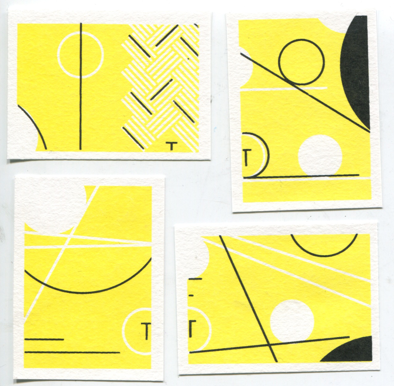
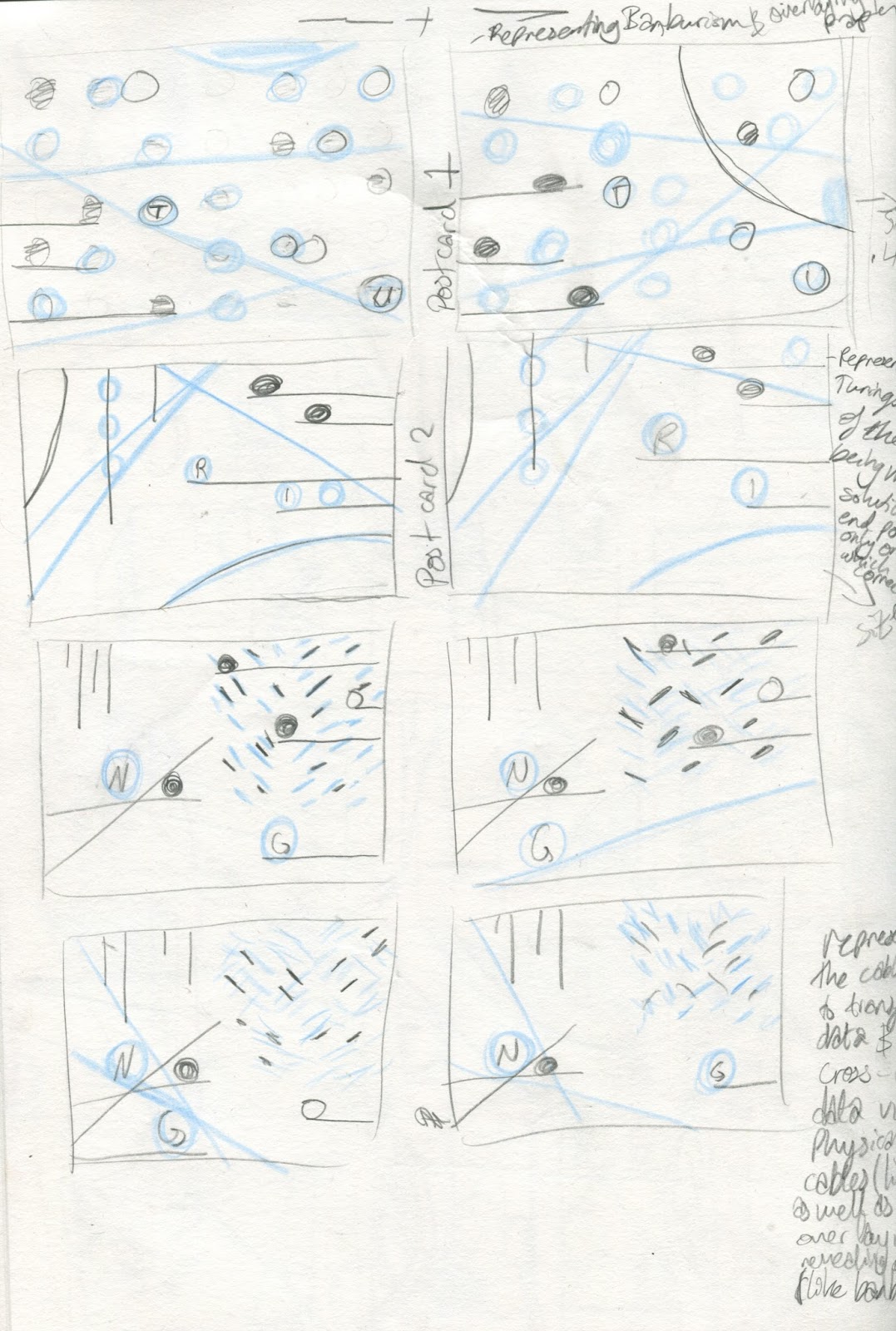
my practise and unearthed unusual, highly theoretical aspects of Turing’s life, which I wouldn’t have arrived at without this research.

4. What weaknesses can you identify in your work and how will you address these in the future?

Some weaknesses of this submission are how I started the first two briefs, as I was lacking inspiration and struggled to grasp an idea I was happy with. However, something changed during the Persons of Note brief, and I really enjoyed my work and was happy with the direction it was heading in. I think in order to ensure I stay motivated and happy throughout the rest of this course, I will make sure that I do what I want within the brief by stretching it to fit with my practise. I also feel I didn’t explore different ideas enough, as I think through more roughing and media exploration I could have pushed myself further. Another weakness was my regard to scale, as until my tutorial with Jamie during Persons of note, I hadn’t really considered the appropriateness of scale within my work, and I wasn’t working to effective scales. My research for the first two briefs was also lacking substance, and I could have done wider research of both images and illustrators to inform my practise. I also think I could have made time after the final critiques to tweak my final pieces to reflect the feedback of my peers.

5. Identify five things that you will do differently next time and what do you expect to gain from doing these?

-Next time I will plan my time from the start, as I found it so helpful to have an effective timetable during the last brief and found sticking to it fairly easy and incredibly useful. During my next project I will create a detailed timetable of both in and out of college activities at the start.
- I will make sure I don’t stress during my image experimentation, and remember it’s ok to get things wrong, and that’s actually what teach me the most about my practise and help me grow as an illustrator.
-During this module I have been a lot more confident in showing my work to peers, and getting feedback, which is something I struggled with a lot previously, but by getting to know my peers and through establishing more of an online presence with my work, I’ve realised that, the feedback is either good or bad, and if it’s not complimentary, then it is an opportunity for me to change things and learn from what wasn’t so successful the first time round and grow from it.
-I also need to make sure I research some more illustrators at the beginning, as often when I look at their work it is after I have made some critical decisions on my work, which may have been different had I reflected on other practitioners work first.  
-After reflecting on my last feedback session, I will spend some time over the remaining weeks and over the summer about where my personal practise sits within the creative field, and how I can work to create images I love and that inspire me to keep working.

6.How would you grade yourself on the following areas:
(please indicate using an ‘x’) 

5= excellent, 4 = very good, 3 = good, 2 = average, 1 = poor

1
2
3
4
5
Attendance


x
Punctuality


x

Motivation


x


Commitment


x

Quantity of work produced


x

Quality of work produced


x


Contribution to the group


x

The evaluation of your work is an important part of the assessment criteria and represents a percentage of the overall grade. It is essential that you give yourself enough time to complete your written evaluation fully and with appropriate depth and level of self-reflection. If you have any questions relating to the self-evaluation process speak to a member of staff as soon as possible.

Tuesday, 19 April 2016

Persons of Note- Final feedback

Within a group of five peers and Matt we discussed our final outcomes through a 'silent crit' where the others had to try and figure out who we had and what it meant without the maker telling them. The initial thought people had were maths, equations, formula, algebra, old school, 50's poster, charts. They struggled to guess who it was, but through the small hints on the images they were getting closer to who it was, which was actually my intent.

I think it was really beneficial to hear what people who hadn't seen my previous work thought, and I think the feeling of 'decoding' the images got across. The group also liked the composition of the image, and thought it had a good line of sight which moved around the page.


The main concern with my work is really where it 'belongs' as I seem to sort of be straddling graphic design and illustration, so Matt gave me some suggestions of practitioners to look at who deal with similar styles.

Below are my quick initial looks at these artists, a few of whom I recognise from previously seeing their work. I am really excited to see where my practice leads me and not worry about it being 'illustration enough'. I think if I am making successful imagery and enjoying it, then that's all I want to achieve.

James Joyce


Anthony Burrill


Supermundane


Neasdon Control Centre


Persons of Note- Inspiration and motivation

During my first year at university I've struggled at times, which is expected, but overall I've been feeling really uninspired and unmotivated, something which is totally new to me. I don't know whether it was just the stress of learning to live on my own in a new environment where I didn't know anyone, as I really don't cope well with big changes, and getting used to it takes a lot of energy. But over this module I think I've worked through it and I've really been thriving off the work load, especially during the last brief. I think the turnaround point was during the Greetings From brief when I woke up at 2am to jot down some ideas and just got my thoughts down on the page, no matter how messy, and this made me realise just how much illustration means to me, as I couldn't sleep because I was so excited about it. I think since then I've woken up every morning excited that I get to work on my project and just see where the work will take me. I also think getting Alan Turing for my Persons of Note brief was the best thing that could have happened, as if I had a choice out of anyone, I already knew I would have chosen him, as I just find his work so inspirational and interesting, I knew I was really going to enjoy this project. I think this project is the most I have ever enjoyed a project through my whole education, and I really feel like I'm finding my 'place' within the course, even if I haven't necessarily developed a set style, which is what I worried about before. Also, myself and five of my course mates have set up a collective on Instagram, where we take it in turns to post our work, and I think this external validation alongside my friends, whose work I find incredible, really helps me to realise that I can keep up, and I can succeed if I just try my hardest, which is exactly what I'm going to do.

Monday, 18 April 2016

Persons of Note- How has my research and practise informed my outcomes?

- Research through both Alan Turing books was great, the smaller one gave me a broad overview, and the 800 page one was just a really interesting novel which informed my practise through helping me to really understand what Turing was about.
- The visit to Bletchley Park was not only something I loved doing, but something which made my understanding of Turing, the Bombe and the Enigma machines so clear and deep, which meant I wasn't relying on the public perception or knowledge of Turing, but being able to rely upon my knowledge and try different ideas safely knowing they have a reason and strong link to Turing.
- I also think that by coming into college during the holidays to use the print room ensured I was on top of my work and allowed room for more drafting later on.
- I think the thing which I am happiest about is how every part of my final outcomes have a reason for being there, and a real purpose.

Friday, 15 April 2016

Persons of Note- Final outcomes

Overall I am quite pleased with my outcomes, as I feel they fit the brief well, as they explore what Alan Turing stood for, and reveal his thought processes, rather than just being a portrait.

What do I think?
- Like the underlying message and how each component has a meaning and link to an aspect of Turing's theories
- I like the idea behind the CMYK colours, as I think it carries on the theme of essential and 'pure' materials and theories, as well as providing a good link to the cross over between mechanical and hand rendered, like printers ink, and the colours of the drums in the bombe
- Think the yellow could have been slightly darker to show the detail of the white
- I think it was a good decision to stick to lines, text and five set circle sizes (of which three are on each design) to mirror the electrical circuits and rotors in Enigma and the Bombe
- Could have practised more with A2 poster to make it a smoother, crisper print
- Could have simplified stamps even further
- Like how they work as a set, and all show a different section of Turing's work
- Think they work well as final sets of memorabilia for Turing, I could even see them in the gift shop at Bletchley Park, as the people who go there will have an understanding of what Turing did and how he worked, meaning they will understand the poster's design

What did I struggle with?
- PRINTING THE A2 POSTER! I printed over 15 of the cyan, only 3 of which were precise, and a further 3 were almost complete, the others were really messy. I think it was partly because I had used two A2 prints on one screen, meaning there wasn't much space around the edges, and because of the squeegy I used, as the initial one was just big enough, meaning I struggled to get pressure to the ends, but when I swapped to a larger squeegy and taped up the overlap, the prints were a lot cleaner.
- I also struggled with timings, as I had to digitally print my A2 positive during my booking on Friday morning, meaning I couldn't start screen printing the A2 until after my 10am booking. Next time I will consider my bookings and see if I can swap with someone if it is near to the time.
- Believing in my designs- For a while I felt they might have been too 'graphic design' or too simple, but I've realised that this is the only way I wanted to show Turing's life, which was, in essence, all about his mind. I think, bearing that in mind, my outcomes are really quite suitable-

What have I learnt?
- The intricacies of screen printing, after doing a draft print and my finals I now feel very confident in every aspect of screen printing, from stripping the screens and exposing them right through to printing and cleaning up after. I was also able to help some friends in the print room with their technique, which boosted my confidence in print
- Time management! I have now finished this project, the earliest I have ever finished a university project, as I have almost a week before hand in. This was mainly because I had to include the screen printing process and allow for unseen delays, such as a full print room, which fortunately didn't happen. I am really pleased that I managed my time so well, as I am now able to spend this weekend tying up loose ends and focusing on my other two modules.
- Illustrator has now become a software which I am extremely comfortable with, which I know will help me in my future tasks.
- To invest time in detailed, intense research. I found my time at Bletchley Park incredible, and I know I would not have been able to produce this work without it. I will ensure to include good primary research in all of my coming projects.
- To keep working, even when things aren't going well. I really struggled when my A2 poster was printing badly, but I just kept going, trying to solve the problem, which mean I was left with a print I was really happy with, rather than just one which was 'ok'
- To consider colour more- although I wanted to use CMYK, I could have tweaked the yellow slightly to make it stand out more, next time I will spend a little more time looking at colour

Magenta postcard print 1
Magenta postcard print 2
Magenta postcard print 3
Yellow postcard prints
I think the yellow doesn't work on the small scale of the stamps, as the detail is lost, meaning I will use the yellow postcards and magenta stamps as my final designs
Final postcard print 1
Yellow representing the colour of the yellow drum
Lines finishing in centre of page with the text represents Turing's idea that there was many solutions (end points) but one of of them was the actual correct one.
Final postcard print 2
Representing the Banburism Turing invented, with the punched holes revealing the key, as well as the negative space leading to the correct answers- just like looking for a crib.
Final postcard print 3
Representing the cable used to transfer data, as well as the crossing of data through physical cables and lines. Also overlay shows the revealing of answers, similarly to Banburism
Final stamp prints
Magenta linked to maroon drum, but showing the raw, essential nature of Turing's work
Top left: Like postcard 3
Top right: Like postcard 2
Bottom left: Representing rotor sizes and circuit board
Bottom right: Like postcard 1
Final poster print
Encompassing all the elements of the postcards and stamps, with the blue completing the CMYK and linking to the blue drum on the bombe
Poster print detail
Poster print quality
Overall themes:
- Negative space representing the punched paper, as well as almost all linking, like the physical paths of the data in Enigma and the Bombe
- Throughout the designs 5 circle sizes are used, but only 3 on each design, like the rotors or drums chosen on Enigma/the Bombe
- Lines and circles solely used, to represent the simple and precise nature of Turing' thought process.
- Tracks and paths act as a sort of map to Turing's mind, and how he comprehended solved the problems 

Thursday, 14 April 2016

Persons of Note- Print research

Because I am going to screen print my final outcomes, I wanted to see how other practitioners used print to portray abstract looking imagery.


Eloise Renouf
I really love Renouf's print work, as I find the simple, clumsy lines mix well with the strong blocks of colour on the background. I also really like the use of digital work with hand rendered, and how these ordered lines contradict themselves to the blocks of colour.
- Simple colours work well- think this will translate well in my work too
- Background of colour and line all black mirrors what I intend to do in my pieces, and I think this works in bringing the attention to the line and their path
- Variants of thickness of line work well, and this is something I have used across all of my designs, so I am glad this will work well, but I could have pushed it more in mine within the single pieces
- Could I have tried using looser lines against the crisp ones?


Marcus Walters

Really love Walters use of cut paper and overlapping shapes- I hadn't thought about how this would translate to screen print, as I think this would have been an interesting avenue to explore, especially with the facts about Turing's clumsy nature.
- Like the white gaps, feel these are reflected in my work too, I also like the use of gridded lines as a nod to graph paper, which again is something I wish I could have explored more
- Like how the colours are toned down variants on CMYK, I might explore my colour ways before I print tomorrow


Lucienne Day (1953)

I absolutely love this work created in 1953 by Day, as I think it gives a real feel of the 50's whilst maintaining a timeless feel. 
- Think the lines and negative space with limited colours are very reminiscent of my designs, which I am really pleased about, as I want to evoke a 40's/50's look in my prints, as this was when Turing's work mainly took place
- Love the cross sections and overlapping lines again are similar to what I have created, and I like how they seem to show a circuit board and its connections.
- Wish I had thought about adding a third colour to my prints, as it might have made them more interesting and dynamic, but it is too late now to redesign them 

Wednesday, 13 April 2016

Persons of Note- Final designs

Through working with paper and illustrator I have been able to refine my designs to not only look more effective, but communicate a deeper hidden message relating to Turing's work.

Evaluation:
I am overall really happy with my designs, as I think I have been able to develop a set which show strong links to Turing's work whilst still maintaining the obscurity he possessed. I also like how the poster will encompass all of the elements of the designs, almost like a blueprint to the rest. In addition I like how I have been able to use five standard circle sizes throughout, out of which three are chosen for each design, which I think works well to represent the five rotors available, out of which three were chosen for the Enigma machine. However I am unsure as to how the scale will work, especially on the stamps, so I will just have to wait until I have screen printed them to see.

Questions:
- How will the scale work as prints?
- Will the colours work without it looking too modern?

What is my plan now?
- Get printing! Need to use my digital print slot on Friday to print the A2 Poster positive but can start with the postcards and stamps now
- Ensure they are all extremely precise in their execution

Simpler roughs for postcards
Trying to link them through a central
circle to extend circuit metaphor

Top two final, bottom left revised to bottom right to include
cable element and fit around central circle

Designs side by side show alterations to include
correct/incorrect answer theory (top), cable (middle),
and Banburism metaphor (bottom left).
Bottom right showing rotor sizes left unchanged.
Top left original design, top right adding cable
bottom left giving more room to new element
and final design (bottom right) balancing
amount of cable and blank space

Tuesday, 12 April 2016

Persons of Note- Feedback session

My feedback session with Jamie was incredibly helpful, as I had been concerned about other people understanding my designs and how I have visualised them.

What we discussed:
- background of my research and development of designs
- the importance of different factors of my design and how they work as single pieces
- how my work shows the nature of decoding for the audience
- The effectiveness of my designs
- Colour- could it reflect the colours of the bombe drums?
- Scale, do the circles stay the same size throughout to represent the choices of 5 rotors? Of which only three are used per image?

What he suggested:
- Poster - fix the 'T' make it digital type like the rest
- Postcards - focus more on the details, make them emptier
- Stamps- Close up and detailed, even just a small section of a circle
- Overall, the designs are too crowded
- Colour- try CMYK (variations of the drums but have a strong link to the 'pure' nature of Turing's work)
- Manage time- dedicate some time to COP on Wednesday

What I will do now:
- Develop final designs
- Decide on colours
- Prepare screens for screen print ASAP
- Manage time- remember to leave time for other modules
Roughs of stamps
Feedback sheet

Friday, 8 April 2016

Persons of Note- Artist research

Whilst developing my images I've had an idea in my mind, but I just couldn't remember where I had seen it used before, until I revisited the slides from the briefing and found this.

Although I couldn't find out who made them, through some research I discovered they were made in Poland in the 1960's.

I think the style would work well with my images too, as this is artwork which was definitely around during Turing's lifetime, and possesses a timeless feel.

I dealt like the cohesive but contrasting colours between the set, and I would love to be able to create a colour scheme for mine which works just as well.

I also really like the negative space, which I feel shows the unknown in space travel, and although mine will represent the hole punches of the code breakers, I suppose the same holds true, as they never really knew what that small negative spec would lead too.

I think the design and layout on these stamps works incredibly well, and I think I will need to spend quite a bit of time reflecting on my designs so that they work just as well compositionally.


Persons of Note- Print outcome

Today I got to spend the morning in the print room, and because I was organised yesterday with getting my negatives and screen prepped, it only took me about an hour to print around 15 copies, which was a lot faster than I had screen printed before.

What do I like?
-The negative space in the prints works to remind of punched holes
- Like the scales of circles, to signify the different sized rotors to choose from
- Like how where the text comes off it is reflected by the wires in the Bombe drums, which scrambled letters using wire just like this

What don't I like?
-Colour is too ambivalent, why is it blue?? Could think of using drum colours instead to work across the set?
-Alignment on final, is a bit too 'slightly off', should either be exact all the way through or slightly off all the time

What will I do next?
-Think about colours before final print
-Develop designs which show the thought processes and include 'circuit board' like elements of negative space
-What other ways could I add line? 
- More circles with text in?
-How will it work across all the designs? will stamps be legible? 
-Is the idea just too abstract????? Talk to Jamie at tutorial, can always swap to text and cut paper idea
-Could I try using cut paper to construct the negatives? might make it more messy like Turing's nature?

Black print- could think of interesting ways
to add colour?
Stitch? Pen and ink? Cut paper? What ways
can I add line?
Thinking about different alignments and the
relationship between them

Don't like this alignment, think it is too obviously
similar images but not alined 
Final screen print draft


Changing colours on photoshop to see
how it effects the mood