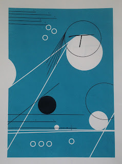
Today I got to spend the morning in the print room, and because I was organised yesterday with getting my negatives and screen prepped, it only took me about an hour to print around 15 copies, which was a lot faster than I had screen printed before.
What do I like?
-The negative space in the prints works to remind of punched holes
- Like the scales of circles, to signify the different sized rotors to choose from
- Like how where the text comes off it is reflected by the wires in the Bombe drums, which scrambled letters using wire just like this
What don't I like?
-Colour is too ambivalent, why is it blue?? Could think of using drum colours instead to work across the set?
-Alignment on final, is a bit too 'slightly off', should either be exact all the way through or slightly off all the time
What will I do next?
-Think about colours before final print
-Develop designs which show the thought processes and include 'circuit board' like elements of negative space
-What other ways could I add line?
- More circles with text in?
-How will it work across all the designs? will stamps be legible?
-Is the idea just too abstract????? Talk to Jamie at tutorial, can always swap to text and cut paper idea
-Could I try using cut paper to construct the negatives? might make it more messy like Turing's nature?
 |
| Black print- could think of interesting ways to add colour? |
 |
| Stitch? Pen and ink? Cut paper? What ways can I add line? |
 |
| Thinking about different alignments and the relationship between them |
 |
| Don't like this alignment, think it is too obviously similar images but not alined |
 |
| Final screen print draft |
 |
| Changing colours on photoshop to see how it effects the mood |
No comments:
Post a Comment