What do I think?
- Like the underlying message and how each component has a meaning and link to an aspect of Turing's theories
- I like the idea behind the CMYK colours, as I think it carries on the theme of essential and 'pure' materials and theories, as well as providing a good link to the cross over between mechanical and hand rendered, like printers ink, and the colours of the drums in the bombe
- Think the yellow could have been slightly darker to show the detail of the white
- I think it was a good decision to stick to lines, text and five set circle sizes (of which three are on each design) to mirror the electrical circuits and rotors in Enigma and the Bombe
- Could have practised more with A2 poster to make it a smoother, crisper print
- Could have simplified stamps even further
- Like how they work as a set, and all show a different section of Turing's work
- Think they work well as final sets of memorabilia for Turing, I could even see them in the gift shop at Bletchley Park, as the people who go there will have an understanding of what Turing did and how he worked, meaning they will understand the poster's design
What did I struggle with?
- PRINTING THE A2 POSTER! I printed over 15 of the cyan, only 3 of which were precise, and a further 3 were almost complete, the others were really messy. I think it was partly because I had used two A2 prints on one screen, meaning there wasn't much space around the edges, and because of the squeegy I used, as the initial one was just big enough, meaning I struggled to get pressure to the ends, but when I swapped to a larger squeegy and taped up the overlap, the prints were a lot cleaner.
- I also struggled with timings, as I had to digitally print my A2 positive during my booking on Friday morning, meaning I couldn't start screen printing the A2 until after my 10am booking. Next time I will consider my bookings and see if I can swap with someone if it is near to the time.
- Believing in my designs- For a while I felt they might have been too 'graphic design' or too simple, but I've realised that this is the only way I wanted to show Turing's life, which was, in essence, all about his mind. I think, bearing that in mind, my outcomes are really quite suitable-
What have I learnt?
- The intricacies of screen printing, after doing a draft print and my finals I now feel very confident in every aspect of screen printing, from stripping the screens and exposing them right through to printing and cleaning up after. I was also able to help some friends in the print room with their technique, which boosted my confidence in print
- Time management! I have now finished this project, the earliest I have ever finished a university project, as I have almost a week before hand in. This was mainly because I had to include the screen printing process and allow for unseen delays, such as a full print room, which fortunately didn't happen. I am really pleased that I managed my time so well, as I am now able to spend this weekend tying up loose ends and focusing on my other two modules.
- Illustrator has now become a software which I am extremely comfortable with, which I know will help me in my future tasks.
- To invest time in detailed, intense research. I found my time at Bletchley Park incredible, and I know I would not have been able to produce this work without it. I will ensure to include good primary research in all of my coming projects.
- To keep working, even when things aren't going well. I really struggled when my A2 poster was printing badly, but I just kept going, trying to solve the problem, which mean I was left with a print I was really happy with, rather than just one which was 'ok'
- To consider colour more- although I wanted to use CMYK, I could have tweaked the yellow slightly to make it stand out more, next time I will spend a little more time looking at colour
 |
| Magenta postcard print 1 |
 |
| Magenta postcard print 2 |
 |
| Magenta postcard print 3 |
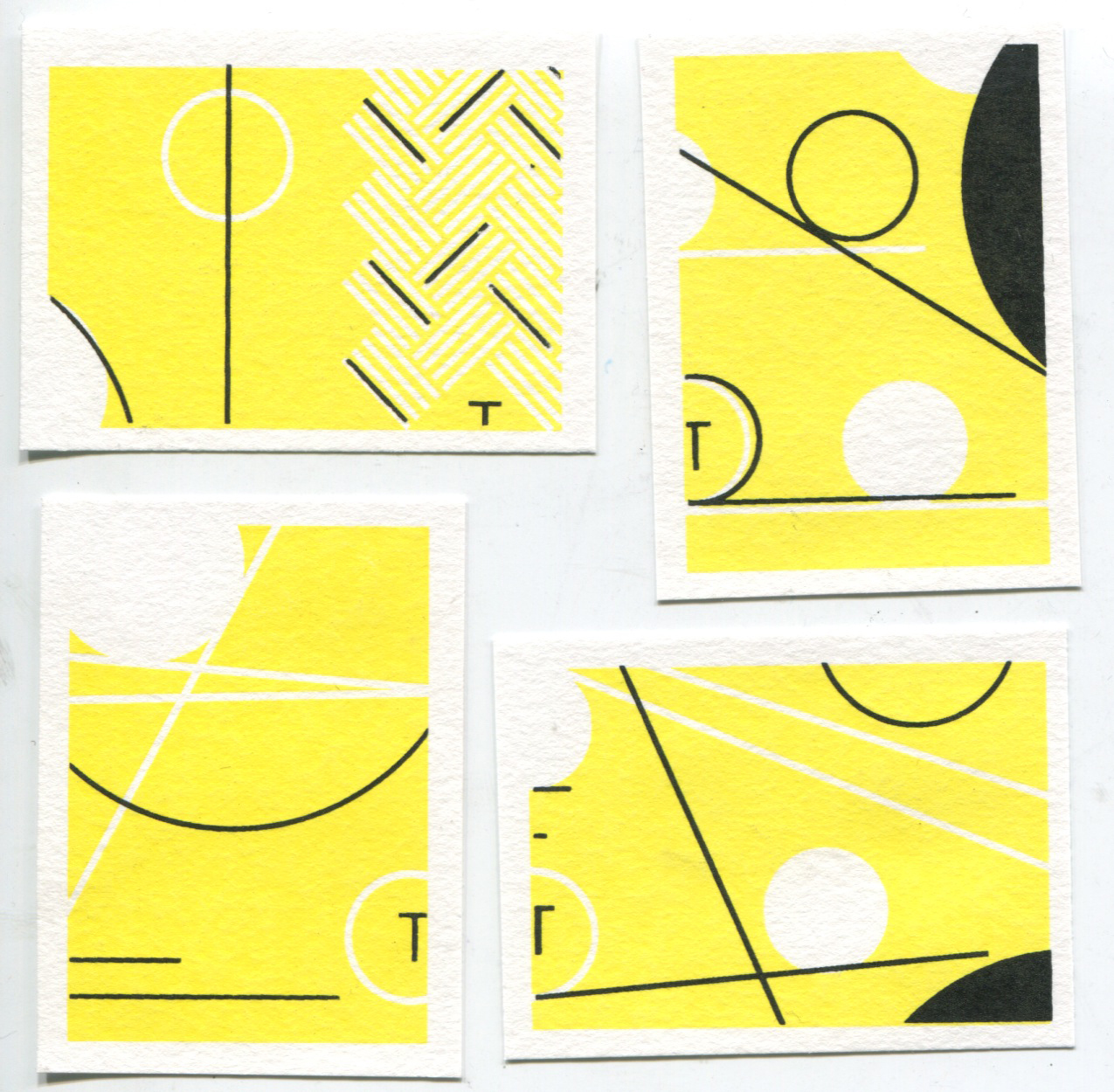 |
| Yellow postcard prints |
 |
| Final postcard print 1 |
Lines finishing in centre of page with the text represents Turing's idea that there was many solutions (end points) but one of of them was the actual correct one.
Representing the Banburism Turing invented, with the punched holes revealing the key, as well as the negative space leading to the correct answers- just like looking for a crib.
Representing the cable used to transfer data, as well as the crossing of data through physical cables and lines. Also overlay shows the revealing of answers, similarly to Banburism
Magenta linked to maroon drum, but showing the raw, essential nature of Turing's work
 |
| Final postcard print 2 |
 |
| Final postcard print 3 |
 |
| Final stamp prints |
Top left: Like postcard 3
Top right: Like postcard 2
Bottom left: Representing rotor sizes and circuit board
Bottom right: Like postcard 1
Encompassing all the elements of the postcards and stamps, with the blue completing the CMYK and linking to the blue drum on the bombe
Overall themes:
 |
| Final poster print |
 |
| Poster print detail |
 |
| Poster print quality |
- Negative space representing the punched paper, as well as almost all linking, like the physical paths of the data in Enigma and the Bombe
- Throughout the designs 5 circle sizes are used, but only 3 on each design, like the rotors or drums chosen on Enigma/the Bombe
- Lines and circles solely used, to represent the simple and precise nature of Turing' thought process.
- Tracks and paths act as a sort of map to Turing's mind, and how he comprehended solved the problems
No comments:
Post a Comment