I developed my favourite six of each composition to make 18 sketches which I could then get feedback on in an anonymous peer crit.
I found this really useful, as people were able to identify exactly which rough they prefered and why, which will help me develop my final ideas.
SQUARE:
What was successful?
- Moon, brain and hand offer the most fluid and pleasing compositions
- Detail in moon works well with the simple colour
- Think the colours really create the tone I want within these illustrations, as I want them to be calm yet active, and I think the fairly bright turquoise contrast with the dark grey/white whilst not fighting them on the page
What doesn't work?
- Layered up imagery- didn't really put much thought into this though- could try and develop for next project
- Overlapped type on moon- think it worked better as solid (or near solid) background, and the type doesn't offer a strong enough contrast
What did the feedback suggest?
- That I continue development with the equal moon (1) and brain (3)- maybe trying different media (The hand also scored high, but I think this works better as a landscape format)
LANDSCAPE:
What was successful?
- Like how the line of the content shows through the colour- helps add to Yutang's dedication to translation and equality through contrast
- Line of sight in hand (11) works well and really creates a flowing composition across the page
What doesn't work?
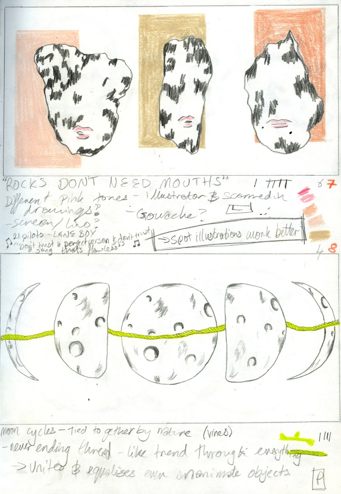
- Detail on moons and rocks lacking- need to draw more for prep for finals
- REMEMBER IT'S TWO COLOUR- make sure tones are of the same colour
What did the feedback suggest?
- That I develop the rocks with mouths (7) and hand (11) into final roughs
PORTRAIT:
What was successful?
- Like the compositions of 13 and 15, as they leave a lot of space and give the work room to breathe within the space
What doesn't work?
- 14, 15 and 16 were the ones I rushed near the end and were the roughs which no one really said they liked, which really taught me how important it is to put in the time and effort
- Struggled with this format the most, feel like I'm not using the space to help tell a narrative rather than just contain items
- Don't think I really put the messages across, they're a bit too simple/ambiguous- might be because they were the last set for me to do, so I had run out of ideas/enthusiasm?- plan time better!!
What did the feedback suggest?
- Some people really liked the rocks and vines (18) so I will develop this, I will then take some of the successful landscape ones and develop them as portraits, which will be the moons and vine (8) and equal rocks (9)
OVERALL:
What will I do next?
- Develop 1, 3, 7, 11 and 18, and try both 8 and 9 in portrait formats
- Experiment with different media- maybe gouache since I enjoyed it so much during the zine project?
- Research some editorial illustrators and how they play with image to make a narrative without words
What have I learnt?
- The importance of putting in the time and effort and not just 'getting it done' - my passion really shows through in my drawings
- Be respectful of the briefs- although last year I would change the brief if I didn't like it, this is different, the limits are there to teach us- two colours is difficult, but I will learn a lot from practising it
FEEDBACK:
I found this so useful, as the specific feedback enabled me to get a
clear idea of how people are receiving my work, which is something I really want to become more aware of during level 5.
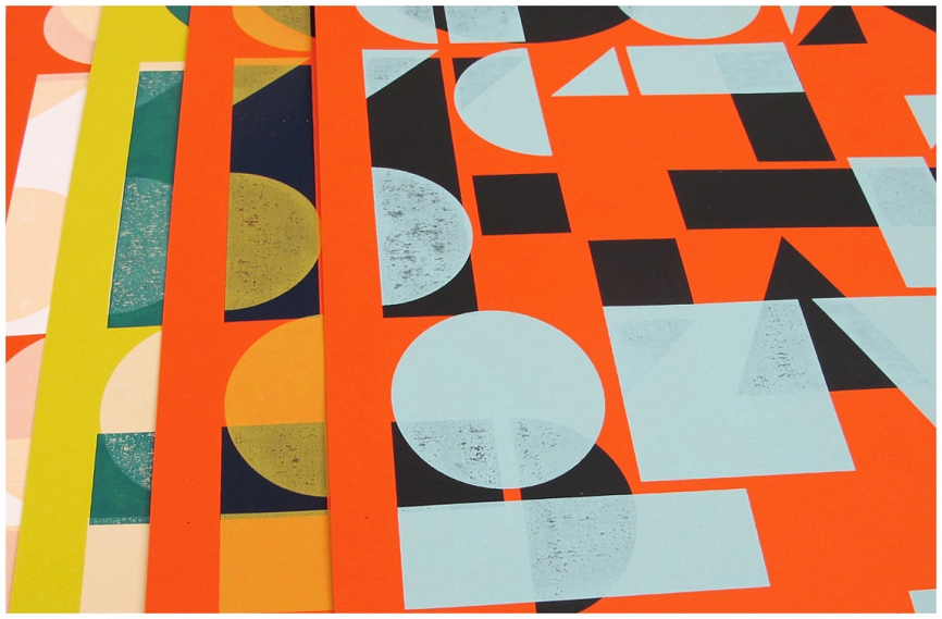
KATE GIBB:
After feedback from the last session, I looked at the work of Kate Gibb, who is a silkscreen artist and illustrator based in London.
I really love her
well thought out, yet easy layouts, as they seem so effortless, yet they offer a multitude of different, interesting compositions through the
overlaps and negative space.
I'm really interested in this overlapping of shapes and images, especially since it links so well to screen print, which is a process I thoroughly enjoy. Hopefully in this module I can play around with
overlapping of shapes and tones, as it's not something I do regularly in my work, but I would love to explore these processes and effects more throughout level 5.
Also, on a different tone, I like how Gibb describes herself as a silkscreen artist and illustrator, as I'm
struggling to 'place' myself within the creative industry, as I enjoy many different processes for different reasons, but I'm becoming more aware of people who combine practices and descriptions in their working process.