Monday, 8 May 2017
Sunday, 7 May 2017
Applied Illustration- Revisiting 504 skills
I looked back on my aims from the start of the module to see whether I had attained them, and it was really interesting:
One thing I will take forward from 504:
- I want to further explore print, especially in reference to colour and overlay
One way you will push yourself outside of your comfort zone in 505:
- By trying to incorporate more simple shapes into my work/ try to include character
One thing you want to accomplish by the end of May:
- I want to be more confident in my work, and strengthen my ability to pursue and execute ideas as tests without the stress of having them as finished outcomes necessarily
I feel like I have pushed myself a lot in this module, but I'm still avoiding character- maybe that just isn't an aspect of illustration I'm determined to work with!
Applied Illustration- Presentation
For submission, I made a couple of folders and a box to put my prints and mock ups into.
- I'm really happy that I had enough time to properly display my prints, as if I had just put them in clipped together they would have lost their polished feel, and I wouldn't have felt as positive about my submission
Applied Illustration- Time management
Revised timetable for April/May:
On reflection I didn't spend as much time on this module as I would have liked during April, but I did manage to sneak in periods of time to work on it which are not reflected on my timetable, as I really had the motivation to work on this project.
Saturday, 6 May 2017
Applied Illustration- Proposal revisit
At the end of my project, I thought it would be interesting to revisit my project proposal and make alterations to reflect the outcomes of my project.
It was a fairly interesting exercise, as most of the intent had stayed the same, due to me trying to stick to my proposal as much as possible, yet I did highlight a few changes. Most of all, as previously analysed, the audience to being more appropriate to women, and not feeling the need to expand the range to include other make up such as lipstick and mascara.
Overall I found writing and adhering to my own proposal a really interesting and fun experience, and I'm really looking forward to repeating it next year.
Applied Illustrations- Final Applications
Box mockups:
- I cut and constructed the nets I made earlier then photographed them in the studio, it was really useful to refer back to how we photographed my 503 project for this task
- Overall I'm really pleased with how the products and photos came out, as I think they offer a good overview of my products, and how they function
- Although it would have been a lot quicker to just use digital mock-ups, the fat I was forced into constructing them myself made me feel a lot more resolved about this product, and I ended up with far more appropriate photos
- I did, however, forget to print the 'In collaboration with Changing Faces' onto the lids, so I photoshopped them onto the photos after, and I think it gives a strong overview of the product and it's intent
Final Images:
Applied Illustration- Extra Applications
I thought a lot about what other applications I would have, as I didn't want to go over the top, but I wanted to show the versatilities of the designs
- I thought this application would make sense, as having a branded bag may make the range feel more like a luxury make up range rather than a prescription you get from a pharmacy, which is more similar to the current range
-The selling of prints was suggested by Bronte in my crit, and I feel like this is a very appropriate way to easily and cheaply raise money for the Changing Faces charity
- I also thought the selling of tote bags would be a good way to create a useful, tactical product which again may be an easy way to raise funds
- The primary function is decoration, but which will hopefully remind people of the campaign and link to the skin conditions, thus raising awareness of them, and helping people feel less alone living with the conditions
Applied Illustration- Poster mock up
- I made a set of three posters with information about the three skin conditions I was focusing on, I then mocked them up onto poster templates
- I wanted to focus on the wellbeing of the sufferer, with a secondary intent of informing the general public about a key issue with the condition
- I would imagine these posters would be displayed in GP surgeries, and similar healthcare places, where it is a difference to the normal medical information posters, which mirrors the beautiful uniqueness of the skin of people who have these conditions
Psoriasis:
Info from:
http://www.nhs.uk/Conditions/Psoriasis/Pages/Introduction.aspx
Rosacea:
Info from:
http://www.nhs.uk/conditions/Rosacea/Pages/Introduction.aspx
Vitiligo:
Info from:
http://www.nhs.uk/conditions/Vitiligo/Pages/Introduction.aspx
Applied Illustration- Design Board alterations
I'm working on my design boards and I'm finding it really difficult to decide which photos to show and how to promote my designs the best.
I played around with the layouts and asked for some feedback from my peers as to what I should include.
I've found this process really informative as to how to construct boards and show off the best of my work.
Friday, 5 May 2017
Applied Illustration- Nets
Nets for packaging:
- Because I really struggled with finding a mock up the correct format to show off all aspects of my design, I decided to make some nets and construct and photograph the outcomes
- I used Illustrator to make the net, which I then imported into Photoshop to put the artwork onto
- I really like how this highlights the difference between the three sets of prints, and should hopefully create my outcomes into more of a range, which is something I've been struggling with
- I asked my peer what to do about making the text more natural, and she suggested I turn it slightly grey to make it fit in more, which has worked well
Applied Illustration- Text mock ups
I started some mock ups including how to add text to my products:
I tried experimenting with different ways to incorporate the text into my product, through using white boxes, but I feel this looks quite dated.
I'm still struggling with how to make the text look more natural on the boxes, as I feel like it jumps off the design too much.
I think I will have to revisit the mock-ups later on and see if I can make the text sit more comfortably on the product
I used an existing product and altered it on photoshop to imagine how it would look reimagined with my designs
I like the overall feel of this, but the quality of it is quite low, meaning it can only be used quite small as a little taster, which is a shame, but I feel it does the purpose of showing my intent
- I tried to mock up some boxes for the product, but I feel they look like Washing Powder boxes. This may be due to the scale
- I also was unable to find any mock-ups for boxes with their lid open, so that I could show the inside of my lid
- I also want to expand my proposals into things which could help promote the skin conditions and what it really means to have them
Applied Illustration- Wellbeing
INTENT:
-Seeing the reaction on facebook to Katie Pipers documentary last night pushed me to want to add elements of positive text on my product.
- I want to utilise the inside of the lid to create a private, personal feeling message between the cover up cream and the user, and hopefully make them feel less alone in their struggles.
HOW:
- I tried scanning in china marker, then using photoshop brushes to create a handmade feel
WHAT:
- I really didn't like this outcome, as I felt it was too contrived and didn't offer the fluid, cheeky, personal vibe I wanted
- I decided to try cut paper to fit more with the feel of my prints, the positives of which were made using cut paper
HOW:
- I sketched out then used a scalpel to cut out my motifs from a plain colour paper
- I then scanned it in and used magic wand and selection tool to turn them into the colours of the print aspects
WHAT:
- I really like the rough, hand crafted feel to these motifs, and how that balances and links with the type, which is the same as the one on the outside
- I'm not sure if the blue will work as well as the pink, as it may become overbearing and not mirror the soft, embracing tone I want to show within my packaging
WHAT NEXT:
- Find some way to mock these up onto boxes to see how they function with the actual illustrations
Applied Illustration- Social Media
Last night I saw a facebook post of a clip of the Katie Piper documentary I watched last month and it made me very emotional.
The main thing that got to me was the diversity in the comments between people with vitiligo and people without.
So many people without the condition were saying how she was beautiful before and that the program 'was incredibly insensitive and disgraceful' for them to be covering up her white patches.
Meanwhile, people who suffered from vitiligo were saying how enlightening and empowering the program was and that the cover up creams offered a choice, which is often not given to them.
It made me really sad to see people who had unaffected skin criticising others for not proudly showing off their white spots, with no regard for how difficult it can be.
There were also others who angrily demanded people with vitiligo prove they have it, as it was not evident on their profile.
Since I suffer from the condition, I found it really sad to see people without the condition belittle it and state what they would do with it, or offer nonsense advice!
This has made me even more determined to create promotional good to educate others and show people with skin conditions that they are not alone. I also want to normalise the use of cover up creams, IF people want to use them, whether to give more confidence of just as a change.
Applied Illustration- Group Feedback
Quick mock-up I did last night of my poster idea |
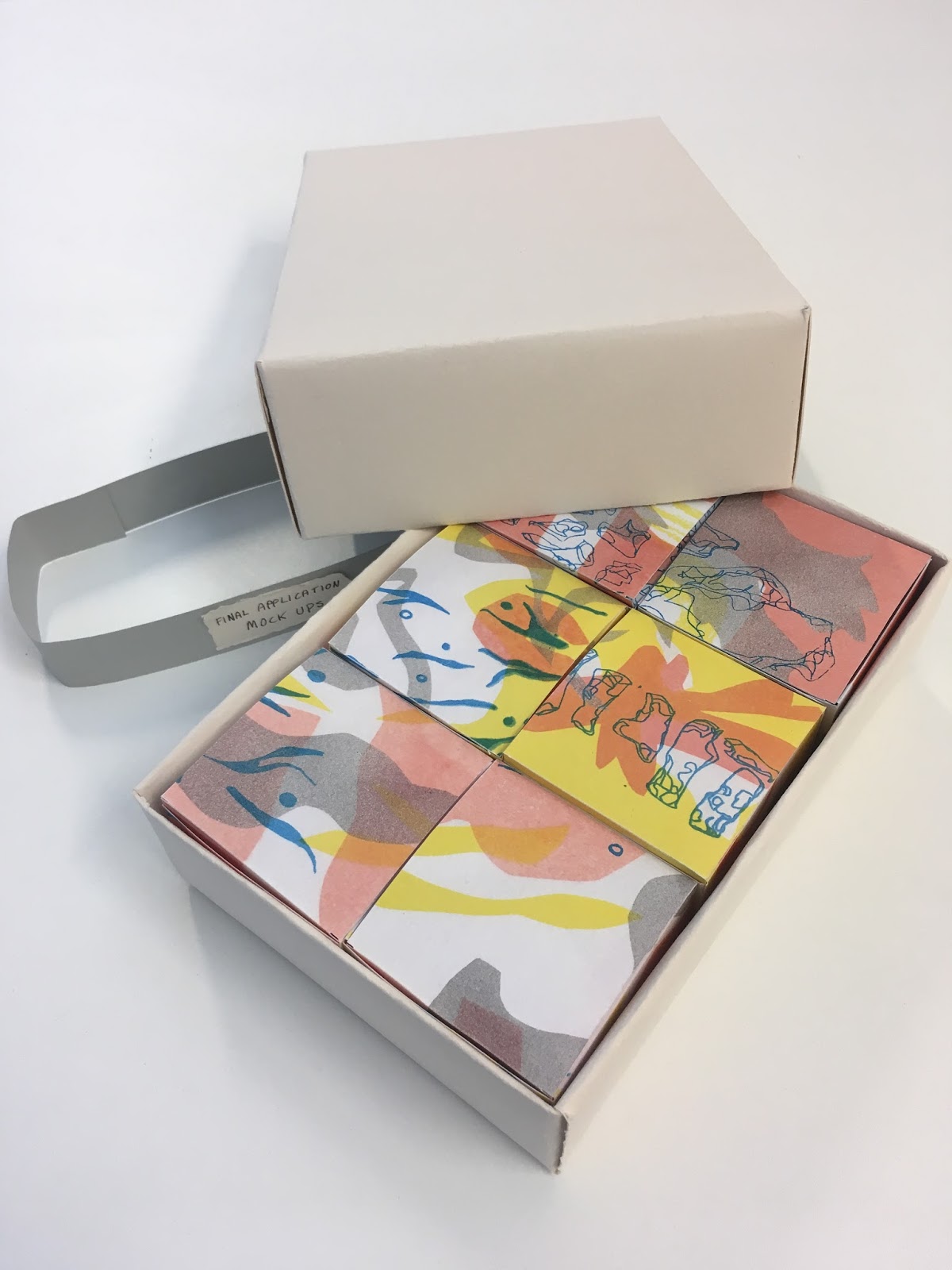
Current design boards:
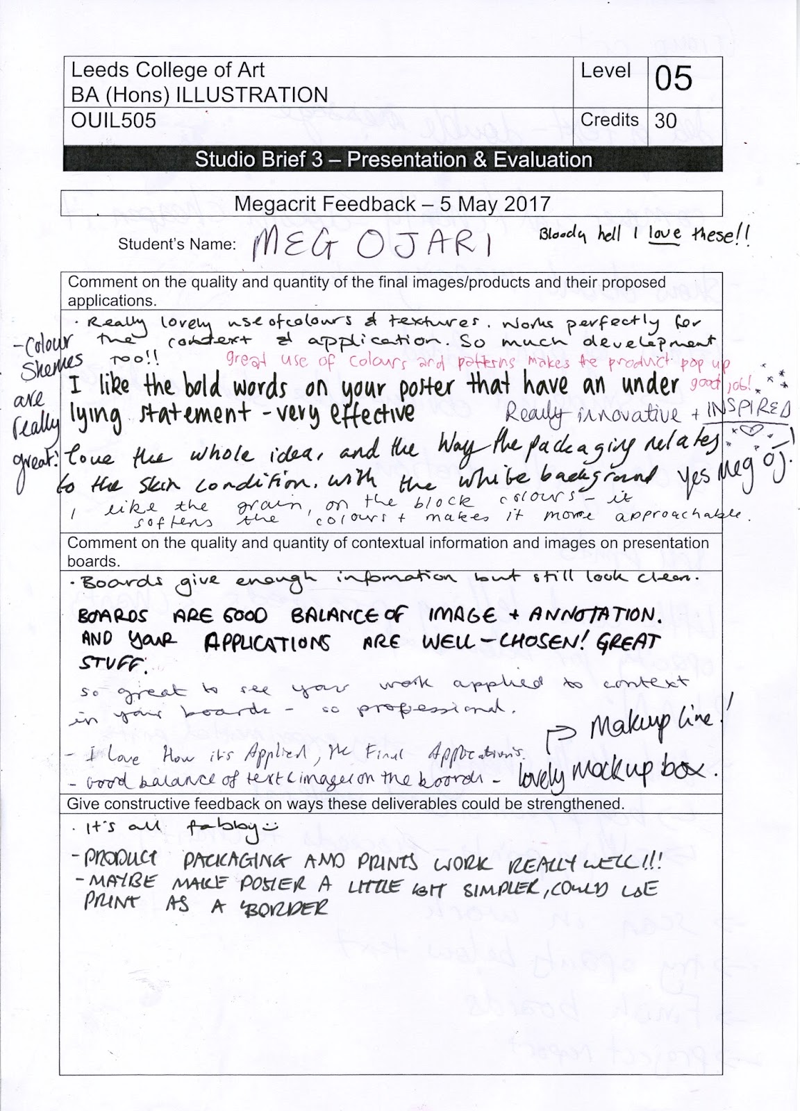
Mega crit feedback:
I found the mega crit really useful to gain some feedback on my current application proposals before I invested time into them, I also thought it was useful to see how other people had been working.
It was really interesting to consider how everyone had exactly the same starting point, and to see how wildly they have developed into personal projects
Pitch:
In my pitch, I talked about the key points of my project, which are:
- That the product is strongly linked to a charity, working alongside a camouflage cream producer
- That whilst I was drawing the skin conditions, I was reminded of flower shapes, and that vitiligo is often segmental, meaning it is mirrored across the body like butterfly wings
- That the shapes are all taken from skin conditions, flower shapes and butterfly wing patterns
- I also talked about how I was applying small amounts of text to the lid
I found the pitch immensely useful in myself clarifying my project and how I will tie it up in the coming days
Feedback:
- The poster received good feedback, with my intent being very evident, to show the use of Changing Faces, whilst offering non judgemental facts
- There was a lot of support for how my project isn't 'cheapened' by becoming packaging because of the strong links with the charity
- It was also suggested that I could expand my range further and propose selling prints to raise funds for the charity
- A lot of people said the prints reminded them of biology/skin, which I was really happy with
- In order to make my text fit onto the product better, Bronte suggested that I try to include a light transparency box underneath the text
- The grain of the print was praised, as the faded nature reminded a few people of how it is simple and not glaringly obvious, which can often be the case with skin conditions
Thursday, 4 May 2017
Applied Illustration- Packaging applications
I roughed up some potential packaging designs on the cheap printer, which highlighted some good points and negative, as well as gave me an overview as to how my illustrations would work as packaging designs.
I used some placeholder text to see how my prints would look in context
- I made a net on illustrator using notes from the workshop
- I definitely need to work on the type more, I asked my Graphic Design friend what the typeface was for the Veil brand, and he told me it was Helvetica Neue Bold, so I will use this in my future designs
- I want to incorporate the type onto the design more, perhaps through using frames
- I'm really keen on adding a small amount of text onto the lid of the box, so that when it is opened, the user gets a nice, empowering message, which hopefully will help with their emotional wellbeing about the condition
- I used a low res image of the branding to make it more cohesive with Veil, but I think the overall effect is a bit dated, and doesn't look as crisp as some of the packaging I found in my research
- I would like to make a more contemporary type design which fits with the message of the product more
- I would like to mimic the beauty products below in terms of text placement, which will increase the view of my products as supplementary and not necessary products
Subscribe to:
Posts (Atom)