Final set of six screen prints:
 |
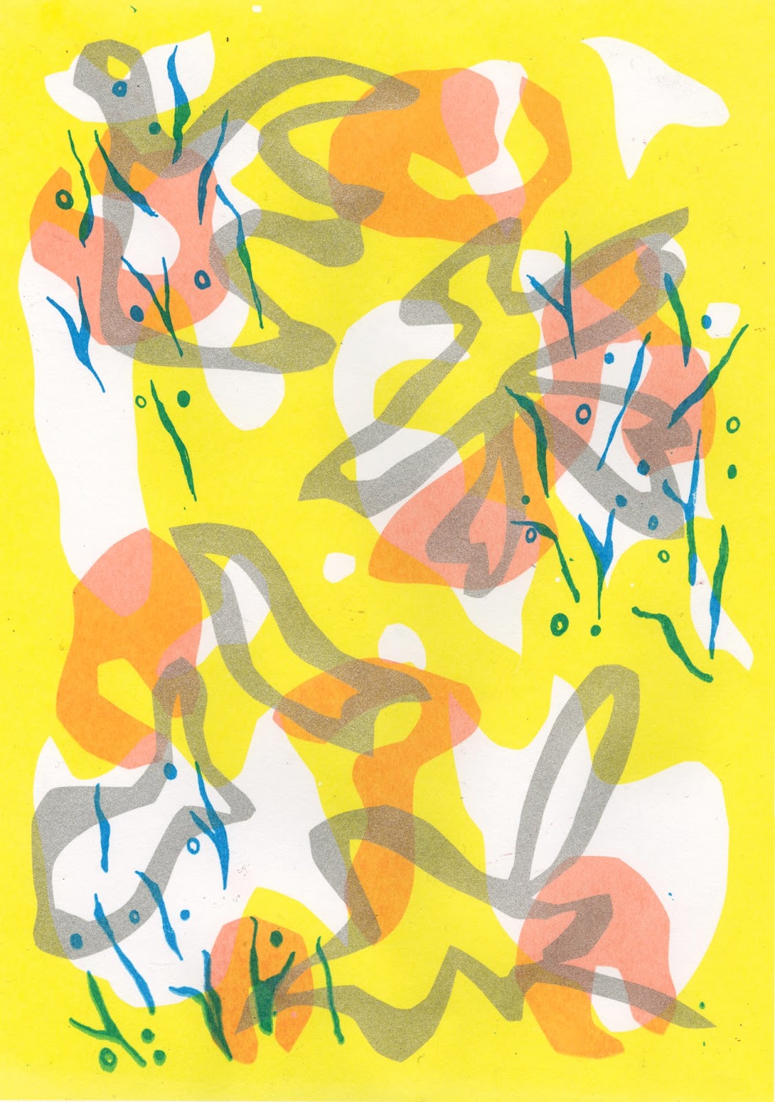
| Rosacea print |
- I feel this is my favourite outcome, as it has a dynamic and direct line of sight in the yellow and blue down the composition which draws the eye across the page
- I really like the transparency between the silver and the yellow, which really shows the pigment left by each colour way
- I could have added more blue detail to the pieces to create a stronger link between the four colours
 |
| Rosacea print |
- The overlap of different colours works well to create a multi tonal outcome, but I feel the yellow gets slightly lost behind the darker tones of the silver
 |
| Psoriasis print |
- The silver elements disappear slightly once scanned in, maybe I should have used foiling, but I didn't have time, which is a shame
 |
| Psoriasis print |
- I'm not sure about the yellow china marker lines, as I feel it is very different to the other pieces, but then I suppose this highlights the differences between everyones skin
- I like the psoriasis line overlay, as I feel it adds a soft, not too overbearing detail which highlights the beautiful forms in the condition
 |
| Vitiligo print |
- I also like the difference between thickness of line in the different layers, as it shows the irregularities between the skins pigments and appearances
 |
| Vitiligo print |
- I feel like I could have made the blue lines more fluid across the page and less 'clumpy'
Overall, I'm really happy with the outcome of these pieces, but I feel like if I had more time to work on making the positives, I could have been more accurate to my roughs and feel more natural. This was an important lesson in time management and finding time to use the resources I need
No comments:
Post a Comment