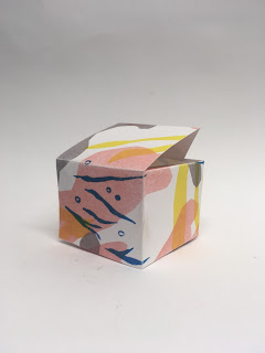
I roughed up some potential packaging designs on the cheap printer, which highlighted some good points and negative, as well as gave me an overview as to how my illustrations would work as packaging designs.
I used some placeholder text to see how my prints would look in context
- I made a net on illustrator using notes from the workshop
- I definitely need to work on the type more, I asked my Graphic Design friend what the typeface was for the Veil brand, and he told me it was Helvetica Neue Bold, so I will use this in my future designs
- I want to incorporate the type onto the design more, perhaps through using frames
- I'm really keen on adding a small amount of text onto the lid of the box, so that when it is opened, the user gets a nice, empowering message, which hopefully will help with their emotional wellbeing about the condition
- I used a low res image of the branding to make it more cohesive with Veil, but I think the overall effect is a bit dated, and doesn't look as crisp as some of the packaging I found in my research
- I would like to make a more contemporary type design which fits with the message of the product more
- I would like to mimic the beauty products below in terms of text placement, which will increase the view of my products as supplementary and not necessary products


No comments:
Post a Comment