I was approached by a Graphic Design student to collaborate on a packaging design project.
 |
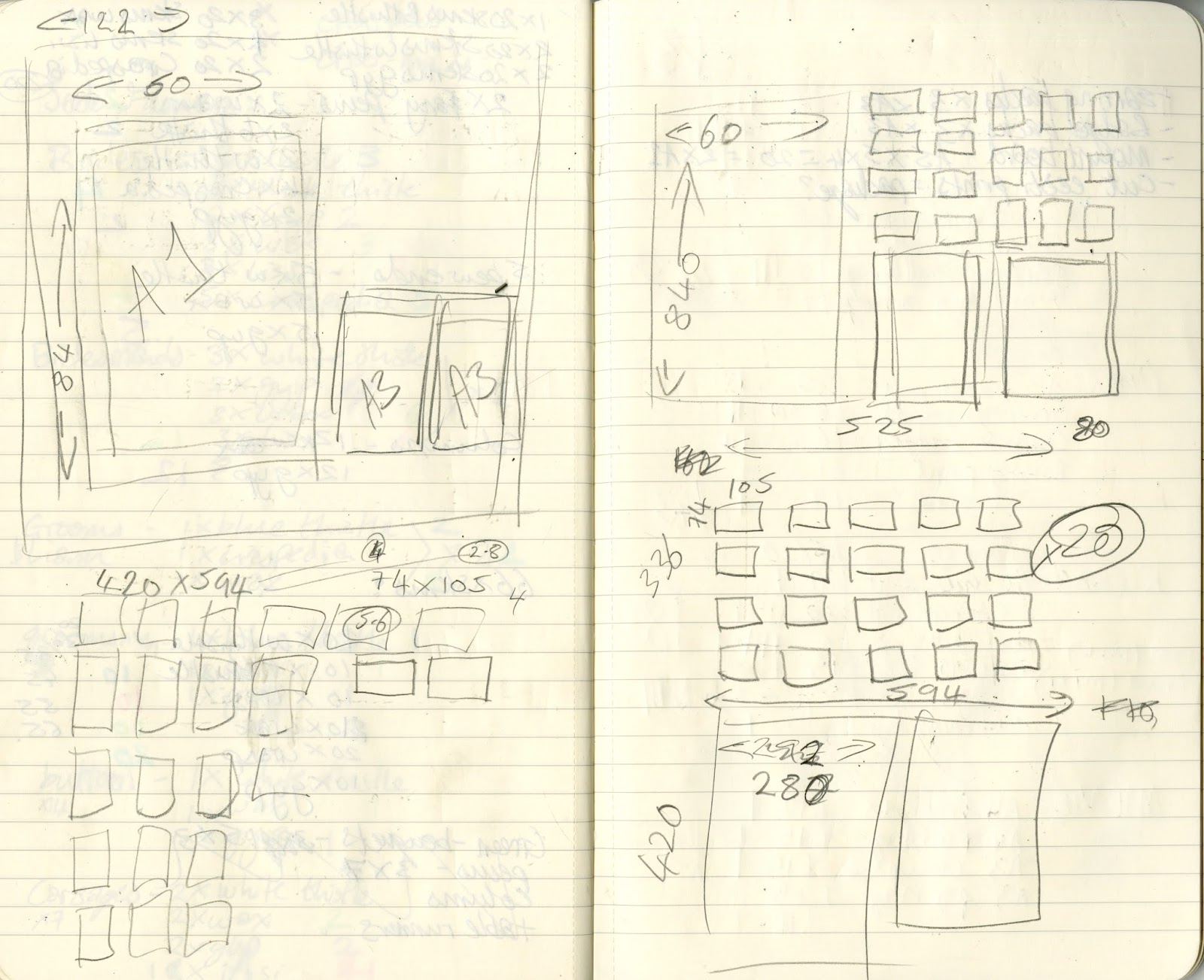
| Initial roughs |
 |
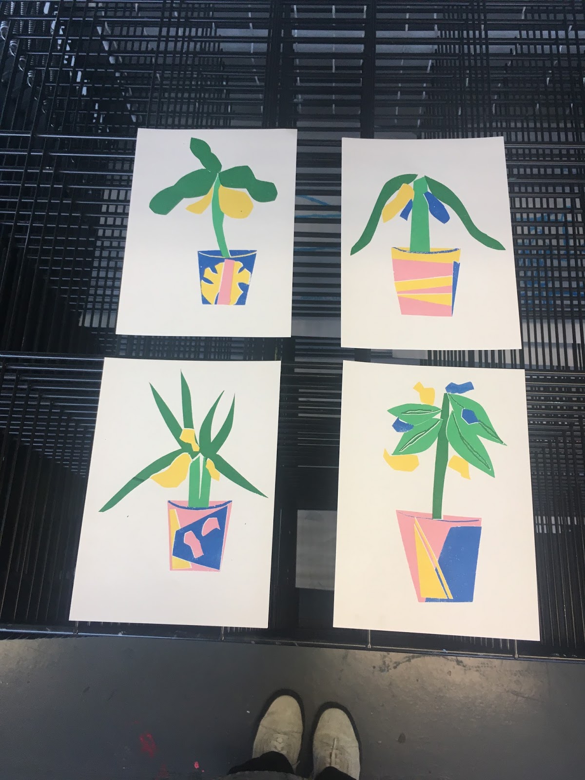
| Initial paper cut |
INTENT:
-I thought carefully before undertaking it, as I knew I didn't want to push myself further than I could work, especially this close to the end of term
- I was very honest about my time limits, I said that I was really eager to work with her, but I would need her to provide the ideas, I would then do the artwork, send it on and then just have her finish the designs without my input
- I feel that setting this out from the start meant I wasn't trying to fit to schedules and outcomes which were difficult for me, and I could easily produce and finish the artwork without much stress
INSPIRATION:
- Healthy fruit and vegetable juice design
- I got given a list of the flavours to illustrate using cut paper
- Having learnt from last time, before I started, I cleared up exactly what media and colours she wanted me to use, so that I wasn't wasting time creating images which wouldn't be used
GOALS:
- To deliver three repeat pattern designs for my partner to incorporate into a juice packaging design
- To work effectively with a designer and set out firm limits
- To say no if it was too much!