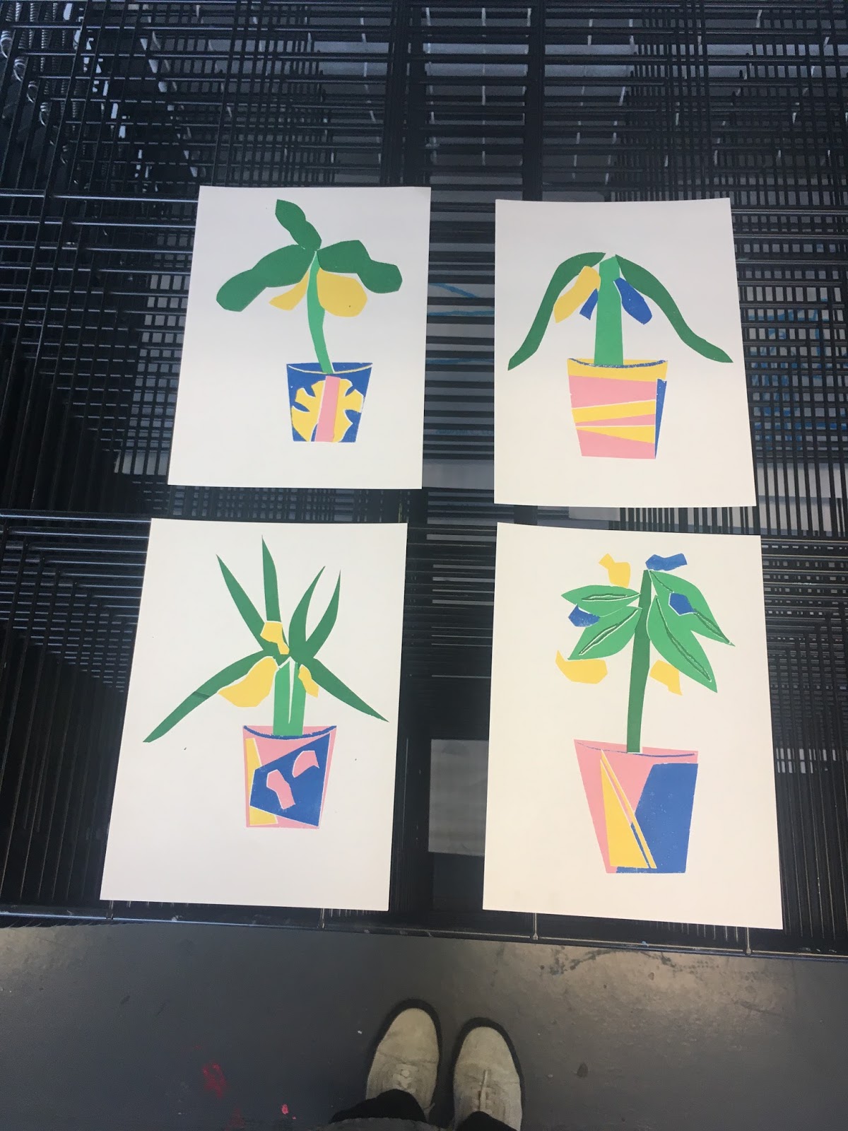
I paper cut some funky shapes to use as a starting point, as the workshop was also for painting the pots.


I then screen printed the outcomes, so that I could sell them at Print Stuff next weekend.

I asked for advice from my friend of Graphic Design about the poster, and came up with this design:

POSITIVES:
- I really like the printed effect and slight mis-registration, and how this gives character and charm to the images
- I think the colours are really vibrant yet still hold the calming effect that I wanted from the posters
- I'm pleased with how easy the printing process was, as I set them so that I printed 5 A3 and them cut them afterwards, which is a really effective way for me to print
NEGATIVES:
- On some of the prints the registration is a little too off, looking slightly messy
- On some of them there are small dots of ink in the white space where it has come through by mistake
No comments:
Post a Comment