Friday, 31 March 2017

Responsive - Final crit

For the final crit, I had some design boards ready, and I found it really helpful to get feedback on the design of them, as it's the first time I have attempted design boards.

Individual boards:


Collaborative boards:


Feedback:


What next?
- Change headings- take up too much room
- More legible font?
- Try strips of colour- looks good on others boards

Tuesday, 28 March 2017

Applied Illustration - Mega crit

I was really pleased with the feedback I received today, as I was feeling confident in my roughs and print that I had to show.

The main feedback was:
- Really liked the layering of shapes
- Big painting colourful and grabbed peoples attention
- The textures of the collage worked well
- Liked the colours and overlap of the prints
- Need to experiment with more media

Because of this, I will:
- Experiment with colour palettes and how these affect the mood of the work
- Use more media and broaden how I approach the physical construction of my work
- Try new compositions with cut paper

Monday, 27 March 2017

Applied Illustration - Roughs

INTENT:
- To design and layout compositions for my final outcomes
- To show different aspects of skin conditions juxtaposed with imagery from flowers and butterflies

HOW:
- By using textured cut paper made in the print room, I was able to play with different compositions quickly and ensure it worked before I stuck it down

WHY:
- I found using a mix of pencil roughs and physically cut paper a great method to actively explore how to create a composition which showed off the shapes both individually and as a whole picture
- I wanted to explore different ways of roughing, as since my project is so much about shapes, I thought it would be best to experiment which cut out shapes
- By using print textured paper, I ensured that my images weren't too flat, and stood off the page
- I wanted to see how I could use layering to juxtapose the colours and textures to highlight the differences in peoples skin

WHAT NEXT:
- Refine designs to include an even amount of elements on each design so that they are cohesive
- Reflect on the composition and refine their placement
- Develop a strong colour palette to unite the designs, but differs to alter mood

Negative space used to explore colour compositions


Roughs of compositions 


Yellow- Vitiligo
Pink- Flowers
Silver- Butterfly wings


Yellow- Vitiligo
Pink- Butterfly wings
Silver- Flower outlines


Pink and green- Butterfly wings
Yellow- Flowers
Black- Psoriasis


Pink and green- Butterfly wings
Yellow- Flowers
Black- Psoriasis


Purple- Flowers
Yellow- Butterfly wings
Blue- Rosacea


Purple- Flowers
Yellow- Butterfly wings
Blue- Rosacea

Saturday, 25 March 2017

Responsive - Collaboration submission boards

These are the boards we submitted to for our collaborative brief:


Overall, I have loved working as part of a team, and found it a really useful way to embark on a large project with a fairly quick deadline.
Both of my partners were really easy to work with and I feel like we shared the work in an even manner and were able to use each others strengths to our advantage.
I also learnt a great deal about different Adobe tools as well as ways of working as a group. I would definitely like to work as part of a group again, as long as I was able to choose my partners again, as I feel our real strength was how we got along and had the same strong work ethic.

Applied Illustration- Louise Lockhart

I attended a lecture from Louise Lockhart, and afterward took the opportunity to ask her a few questions about her work, which was a really beneficial experience.


WHAT STOOD OUT:
- Her use of texture and layering to make her work feel handmade and unique
- How much she puts of her energy into her work, she's so passionate and really dedicated to her work
- How lost she was at uni, she says that she had no idea how she was going to become an illustrator until after she graduated
- Her application of images onto packaging, and how she uses this to make money

WHAT WILL I DO:
- I will look into ways to replicate the screen print texture and make unique looking work quickly
- Continue to have fun and experiment as much as possible whilst I have the opportunity at uni
- Think about ways to apply my outcomes to packaging, and how tabs, lids etc can be used to make the outcomes feel more professional

Friday, 24 March 2017

Responsive - Collaboration creative partners form

It is interesting to reflect back on this after the completion of the project to see what went with the plan and what we improvised throughout

WHAT WORKED:
- Nicky working on the UI/UX, as he has the most experience in it and was able to create a very professional outcome
- Being solely responsible for the image creation meant I was able to quickly follow my direction and visualise what we had decided on within the group
- My research trip was a really beneficial way to gather valuable feedback, as well as get a very clear direction to head in
- Working with Graphic Designers was fantastic, as they really taught me a lot about typography and software use

WHAT CHANGED:
- One of Anna's main roles was created after my research trip, which was to independently make the tastecard, and ensuring it worked with the rest of the packaging
- We all worked on the layout of the net for the packaging in order to ensure we were all happy with the outcome 

REFLECTIONS:
- Splitting up the tasks according to our strengths meant we were able to quickly complete tasks, before getting feedback and altering them again
- By leaving the individual tasks fairly separate but  broad, we were able to undertake more tasks, such as the tastecard, later on in development, as we weren't all pushed to finish small, interlinked tasks


Responsive- Collaboration final outcomes

Final edited photos of final outcomes:


Communication methods:

The main way we communicated with each other was via a Facebook Messenger group, as we were able to quickly get responses, as well as ongoing feedback via sending quick screenshots.

We also had a shared Google Drive folder where we could put any kind of files which needed to be good quality or worked on by another member of the group. Also, it meant we had a recorded space for all of our work, so if we needed an old file it was easy to locate.

Shared Google Drive folder

Facebook Group Chat

Wednesday, 22 March 2017

Applied Illustration- Artist Research

I really found the work of Teruhide Kato inspirational, as I think it really reminds me of the negative space I had tried to capture in my prints, and how this builds up a picture.

Although I do think the colours would be too dark for my applications, and I need to ensure I keep my colours fairly pastel and uplifting as much as possible.

I also like the layering effect in Kato's work, and how this adds a huge amount of depth to the piece, which is something I would like to include in my work so that it is not just a flat image.


Responsive- Collaboration Submission

We submitted!! 

It feels like such a huge weight has gone, despite how nervous I am that we missed something off!

It has been such a great experience of working with live briefs and sticking to strict guidelines and deadlines. I've also really enjoyed working as part of this team, which is different to how I normally feel about collaborative projects, but I think it was down to clear communication on all parts, and having two skilled Graphic Designers in my team who did great work on time.


Monday, 20 March 2017

Applied Illustration - Print tests

Stencil tests:


- Using some off-cuts from monoprinting I played around with composition and colourways to make simple outcomes
- I like the effect of the yellow against the flatter, bolder colours, which highlights the difference between starkness of pigments, like in the condition of vitiligo
- The red against the silver works best compositionally, as the yellow acts almost as a shadow to the negative space and grounds the work onto the page


Monoprint tests:


- By exploring my designs through quick print methods, I was able to see a more physical, permanent outcome which brings my different shapes into one cohesive design
- I like the overlay of shapes to reveal different colours and textures, which mimic the textures of skin
- I think the print quality is not too successful, as there are transparencies which evident double printing from the stencils. I need to ensure I leave the prints time to dry before printing on top in the future

Responsive- Collaboration final tweaks

We met up today for a quick meeting to sort out the final issues with our design, including putting a small note to indicate the user should unfold and keep the sleeve as a poster.

We also discussed the design boards Nicky is working on and prepared all the files to print tomorrow.

Monday:
- Nicky to do as much design boards as possible
- Anna to finish and upload tastecard
- Me to write blurbs to go with submission

Tuesday:
- All to print design
- Me to make it
- Possibly photograph depending on equipment store opening times
- Nicky to finish design boards

Wednesday: 
- Photograph if not had the chance on Tuesday
- Check over design boards and entry
- SUBMIT!

Friday, 17 March 2017

Applied Illustration- Development

Developed drawings:


Today I spent hours drawing butterflies and flowers the motifs that both myself and other people associated with the skin conditions I'm focusing on, which were.

I used both books and primary stimuli (of flowers) to capture wildly different shapes and lines.

Books from the library for secondary research


What helped?
- I realised a lot of similarities between the shapes I was drawing for butterflies and vitiligo, as it is normally a symmetrical skin condition
- I found drawing these beautiful shapes made me more fluid in the movement of drawing the actual skin conditions, and realise how beautiful they are
- As I developed the drawings and used overlapping colours, I began to think about compositions and how I could best create a meaningful pattern

What worked?
- The collages I made after the extensive drawing session (below) are far more developed and advanced than the collage I made last week
- I feel my pieces from today have a real purpose and express my intent of beauty within these skin conditions
- The colours I used I feel work well to create a harmonious but contemporary feel
- The overlapping of shapes builds up a unique pattern, which mirrors the uniqueness of the person using the cream

What next?
- I would still like to try these as screen prints if I have the time
- I need to develop a set of six, perhaps each focusing on a different condition
- TRY PRINTING
- Have fun and just explore!


Wednesday, 15 March 2017

Responsive- Collaboration progress

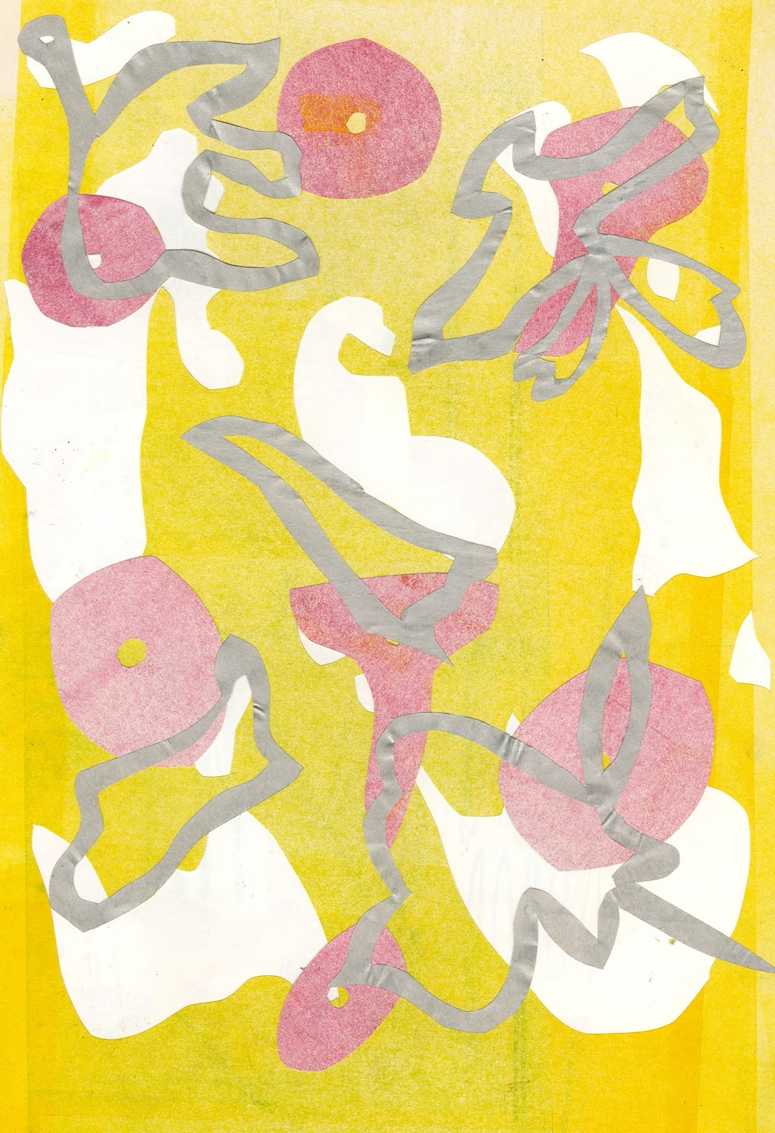
Today I printed my lino cut in two slightly different outcomes, which I then scanned in and altered using select colour range and fill with the colours eye dropped from my screen print.


WHAT WORKED?
- Dropping the colours in afterwards worked to same a lot of time, which I really need to focus on with so much work from Applied Illustration still to do
- Trying the less blocked lino first before cutting into it to get two possible outcomes
- Quickly developing a few patterns, which can then be cut down to the necessary ones, without stressing about getting the patterns perfect each try


We then worked on the net of the product:


We sat together for nearly 4 hours to really nail down the design of the box.

There was a lot of ideas mixing and bouncing off each other, and I thought it was great to have that natural development through conversation and trialling to get an outcome we were all happy with.

POSITIVES:
- Simplicity on tray harks to their simple brand ethos
- Elements of hidden texts adhere to brand guidelines
- Hidden print on inside of sleeve creates an element to keep

NEGATIVES:
- Perhaps include text detailing to unfold and keep print?
- Colours of print and lino don't align precisely on some monitors, will have to see how this prints


Finally, I printed and made up the design on a thick paper in black and white to see how the registration worked:


What needs changing?
- Registration of corners on inner tray need to align better
- Alignment of two sided printing needs fine tuning
- Bottom tray printed upside down

What works?
- Layout of going going gone! on bottom tray
- Simplicity of bottom tray sides and base
- Precision of fitting the images to the net, and how they work on a 3D form


NEXT STEPS:
- Nicky/Anna to do design boards
- Nicky/Anna to alter designs slightly to reflect issues
- All to print on Tuesday
- Me to assemble on Tuesday
- All to photograph on Wednesday
- All to create submission file on Wednesday