I've FINALLY submitted my penguin designs.
I lost track of how many times I revised and redesigned my covers, and ideally I would have liked to have spent more time on them, but overall I'm pleased I got them done and handed in.
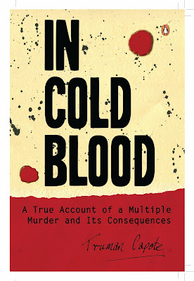
Out of all three, my In Cold Blood cover is my least favourite, and I would have liked to spend more time on it
WHAT WORKED:
- Bold colours contrast well to show the starkness of the books reality
- The connotations of the design subtly communicate the 'four gunshot wounds and a knife cut' from the attack
- The difference in type works to show different weights of importance
- Handmade element lends to the brutal, animalistic way these murders were committed
WHAT DIDN'T WORK:
- Think the cream and red is too overdone, its seems slightly childish
- Doesn't really reflect the seriousness and reality of the content
- I could have spent more time working on the type to ensure it shows the personality I want it to
- The text of the authors name is not incredibly legible, especially on the spine
WHAT HAVE I LEARNT:
- To consider all elements equally, and how they will impact on the overall design
- To trial different type and ideas before settling on one
- To allow extra time to finish off and tweak my design
WHAT WORKED:
- The childlike elements of the design, and how this reflects the nostalgia of this classic book
- Using textures ensures it is different to most books and adds a USP to the design
- The mix of Hand rendered type and digital highlights the childlike values, whilst not seeming too childish
- Keeping the shadows and textures throughout ensures there are several different tactile elements to it, which will hopefully engage and interest the reader
WHAT DIDN'T WORK:
- I used the Multiply tool to remove the white around the images, but it means the wood texture shows through, which distracts from the difference in colours and media used
- The shape of the paper on the back, I used the lined paper I already had, but I wish I had some squarer pieces so that the composition was a bit more balanced
- The hand rendered type is in places a little messy, and although this adds to the feel, it may be a little bit hard to read at times
WHAT HAVE I LEARNT:
- Working on screen can be beneficial to just fine tune placement etc
- Important to keep documenting changes as I go to see where and why I changed things
- To investigate new tools on software that will help me achieve my desired outcomes
- Important to keep documenting changes as I go to see where and why I changed things
- To investigate new tools on software that will help me achieve my desired outcomes
WHAT WORKED:
- Simple, yet I think it fits the brief by strongly referring to the text inside, which is obviously such a valued classic
- The colours, I feel, symbolise the new age and freedom referenced within the book, but with such a dark background keep the text solidly on the page, never to escape
- The text is really legible, and has a definite place on the page
- The decision to use the cream of the page rather than white has added a nice twist from the normal black and white, with obvious connotations
WHAT DIDN'T WORK:
- I could have developed this further, I still really like my initial idea to form the words from the text, but it did make the legibility very poor
- I could have included an element on the back, as it is just very simplistic
- I would have liked to have a design spread across the whole cover, like in my other designs
WHAT HAVE I LEARNT:
- To consider the legibility above all else
- To develop more roughs and varying ideas before starting to design
- To think about the interactive element of book covers, and how my designs could work alongside this


No comments:
Post a Comment