- To design and layout compositions for my final outcomes
- To show different aspects of skin conditions juxtaposed with imagery from flowers and butterflies
HOW:
- By using textured cut paper made in the print room, I was able to play with different compositions quickly and ensure it worked before I stuck it down
WHY:
- I found using a mix of pencil roughs and physically cut paper a great method to actively explore how to create a composition which showed off the shapes both individually and as a whole picture
- I wanted to explore different ways of roughing, as since my project is so much about shapes, I thought it would be best to experiment which cut out shapes
- By using print textured paper, I ensured that my images weren't too flat, and stood off the page
- I wanted to see how I could use layering to juxtapose the colours and textures to highlight the differences in peoples skin
WHAT NEXT:
- Refine designs to include an even amount of elements on each design so that they are cohesive
- Reflect on the composition and refine their placement
- Develop a strong colour palette to unite the designs, but differs to alter mood

Negative space used to explore colour compositions


Roughs of compositions

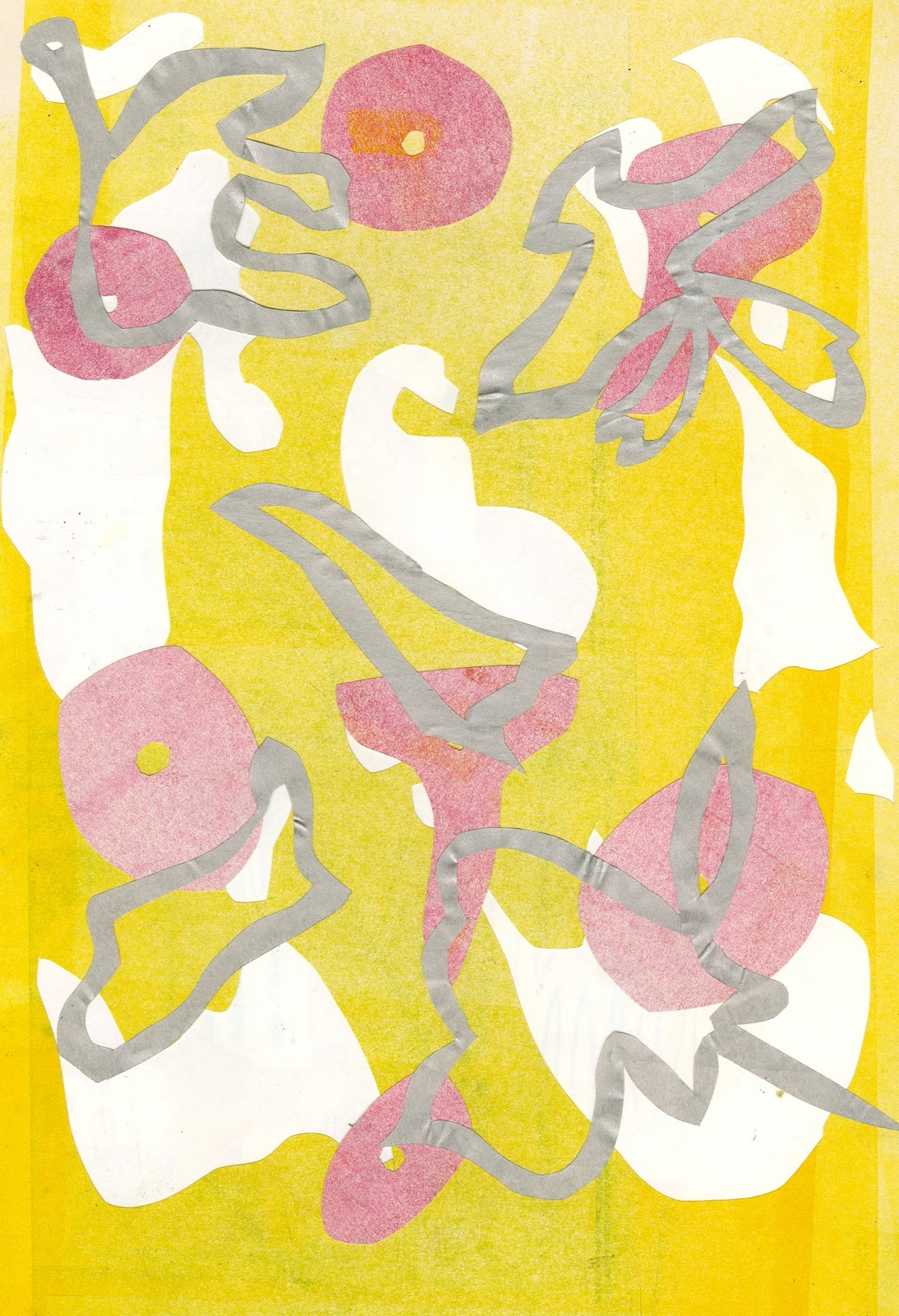
Yellow- Vitiligo
Pink- Flowers
Silver- Butterfly wings
Yellow- Vitiligo
Pink- Butterfly wings
Silver- Flower outlines

Pink and green- Butterfly wings
Yellow- Flowers
Black- Psoriasis

Pink and green- Butterfly wings
Yellow- Flowers
Black- Psoriasis

Purple- Flowers
Yellow- Butterfly wings
Blue- Rosacea

Purple- Flowers
Yellow- Butterfly wings
Blue- Rosacea
No comments:
Post a Comment