WHAT WORKED?
- Dropping the colours in afterwards worked to same a lot of time, which I really need to focus on with so much work from Applied Illustration still to do
- Trying the less blocked lino first before cutting into it to get two possible outcomes
- Quickly developing a few patterns, which can then be cut down to the necessary ones, without stressing about getting the patterns perfect each try
We then worked on the net of the product:
We sat together for nearly 4 hours to really nail down the design of the box.
There was a lot of ideas mixing and bouncing off each other, and I thought it was great to have that natural development through conversation and trialling to get an outcome we were all happy with.
POSITIVES:
- Simplicity on tray harks to their simple brand ethos
- Elements of hidden texts adhere to brand guidelines
- Hidden print on inside of sleeve creates an element to keep
NEGATIVES:
- Perhaps include text detailing to unfold and keep print?
- Colours of print and lino don't align precisely on some monitors, will have to see how this prints
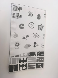
Finally, I printed and made up the design on a thick paper in black and white to see how the registration worked:
What needs changing?
- Registration of corners on inner tray need to align better
- Alignment of two sided printing needs fine tuning
- Bottom tray printed upside down
What works?
- Layout of going going gone! on bottom tray
- Simplicity of bottom tray sides and base
- Precision of fitting the images to the net, and how they work on a 3D form
NEXT STEPS:
- Nicky/Anna to do design boards
- Nicky/Anna to alter designs slightly to reflect issues
- All to print on Tuesday
- Me to assemble on Tuesday
- All to photograph on Wednesday
- All to create submission file on Wednesday


No comments:
Post a Comment