Today we had our first proper meeting with everyone in our collaboration group, and I was feeling a bit behind the other groups, but the meeting was really helpful.
Some research into the company:
Support St Clare hospice charity – for adults with life limiting illnesses
Don’t test on animals
All products are recyclable/made from recycled products
Pro EU
GUCC abbreviation used
Environmental concerns:
Use local suppliers for packaging, ingredients and transport
Efficient hot steam use to reduce water usage
Melt and reuse any unused chocolate
Miss shaped become samples
Aim to further reduce packaging and waste once they grow as a company
Ran competition for ‘funniest childhood story’
Likes character and humour
Have knitted character ‘mascot’
Core themes:
Environmentally friendly
Easy and cheap to produce
Humorous and fun
Unique and personal
Some thoughts I had before the session:
- Where does the chocolate originate?- they want it to be local, but are pro EU, 'British' may have bad connotations
-
Handmade
-
Environmentally friendly
-
Want to recreate childhood for adults - think of style- accessible
- Important to be
practical- arrive on rolls
- Could be based on factory/people who make it?
- Would be nice to have element of blank space to fit with style
- All in the crafting
- Pick theme- like they have with photos of kids
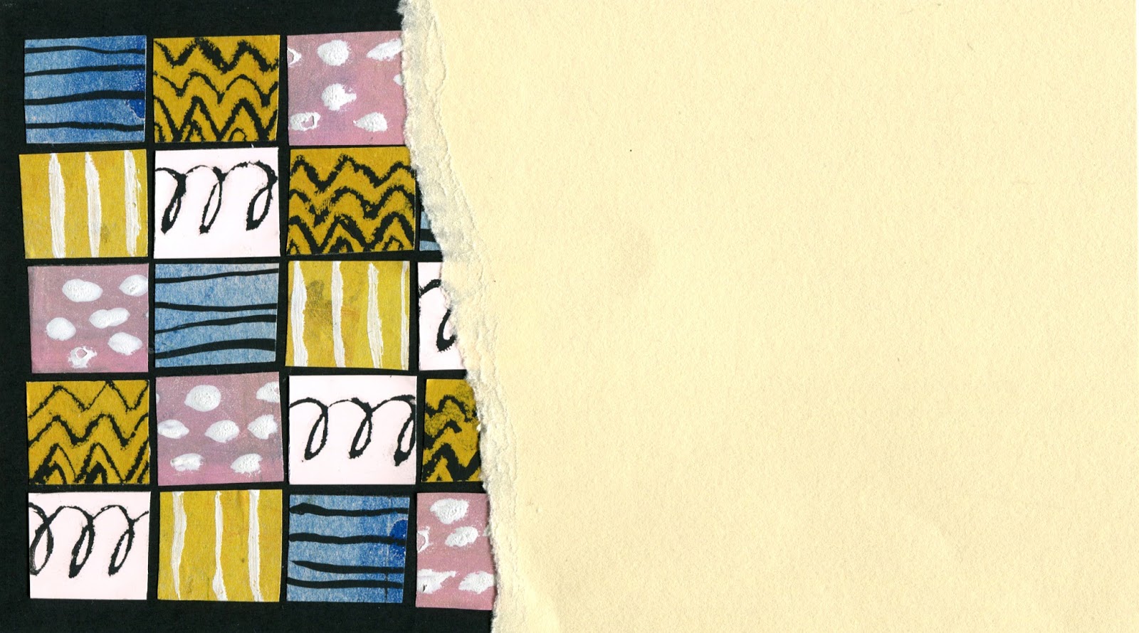
- Screenprint/letterpress?
- 'Adult' shapes made into playful kids imagery?
- Kids imagery with adult colours
- Could we use edges cleverly, perhaps pattern on them- isolating?
Also, I managed to make a (very) rough mock up of the packaging we are designing, which helped us to visualise how and where we could create artwork and how our designs could work:
We discussed our ideas, research and came up with a loose action plan before we meet later on in the week.
- Could we consider a strong link to St Clares, the charity they support?
- We were all keen on using
pattern rather than images, as this would offer a more 'luxurious' and ambiguous outcome
- Could focus on things kids don't like to make sure they don't open it (adds humour)
- Could we include an element of personalisation into the actual outer box? e.g. if given as a gift
- Could construct patterns to be reminiscent of chocolate bars? e.g. strips/grid pattern
- Have
half of the cover ripping off to reveal the patterned chocolate (a bit like Charlie and the Chocolate factory style) with cover being simple and fitting into their theme
- Potential for using colours from their range to tie together whilst still being colourful
-
Simple design will keep costs down (and be more environmentally friendly)
Things we highlighted:
-
'Allude to the mystery of what might be inside'
- Not sure where GUCC sits- says it's not for kids yet has children on the wrapper, we thought this could be to make it appealing to everyone, but ascertain that it is for adults and is luxury, therefore setting it apart from mainstream chocolate companies
- Chocolate seems to have a
strong 'retro' trend at the moment, we would like to subtly nod to that whilst still maintaining the companies ethos
- What do we want the content to be- not just random patterns
- Chocolates are
personalised
We struggled on this last point for a while, before deciding to
make a questionnaire for our peers to see 'what items or activities remind you of your childhood?' which we will hopefully be able to pass around during tomorrow mornings lecture. This will hopefully provide imagery from which I will be able to develop more abstract patterns
Tasks:
Nicky- Look into design of the white space on the cover
Anna- Research into competitors packaging, and report on where Grown Up Chocolate Company sits within the industry
Megan- Mock up some designs to see how the grid idea works with placeholder pattern
Quick pieces I made using scrap colours and gouache:
What and why?
- First looks less like chocolate, needs more cross lines to suggest form
- Using coloured paper softens them, but will not be used on final designs- will this be an issue?
- Think a mix of gouache colours would work best, as it is rather playful and childlike, yet has the sophistication needed for a luxurious adult product
- I think the last image works best, as
it separates the lines and makes it more reminiscent of personalised chocolates
We also made a list of questions for me to ask at my visit to GUCC:
-How would the bars be personalised? - What consistencies will there be?
- What is the printing process and what elements are done in house for packaging?
- Will there be a signature child photograph involved in the bars design/could it be on the box?
- To what extent does our design have to differ from your current guidelines? - We noted it's a special addition
- How will the flavours be customised/ added to the bars?
- Are you open to elements of personalisation within the box? Either done in house or left for buyer to fill out? e.g. a to/from label
Overall I thought it was a really useful meeting, and that everyone's viewpoints were considered to create an action plan which is achievable and has good prospects. I'm really looking forward to the remainder of this project.