 |
| My wall of Matisse works at home |
 |
| Valeria Moreiro |
 |
| Burcu Avsar |
- I really want to focus on paper cut block colour, as well as collate different textures, as I think these will be the most accessible and appealing to the target audience of young kids.
- The work of Matisse has always been inspirational to me, as the free, rough cutting of paper gives just enough information to communicate a personal response to his world.
- I would love to use cut paper in this brief, as I think it works really well with the young audience, whilst also being very different to any of the existing Adrian Mole covers.
- Valeria Moreiro combines cut paper colours with textures and negative space to give a beautiful, delicate feel, which I would love to fit into my work also, but perhaps with more of a grounded feel with the presence of line.
- Bercu Avasar uses bright, bold colours to really grab the attention of the viewer, which I would like to emulate, perhaps through using a limited colour palette so as to keep my design from getting too busy.
MY WORK:
INTENT:
- I wanted to do something which hasn't been done before for Adrian Mole, whilst still being classic and relatable for kids
- The vibe I wanted my design to show was of an old style school desk, as if the child was sitting at the desk
- I wanted to create a casual tone of voice, which was easily understood by kids, whilst not garish to the adult who may purchase or read the book on the child's behalf
HOW:
- I started by roughing my initial ideas and working on possible compositions. Even though my drawings aren't very attractive, I feel they communicate my ideas and show the preliminaries in how it will function as a book cover
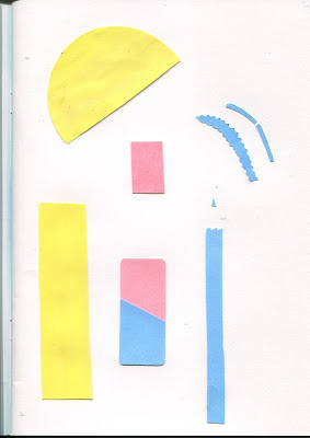
- I painted paper in the shades that I wanted, then cut out the base shapes for my imagery, which I scanned in before adding line drawings on top so I had the option of which to use
- After this I put the design together on Photoshop
WHY:
- My main aim was to create a cover completely different to any previous Adrian Mole cover, so used depth and texture to make a more interesting, tactile seeming outcome
- I wanted the imagery to be relatable and easily recognisable, as well as including school related items which had been repurposed or discarded, such as the intended audience may do
- I wanted to reflect the theme and age of the book, so used timeless school equipment and an old style school desk background
REFLECTION:
- I found it difficult to place all of my artwork on the actual design, so had to cut down the amount and size of some pieces, which reminded me I need to thoroughly plan scale and composition during the roughing stage- Using two options of imagery was really useful, as I could quickly test out different ideas without having to physically remake an item
- It was an interesting lesson in working with texture and colour, as well as ensuring the composition is balanced


No comments:
Post a Comment