Monday, 29 February 2016

Greetings from- Idea development


For my next idea I wanted to just explore Tallinn, my favourite city, which has loads of different interesting cultures and scenery.

Exploring layout through gouache, inspired by
Naomi Wilkinson
Thinking about less busy, simpler designs

I wanted to try and depict the city on a whole through small insights into the city such as dress, food and small customs.

Although I like the premise of the idea, I think the colours are too clashing and the imagery might be too diverse, so I will not carry on with this idea


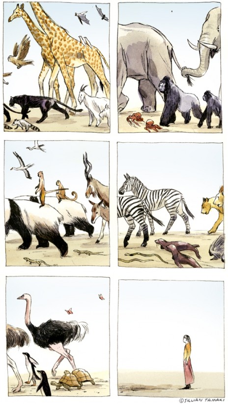
I was originally inspired by the work of Naomi Wilkinson, whose bright but quite cohesive colours help to tie the fairly unusual imagery together. I really like her use of contrasting scales as well to help break up the solid block colours.
Naomi Wilkinson

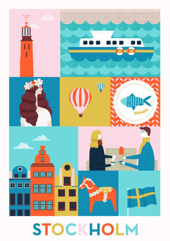
Walk this World by Lotta Nieminen

I really like the way she has used flat, vector esque shapes to depict cities, as well as reducing the amount of information given to ensure that the communication of the location is successful, without being too over complicated. I think this is something I really need to keep in mind during my development, as this project is all about stripping an element back to reveal the core facts whilst still communicating enough information.


Sunday, 28 February 2016

Greetings from- Wetherspoons development

My initial idea was to look at the carpets of Wetherspoons in different cities, as they are all individually made for each specific branch, which would offer a lot of diverse imagery. I was also intending to look at the animals each pub is named after and how this links to the carpets.

Birds from Wetherspoons names
How to link the carpet into the animal, but all looks too
cramped and 80s
Although I quite like the bird imagery, and see how they would be able to translate well into vector based drawings, on reflection, I don't think I will pursue this idea, as it is not one which I am really very excited by, which is the most important thing. I think being inspired and enthralled by the work is a complete necessity in order to put that love and enjoyment back into the work and let it show through, so I need to find a different idea, which inspires me, which is something I am finding really difficult at the moment.

Viewpoint, depth and line of sight

In order to develop a composition for my fan art poster on the Great British Bake Off, I played around a lot with depth in order to see how I could create narratives within a single frame.

Roughs for fan art composition, struggled with getting depth
and humour into the piece
I found these roughs very helpful, as they didn't take long but gave me a good sense of what the composition would look like with regards to viewpoint.

What does depth of an image mean? How can this be achieved?
Illusion of distance of a third dimension can be achieved through overlapping an different scales.

Is depth only relevant to image makers who want to make realistic artwork?
No, it can help to convey narratives and create interesting compositions, regardless of style and content.

What is line of sight?
Direction in which the eye travels when looking at a picture.

What does line of sight do for composition?
Creates more pleasure in the piece and more of an impact on certain aspects, it can also create movement within a frame.


Roughs of main components and analysis of others
work

Breaking down work into the main parts and looking at how
they achieved depth and line of sight


Jillian Tamaki:
Everything leaving the frame to the left- leaving her behind
-Creates movement
Follows the western conventions of reading left to right and builds a strong line of sight
-Narrative built through cropping and progression in each frame
Jilian Tamaki


Mobius:
Line of sight and movement works to show how removed he is from the rest of the scene
-Movement is juxtaposed to that of the boats which is leading away
Depth is achieved through the scale of the birds and boats which builds a distance within the image
Movement of water contrasts to the direction of the bird which again removes the central character from the scene and builds a narrative about why he is leaving.
Mobius


Friday, 26 February 2016

Greetings from- Artist and Wetherspoons research

I looked at the different animal names of Wetherspoons pubs across the country in order to see what starting points I had to work with. The ones which I like the most are:

The Rhinocoeros
The Leaping Salmon
The Red Lion Pinapple
The Beehive
The Monkey Walk
The Bear and Ragged Staff
Moon and Starfish
The Kingfisher
The Unicorn

I also looked at some work by design company Foosux, who use vectors to create birds, which I think are really similar to my own work, and I like how clean cut the lines are and evenly spaced the shapes are, which I would like to work on more in my own vector practice.


Foosux

Monday, 22 February 2016

Greetings from- Initial ideas

Task:
Create a set of four postcards based on different cities, which are 140x210mm each, portrait or landscape and unite the cities under one, not clichéd, theme. All must be created using illustrator.

This project is really exciting right now, as I have been looking forward to using illustrator, and I am interested to see how my work will transfer into vector based imagery. 

My initial ideas for this project are:

Shoes
Flowers
Inventions
Exports
Baked goods
Fairs and festivals
Biscuits
Cheeses
Wetherspoons carpets
Wine

However, I think the more regional things might be difficult to pin down to a city, and I need to ensure that the stimuli are different enough to offer interesting and varying outcomes.


TASK:

Aims
To simplify a given stimulus to the most basic shape possible using just one colour. The object I got given was 'crab claw'


Intent
I wanted to keep the classic crab claw shape whilst using very simple, large shapes so that it was still easily recognised.

Evaluation
I think I was fairly successful in depicting the object in a simplified manner, but after seeing the work of my peers I feel I could have been more creative and symbolic with the final outcome. However I really gained from this exercise as I was able to see how complex shapes can be simplified easily, which is directly lined to this project.


I see faces- Evaluation and reception

Today we viewed everyones gifs in lesson, which I thought was really beneficial, as I was able to see how my peers tackled the same brief as me, and what their final outcomes were. The one thing which I think would have benefitted my practice the most over this project would be to have had more group crits so that I could create more informed decisions about how to develop my work based upon a wider context than just my friends and my own opinions.

I think the purpose of these gifs is quite ambiguous, as they have a very quiet, simple tone, which may make them suitable for a means of entertainment, whilst the repetitive and different nature might make them suitable for more commercial, advertising based purposes, which some alterations.

Overall the reception to my gifs was largely positive, and I think it was a good decision to use the same character over all three to see how it translates into different media.

3D:
When I first made this gif I wasn't completely happy with it because I felt the movement was fairly stilted and the execution of the unravelling jumper and texture of the fur, as I could have spent more time over the photography part which would have produced a more professional outcome. I also think I could have considered the composition further as I think if the camera was lower more of the walking would have been captured, and allowed a more grounded and successful narrative.

Hand rendered:
My main issue with my hand rendered gif is that the focus of the viewer will probably be mostly on the eyes and face of the character, rather than the knitting action which is what I intended. In hindsight I should have considered composition further through roughs in order to develop a composition which showed the movement I wanted. However I really like the quality and media I used on this gif and I think it really suits the character well with a hand rendered feel.

Digital:
I didn't have a lot of time to create this gif, as I focused too much of my time on the other two, however I also found the digital gif the easiest and quickest to animate. However I think I could have put more movement into the rest of the body to help it seem more fluid. I also think the composition in this gif works the best out of all three, especially since the focal point is in one of the points on the rule of thirds grid.


Sunday, 21 February 2016

I see faces- Digital final

I ended up making 15 frames for my final gif, with a 0.15 second delay, but since I had separated my components on different layers, I was able to repeat half of the frames but with an additional layer to fill the spoon with honey. Overall I'm happy with my outcome considering I haven't used much digital media previously, but I feel with more time I could have pushed it further and perhaps been more adventurous with the movement.

What works well:
- Like how not the whole of the image moves, as it ensures focus is on movement 
- Think the repetition of slightly altered frames makes sure the movement seems more natural and smooth
- The interjections and overlaps of grass and white help to brighten up the character without being too pronounced
- Think the shadow works quite well, especially on the arm, as it helps to prevent the character from feeling too flat and adds an extra element of movement

What I would change:
- Don't think it is quite as simple and 'slick' as the deer gif I looked at during my research, Perhaps could have added a little movement in the rest of the figure to make it feel more 'whole' as a character
- Last frame, where the honey disappears could have been less jumpy by including a few more frames at this point
- Could have added a bit of pattern or texture to gloves to help add interest and link to other gifs 

What I've learnt:
- I felt quite stuck with where to start with the digital one, since I didn't have much experience with digital before, which meant I put this one off until the end. I felt fairly rushed with this gif, but next time I have something I'm not too sure what I'm doing with I think I will just start earlier and get stuck in in order to generate more possibilities and allow me more time to refine it
- Major skill I learnt was improving my digital image creation skills, especially through using a graphics tablet


Saturday, 20 February 2016

Photography inductions

Yesterday we had our photography and lighting inductions, working in small groups, we learnt about how to get certain effects from our photographs as well as how to use the specialist lighting equipment at the college. Unfortunately because we were on such a tight schedule, we had to return the cameras fairly quickly, and were unable to save any of our photos.

What I learnt:
- Different techniques to light objects in order to photograph them in appropriate light
- How the sensors work with the cameras so that the flash is co-ordinated
- How reflected light can soften and harden images

How this will benefit my practise:
- I now feel confident in photographing my made products to a high standard
- I understand how different angles and harshnesses of light can alter the appearance of printed, flat products, and how the correct lighting can alter the appearance

Friday, 19 February 2016

I see faces- Development digital

In order to create my digital gif I started by producing roughs in my sketchbook, as I find this a far easier and looser way of working. I then traced over this in a different layer in photoshop and added different colours and components using a graphics tablet.

What I liked:
- This was one of my first times properly using a graphics tablet, and I am pleased with the overall form and cohesion of my piece
- Colour cohesion, how light blue sits well with the cool greys and slight addition of red balances the image
- Omission of detail works well to ensure it isn't overcrowded and makes sure the focus is on the action 

What I need to do next:
- Animate frames to create movement
- Experiment with amount of frames needed to create smooth movement
- Trail ways of showing the eating of the honey 

What I've learnt:
- How to translate analogue into digital media more effectively
- The importance of layers and how they are needed to quickly alter images later on
- The functions and workings of graphics tablets and how I can use them to develop my ideas and sketches
- Could explore other processes, such as Illustrator to make more uniform work?

Initial sketch
Halfway through
Including line from original sketch
Final image


Thursday, 18 February 2016

I see faces- Final hand rendered outcome

I really wanted to create a very traditional outcome for my hand rendered gif, so I drew out 20 frames by hand through the light box. Although I like how this effect comes across, I think it might be a bit too varying and 'jumpy', especially the scarf, as I think the block colour moves around too much and demands the most attention on the screen, which was not what I intended. 

What I like:
- Movement of paws-think this is really sweet and effective, would have been better more central though
- Movement of eyes adds an extra element of interest
- Like slight movement in ears, adds a natural element to the image

What I don't like:
- Bottom half is too 'jumpy' and distracts from the rest
- Fur moves too much, could have tried to make them more standardised
- Could have tried to show scarf growing, then being pulled back to show progression

What I would do differently:
- Consider composition more thoroughly
- Think about adding media differently
- Trace bottom half more carefully


I see faces- Mono prints

During the mono print induction, I took the opportunity to explore the 'I see faces' theme a little more. Although these prints aren't anything ambitious or too complicated, I think they really served as a good reminder to how to mono print, as it's been around 10 months since I last used this technique, so it was good to have a play around with how to create interesting imagery. I would like to come back some time soon to one of the drop in sessions with some pre-made stencils in order to get the most out of the session and create imagery which really relates to my ideas and themes.


Wednesday, 17 February 2016

I see faces- Digital artist research

I found these two gifs on Pinterest, and loved their simplicity and clean nature, especially in the first one. I would really love to create a toned down, very simple digital piece, especially after my fairly busy hand rendered and 3D outcomes

What I like:
- Simple, repeated nature -shows off slight movement
- Basic colour palettes, just two or three separate hues make sure work is not too complicated
- Action of eating in first, would like to emulate this with a quiet, simple repeated action 
- Varying speeds-need to pick a speed which will reflect the tone and pace I want to convey

What I will do in response:
- Experiment more with graphics tablet and possibly illustrator
- Plan out simple, shape driven designs
- Review notes on how to effectively produce digital gifs


Tuesday, 16 February 2016

I see faces- Hand rendered development

I decided to follow the same character through all my gifs, as I felt this would be most interesting and challenging to me, especially since my character work is not too strong, so I was eager to develop it through ways other than just adding faces to inanimate objects. I used the light box and graphite/coloured pencil to create the drawings, as I wanted a 'home made' feel to the gif, which I think shows through in the work. I wanted to create a quiet feel to the gif by having the action at the bottom, which would balance off the movement in the pencil work elsewhere, but this is not too clear and makes the knitting almost disappear.

What I like:
- Colours and contrast to white paper
- Character comes through in narrative- think slight movement shows considered and quiet personality
- Like difference between blocked out and thin pencil line

What needs improvement:
- Composition- Could have made the character smaller and knitting more central to create more impact
- Could have done fewer, more precise drawings with simple knitting movement
- Colours and shape of scarf could be more consistent

What I learnt:
- Consider composition before committing to drawings, do more precise, detailed roughs
- Process of using light boxing to create sequential imagery
- To consider movement of line and detail as well as character movement
- The process of making gifs which line up and work to create the illusion of movement


Halfway through, simple pencil drawing

Final drawing scanned

Final drawing scanned

Final drawing scanned

First trial without altering levels
Attempt with slight level altering

Edges show, needs cropping, but like levels


I found a book called Norwegian Illustrators no04, which had loads of character design and development I liked.

I chose these two illustrators in particular because I find their work really loose and slightly messy, which is what I wanted my hand rendered gif to show, especially like Hobal's work, which I can almost see the movement of the animal through the line, which I really want to emulate through my practise in order to create a dynamic and endearing outcome.
Tone Lileng
Randi Hobal

Saturday, 13 February 2016

I see faces- Artist research

I struggled to find gif based artwork similar to what I wanted to create, so I looked simply at static artwork of a similar nature.
Whilst looking at ways to develop my bear character into a hand rendered format I looked at the work of several practitioners, my favourite of which were Lizzie Mackay and Julia Pott, who both anthropomorphised bears through adding clothes, but in very different ways. Mackay uses flat colour and simple shapes, whilst Pott creates depth and character though pencil work. I really like how Pott portrays her characters through cohesion in the media used for both the bear and the clothes, and I would love to emulate this in my work.

What I like:
- Character given through simple, set emotions
- Additions of human clothing/accessories fairly crudely put on add humour
- Block colour and line create a playful and quirky outcome

How this has influenced my practise:
- Made me think about ways to add human attributes to my work, such as rosy cheeks and detailed eyes
- Has made me think more about placement of colour and how it balances on the page
- Gave me new ways of thinking about how to put clothes on animals
- Made me realise how necessary it can be to simplify drawings, especially when translating them to gif form, as many frames will be needed-meaning I will need to simplify my designs before I create my final drawings

Own work
Julia Pott

Dominique Le Bagousse

Lizzie Mackay


Friday, 12 February 2016

I see faces- Final 3D gif

Through using plasticine and knitted wool I created a very simple gif of a bear walking with his sweater unravelling. I initially wanted to be more ambitious with this, perhaps having him turn and face the camera halfway through, and although I am fairly confident in creating 3D models, this was my first time exploring how to create stop motion animation, so I decided to keep it fairly simple. Originally I had over 100 still images, but I found it moved too slowly and made it seem fairly boring, so I deleted alternate frames to speed it up a bit.

What I like:
- Like how the wool unravels and creates further narrative simply
- Simple background works well to show off the crafting in the model
- Contrasting textures and continually altering plasticine create a handmade feel
- I like how the simple content makes the gif easy to understand and simple to watch

What needs improvement:
- Trails on floor disappear on repeat- could have put them in beforehand?
- Movement of legs seems quite jittery at times, could have put wire inside to create smoother movement
- Lighting seems to alter at times, maybe to do with camera focus-could have reviewed images before moving to the next photograph
- Slight change in bears direction near end, could have ensured it was more straight

What I have learnt:
- Importance of tests- helped me to develop techniques on how to move his legs
- How the length and speed of gif can be effected by number of frames- it doesn't necessarily look better with more detail in movement
- Not to over complicate content
- Relationship between 3D and lens, and how much of an impact lighting has on 3D items


I see faces- Digital development

Today I experimented with a graphics tablet for the first time, and began to develop some of my initial drawings into digital images. I really enjoyed using the tablet, and was happy that I spent the day experimenting with different techniques and effects, however I am not really very keen on any of the images I created, as I feel the orange is a bit too simple in character, and the figures are a bit bland.

I decided that although I was going to focus on themes of unravelling, since this is a project on character, and developing character is not one of my strong points, I really want to push myself in creating characters which embodied emotions and were relatable and entertaining to an audience. Therefore I would like to develop my bear character further into both the digital and hand rendered gifs.

What I will do next:
- Create more preliminary sketches to develop a character which links to my 3D one
- Research digitally created gifs more-look specifically at animals
- Think about simple movement and small narratives
- Experiment more with the graphics tablet


Thursday, 11 February 2016

Frame

Aims
To use the frame of the image to help create interesting and striking compositions, using an elephant, butterfly and myself.


Intent
I wanted to create a strongly weighted image which used the contrast of the black ink and the white paper, as well as trialling the rule of three in order to study focus points within an image.

Evaluation
I quite like the effect of this image, especially the brush work on the elephant, and I like the small amount of reduced value ink at the bottom to help ensure the images aren't just floating on the page. Overall I found this an interesting exercise, and thought the outcome was fairly successful considering the short amount of time we had to complete it.

Questions
Could I have played with scale so it was a bit more abstract?
Could flight path have been more delicate?

I see faces- Image of final 3D

After investing a little more time into the crafting of my character I am really pleased with how it has turned out. I also knitted a little jumper for my character, which will look as if it is unravelling whilst he is walking along.

What do I like?
- Texture of fur adds a slightly uneven feel
- Contrast of colour between brown to blue/green
- Simplistic face- helps to draw attention to movement on a whole

What needs improvement?
- Is jumper too bulky?- see how movement looks with this
- Do I need thread unravelling? or is it an unnecessary detail?

What will I do next?
- Create scenery for my final outcome-or just plain backdrop?
- Think about how to position camera-use tripod?
- Study the movement more to get an accurate representation