Adobe Colour CC website can help to create colour schemes tailored to your needs.
Playing with colour and using intuition can help your colour skills develop drastically
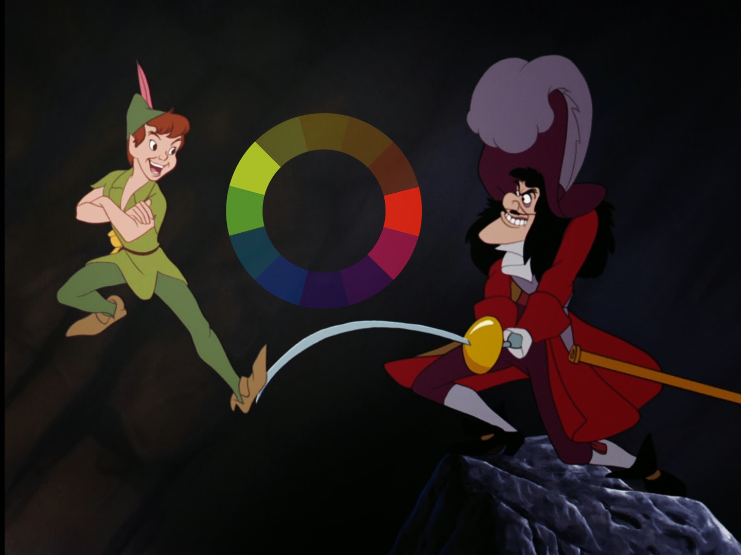
Contrast, accent, compliment, harmonise and vary are all important terminology to consult when thinking about colour
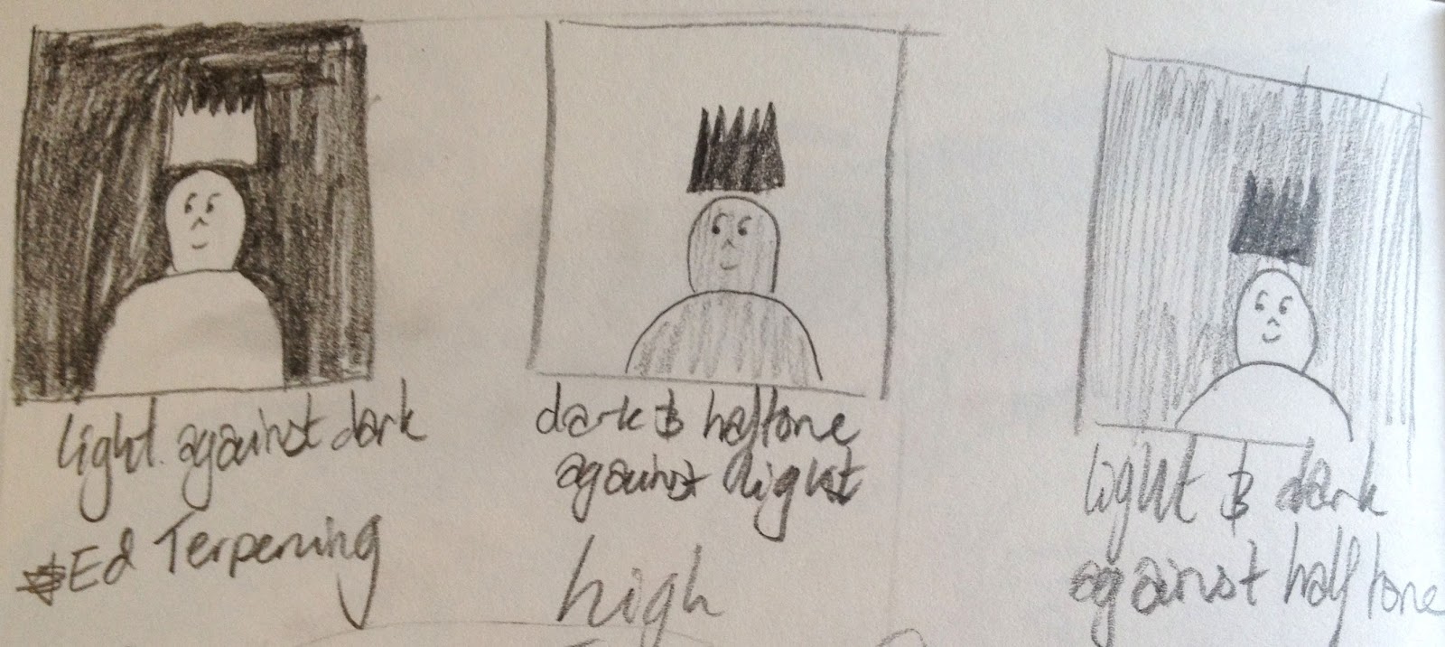
Thinking about different tones and contrasts we made some sketches to show how these variants create more interesting outcomes. I found this extremely helpful as I hadn't really consciously thought about how to construct images based on these values, but it is definitely something which I will keep in mind during my future roughs.
No comments:
Post a Comment