


I ended up developing three fairly simple designs which are also very cohesive as a set. I am quite concerned that they may be too simple, but I intended for them to be simple enough to be easily translated to screen or mono print. I will also experiment with adding more fluid, irregular texture to add more interest to them.
Next I need to try interpreting them to illustrator, and try using lines and the 'expand' tool to get the negative space between my shapes. I also need to decide what colours I want for the shell, city and background.
I like the work below by Jenny Tiffany as I think the way she has incorporated texture to her vector illustrations reflects well the feel of the image, which is quite natural.
I would love to emulate the texture she has used as well as the simple two colours she has explored.
 |
| Jenny Tiffany |
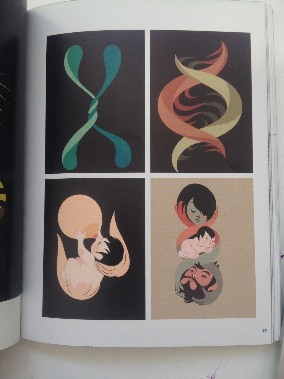
I found a book called 'Vector Illustration selected by Marc Giménez' which was really useful in order for me to see how versatile vectors can be.
 |
| Gloria Pizzilli |
 |
| Gabo Galicia |
No comments:
Post a Comment